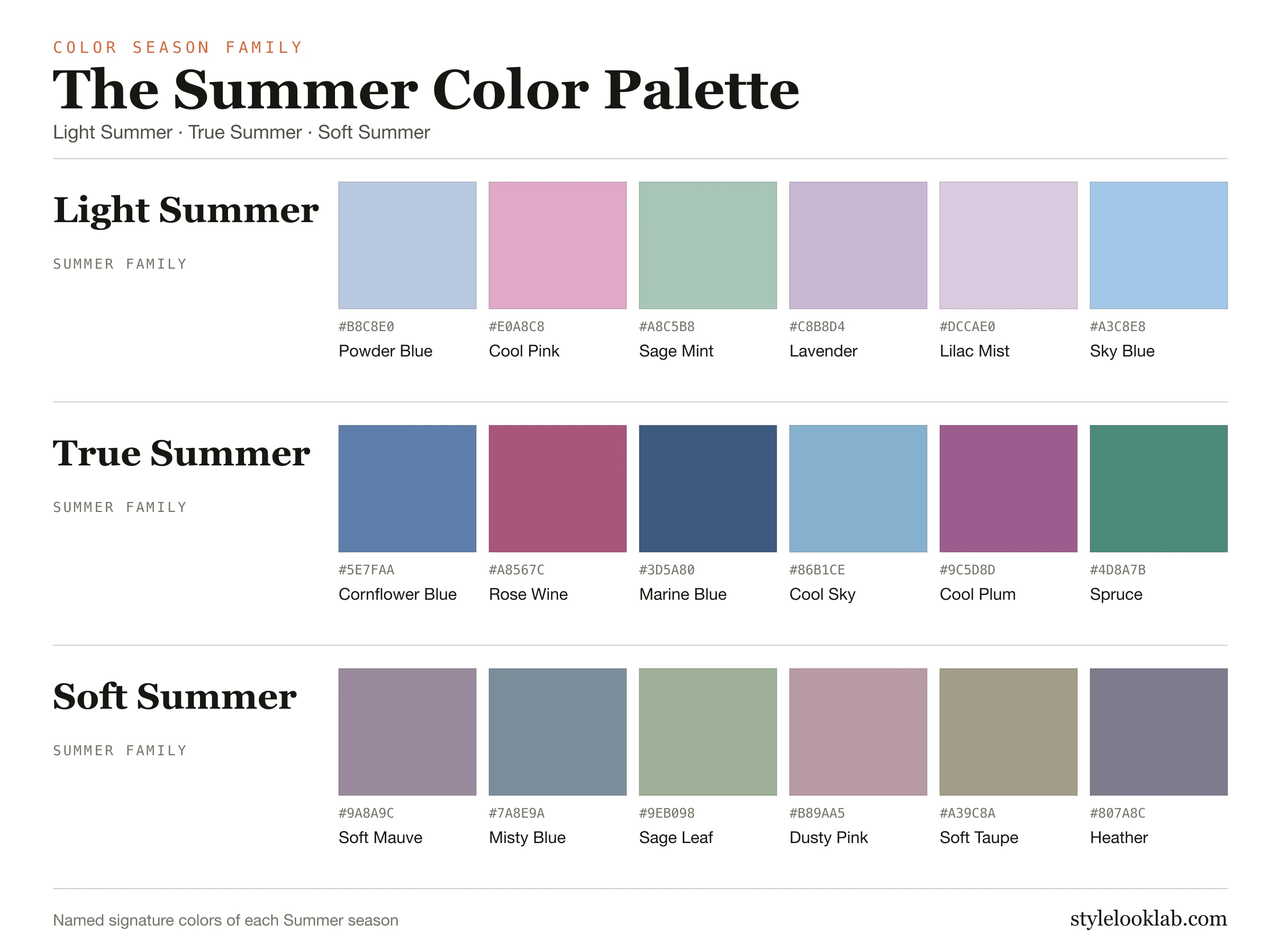
The Summer color palette is cool, gentle and softened: powder blue, rose, mauve, lavender, blue-gray and soft navy. Every Summer color carries a blue or rosy undertone and stays a step quieter than Winter. Orange, mustard, stark black and bright warm yellow usually work against it.
This guide covers what the three Summer seasons share, how Light, True and Soft Summer differ, how to tell which one fits you, and how Summer compares with Winter and Spring.
What the Summer palette has in common
In the 12-season system every family is defined by where it sits on three dimensions: temperature (warm to cool), value (light to deep) and chroma (soft to clear). Summer is the cool and soft family. Its colors lean blue rather than golden, and they are slightly grayed rather than pure and vivid.
That combination is why Summer colors look calm rather than loud. A Summer red is raspberry or rose wine, not fire-engine red. A Summer neutral is blue-gray, soft navy or cocoa, not camel or optic black. A Summer white is soft white, not bright paper white.
Summer is not one fixed set of swatches. Inside the family, three seasons each let one trait lead:
- Light Summer leads with lightness: airy, watercolor colors with very little dark contrast.
- True Summer (also called Cool Summer) leads with coolness: the most blue-based, classic Summer.
- Soft Summer leads with softness: dusty, smoky colors that sit close to the Autumn boundary.
Light, True and Soft Summer side by side
The three palettes below use the same color data as each season's full guide. Read them as directions rather than shopping lists: notice which one gets lighter, which stays purely cool, and which becomes dustier.
Light Summer
The lightest Summer. Airy pastels with very little dark contrast.
True Summer
Also called Cool Summer. The most blue-based, classic Summer palette.
Soft Summer
The dustiest Summer. Smoky, muted colors close to the Autumn boundary.
| Season | Undertone | Depth | Chroma | Full guide |
|---|---|---|---|---|
| Light Summer | Cool | Light | Fresh | Light Summer → |
| True Summer | Cool | Light-to-medium | Softened | True Summer → |
| Soft Summer | Neutral-cool | Medium | Very muted | Soft Summer → |
Which Summer are you?
Most people who suit Summer can narrow the choice by asking which quality matters most near the face. Use one front-facing photo or a mirror in steady daylight, and compare fabrics of similar size.
- Pale colors look easy and dark navy feels heavy? Start with Light Summer. Its strongest neighbor is Light Spring, so test whether peach or cool pink looks cleaner on you.
- Blue-based colors look clearly better than anything with warmth, and mid-depth navy works well? Start with True Summer. This is the season where temperature decides almost everything.
- Clean, bright colors look harsh, and smoky colors look polished? Start with Soft Summer. Its neighbor across the family line is Soft Autumn, so compare dusty rose with camel.
If two seasons still seem plausible, keep both on your shortlist and test the dimension that separates them. The free what season am I quiz can help you narrow the shortlist, and a photo color analysis compares colors against your own coloring. Neither replaces a careful side-by-side check in good light.
Summer vs Winter vs Spring
Summer shares coolness with Winter and lightness with parts of Spring, which is why those are the comparisons people most often get stuck on.
Summer vs Winter. Both families are cool. The difference is chroma and contrast. Winter carries pure black, crisp white and saturated jewel tones; Summer softens all three. If cobalt and true black look sharp and intentional on you, test the Winter palette. If they look severe and soft navy looks better, Summer is the better starting point.
Summer vs Spring. Light Summer and Light Spring are both light and fairly delicate. The difference is temperature. Spring colors are warm and golden; Summer colors are cool and rosy. Compare peach with cool pink, and ivory with soft white. Read the Spring palette if the warm versions look fresher.
Summer vs Autumn. Soft Summer and Soft Autumn are both muted. Autumn adds golden warmth. Compare camel with taupe, and olive with sage leaf.
Wearing the Summer palette
Clothing. Build around soft navy, blue-gray, cocoa or taupe instead of black, then add one or two mid-tone accents such as cornflower blue, rose or lavender. Summer combinations look best when the colors are close in depth. A high-contrast black-and-white outfit is usually where Summer looks tired.
Makeup. Rose, berry and mauve lip colors usually suit Summer better than orange-red or brown-red. Blush in soft pink or cool rose reads more natural than peach. Gray-brown or taupe brow and liner shades tend to look softer than pure black.
Hair color. Ash, cool beige and soft brown shades usually keep Summer coloring balanced. Strong golden or copper tones can look disconnected from cool skin; very dark, blue-black hair can overpower it.
Jewelry. Silver, white gold and pewter usually look easiest. Soft rose gold can work. Bright yellow gold is often the least natural choice, though brushed or pale gold is worth testing.
How to test the Summer palette
- Use daylight from a window, no filter and no strong makeup.
- Hold two fabrics of similar depth near your face, for example soft navy and true black, or rose and coral.
- Look at your skin rather than the fabric: which choice keeps your skin even and your features clear?
- Repeat with a second pair before deciding. One comparison is a hint, not a verdict.
A color season is a way to organize styling decisions. It is not a medical or scientific classification of your skin, and lighting, cameras and screens can all shift how colors appear.
Not sure which Summer you are?
Use clear photos for a separate color estimate. Sign in to check free preview eligibility; the paid Complete Report includes the full recommendations. A photo result does not confirm or inherit a quiz result.
- Sign-in required
- Free preview if eligible
- Complete Report sold separately
Summer color palette FAQ
How do I know which Summer color palette I am?
Ask which quality matters most near your face. If pale colors look easy and dark navy feels heavy, start with Light Summer. If warmth looks wrong but mid-depth navy works, start with True Summer. If clean colors look harsh and smoky colors look polished, start with Soft Summer. Then compare the two closest seasons side by side in daylight.
Is the Summer color palette warm or cool?
Cool. All three Summer seasons lean blue or rosy rather than golden. Soft Summer is the least cool of the three because it sits close to the Autumn boundary, but it still reads cool-neutral rather than warm.
Do Summers wear gold or silver?
Silver, white gold and pewter usually look easiest on Summer coloring. Soft rose gold can work. Bright yellow gold is often the least natural choice, although pale or brushed gold is worth testing.
Can Summers wear black?
True black is usually too harsh for Summer. Soft navy, charcoal blue-gray or cocoa give the same anchoring effect with less contrast. If you love black, keep it away from the face or soften it with a Summer color near the neckline.
Can Summers wear navy blue?
Yes. Soft navy is one of the most useful Summer neutrals and often replaces black. True Summer handles the deepest navy; Light Summer usually prefers a softer, lighter blue.
Which colors are not good for a Summer?
Orange, mustard, bright warm yellow, stark black and very saturated neon colors usually work against Summer. They either add warmth Summer does not carry or more contrast and brightness than it can balance.
What is the difference between Summer and Winter?
Both are cool families. Winter suits pure black, crisp white and saturated jewel tones; Summer suits softened versions of the same cool direction. If cobalt and true black look sharp on you, test Winter; if they look severe, Summer is the better starting point.
Sources & limitations
These references support photographic color measurement and its limitations. They do not scientifically validate the 12-season taxonomy, the grouping of seasons into four families, or the editorial recommendations on this page. A Style Look Lab result is an estimate from submitted photos, and its confidence score is not a calibrated probability of accuracy.
- CIE 256:2025 — Measurement of Human Skin Colour — Measurement conditions and limits for human skin colour.
- He et al. (2022) — Facial skin colour from digital images — Evidence on estimating facial skin colour from images.
- Wang et al. (2018) — Skin colour measurement variability — Shows why location and measurement conditions affect readings.
- Sharma, Wu & Dalal (2005) — The CIEDE2000 color-difference formula — Reference for perceptual colour-difference calculations.
- Google — Improving skin tone representation with the Monk Skin Tone Scale — Google’s introduction to the 10-tone representation scale; it does not define undertones or validate this site’s questionnaire.