The 12 color seasons are a practical map of color, not a rulebook based on hair or eye color. The system compares three visual qualities — temperature, value, and chroma — then combines them into four families with three variants each. The useful question is not “Which box do I look like?” but “Which group of colors makes my face appear clearer, more even, and better defined under consistent light?”
Use this page as a decision path. Scan the four families, compare the three seasons inside your closest family, then open the full guides for the two strongest candidates. A shortlist is more useful than false certainty from one quiz, and a side-by-side fabric comparison is more useful than matching yourself to a celebrity.
| Family | Shared direction | Start your comparison with | Sub-seasons |
|---|---|---|---|
| Spring | Warm and relatively clear | Coral, warm aqua, golden yellow | Light, Warm, Clear |
| Summer | Cool and relatively soft | Powder blue, mauve, dusty rose | Light, True, Soft |
| Autumn | Warm and relatively muted | Camel, olive, rust, espresso | Soft, True, Deep |
| Winter | Cool and relatively clear | Black, pure white, jewel tones | Deep, Cool, Clear |
The 12 seasons at a glance
The twelve cards below are grouped by family. Each card gives you three things at once: a working color strip, a plain-language description, and its position on temperature, value, and chroma. Treat a card as a reason to investigate, not a diagnosis. Hair and eye color provide context; neither is a rule for assigning a season. Compare colors near the face under consistent conditions.
Start with the family whose overall direction seems plausible, then compare its three variants. If light colors look easy but dark colors feel heavy, compare Light Spring with Light Summer. If softness is clearly more important than temperature, compare Soft Autumn with Soft Summer. If black works but muted color makes you disappear, compare the three Winters.
The Spring family
Warm, fresh, and relatively clear. Spring moves from airy pastels to vivid coral and turquoise; its three variants differ mainly in whether lightness, warmth, or clarity leads.
The Summer family
Cool, gentle, and softened. Summer favors powder blue, mauve, rose, and blue-gray; its variants shift from light and airy to fully cool or distinctly muted.
The Autumn family
Warm, grounded, and lower in chroma. Autumn runs through camel, olive, rust, and espresso, with softness, warmth, or depth taking the lead in each variant.
The Winter family
Cool, defined, and relatively clear. Winter handles the strongest light-dark contrast and jewel tones, then separates into deep, fully cool, and high-clarity variants.
Two seasons may remain plausible. That is normal: neighboring palettes share two dimensions and differ mainly on the third. Keep both on your shortlist until the direct comparison sections below make that final difference clearer.
The full 12 color seasons chart
This chart puts every palette on one page and names the colors. The names are intentionally specific. “Warm red” is hard to shop for; tomato, brick, and cinnamon describe different decisions. Save the chart as a reference, then use a season guide when you need the larger palette, hex codes, outfit combinations, and suggested swaps.
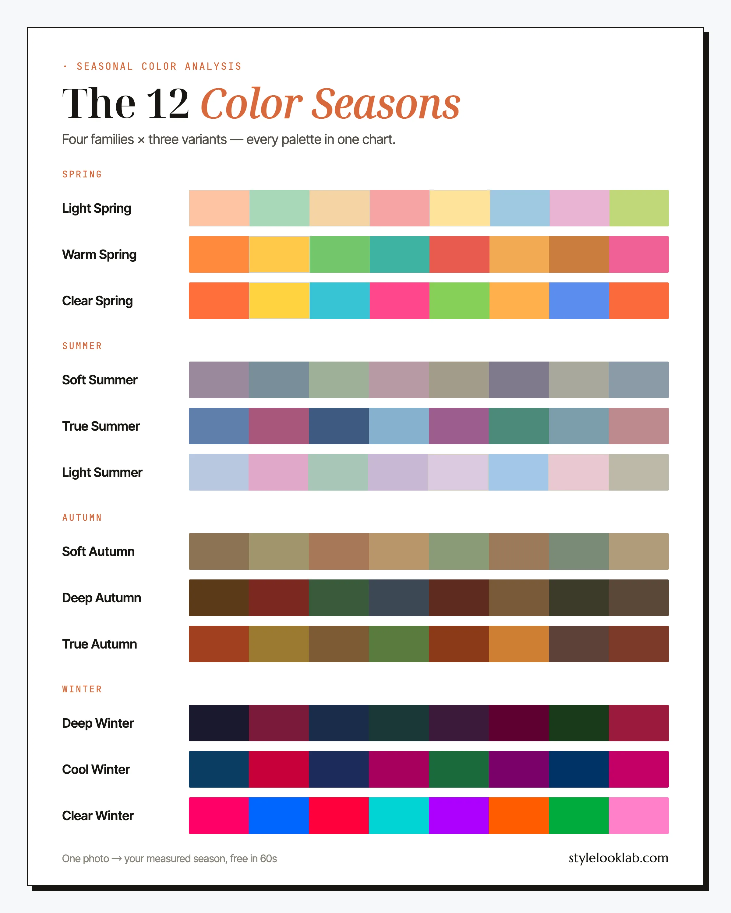
Read the chart vertically before reading it horizontally. Within a family, notice which palette becomes lighter, deeper, softer, or clearer. Across families, compare seasons that share the same leading trait: Light Spring with Light Summer, Soft Summer with Soft Autumn, and Deep Autumn with Deep Winter.
How three dimensions make twelve seasons
Every season is a region on three continuous axes. The categories are useful because they turn a large color space into a manageable wardrobe, but the borders are not walls. Someone near a border may borrow easily from the neighboring palette.
Temperature
01Compare golden, peach, and tomato colors with blue-gray, berry, and blue-red colors.
Value
02Ask how much darkness your coloring can repeat before the face starts to look shadowed.
Chroma
03Compare gray-softened colors with cleaner saturation and watch which side keeps facial detail intact.
Temperature: warm to cool
In seasonal analysis, temperature describes whether warmer or cooler colors appear more harmonious next to the face. It is not the same thing as surface skin color. Style Look Lab uses olive as an undertone label that can also have a warm or cool lean. It is separate from skin depth and does not determine a season by itself.
Use comparison rather than inspection: camel against cool gray, tomato red against berry, cream against optic white. Look for a repeatable preference in visible redness, shadows, and facial definition; the fabric is not changing the skin itself. A single test is only a clue; look for the same direction across several pairs.
Value: light to deep
Value is the light-dark range of the overall coloring and of the colors it can comfortably repeat. Hair and eyes matter here because they shape natural contrast. A light palette tends to preserve delicacy; a deep palette can repeat more darkness without making the face recede.
Value is relative, not a shortcut from skin depth to season. Deep skin can be warm or cool, soft or clear, and light skin can belong to a deep or high-contrast palette. No one should be assigned a deep season from skin tone alone.
Chroma: soft to clear
Chroma describes saturation. Clear palettes keep color relatively pure; soft palettes mix in gray, brown, or haze. The comparison is often easier to see than temperature: if a dusty mauve makes your features look focused while fuchsia arrives before you do, softness is probably important. If muted color looks dull but clean cobalt or coral adds definition, clarity may be the stronger trait.
The leading dimension helps describe the sub-season. Soft Autumn is warm, but softness leads; Deep Winter is cool, but depth leads. No single axis confirms a season — the result is the combination.
Seasonal color analysis is a styling framework, not a medical or biological classification. Controlled photos and numeric comparisons can make the process more consistent, but the label still depends on the palette model being used. Style Look Lab uses the 12-season model and documents its photo checks and confidence scoring on the methodology page.
The 12 color seasons compared
Use the table as a shortlisting tool. Read across one row to understand a season, or compare two neighboring rows column by column. The signature swatches are a preview, not the full palette; open a season name for the complete named set and practical outfit guidance.
| Season | Undertone | Depth | Chroma | Signature colors | Celebrity example |
|---|---|---|---|---|---|
| Light Spring | Warm | Very light | Fresh | Amy Adams | |
| Warm Spring | Fully warm | Light-medium | Clear | Nicole Kidman (warm phases) | |
| Clear Spring | Warm | Light-medium | Brilliant | Hayden Panettiere | |
| Light Summer | Cool | Light | Fresh | Reese Witherspoon | |
| True Summer | Cool | Light-to-medium | Softened | Sarah Jessica Parker | |
| Soft Summer | Neutral-cool | Medium | Very muted | Diane Keaton | |
| Soft Autumn | Neutral-warm | Medium | Muted | Jennifer Lopez | |
| True Autumn | Fully warm | Medium-deep | Rich, not bright | Julia Roberts | |
| Deep Autumn | Warm | Deep | Rich | Jennifer Lopez (deep range) | |
| Deep Winter | Cool | Very deep | Clear | Lupita Nyong'o | |
| Cool Winter | Cool | Medium-deep | Clear | Jennifer Connelly | |
| Clear Winter | Cool | Medium-deep | Vivid | Kim Kardashian |
The celebrity column is visual inspiration only. Styling, lighting, hair color, and image processing can all change how a public figure appears, so a photographed look is not proof of anyone’s season.
4 vs 12 vs 16 season systems
These systems use related ideas at different levels of detail.
- 4 seasons groups everyone into Spring, Summer, Autumn, or Winter. It is simple and can be enough for broad direction, but it leaves neutral, very soft, very light, and very deep coloring with fewer precise options.
- 12 seasons gives each family three variants and makes the leading trait explicit. The result is specific enough to build a wardrobe while keeping the map easy to understand. This is the model used on this site.
- 16 seasons adds bridge categories for people who repeatedly sit between two palettes. Names and boundaries vary between providers, so a 16-season result is only meaningful when its actual swatches and method are clear.
Start with the 12-season model. If controlled comparisons repeatedly leave you between two neighboring palettes, the useful next step is to study the overlap — not to chase a rarer label for its own sake.
Sister seasons and why close results disagree
Sister seasons share a leading trait across a family boundary. Use this table to choose the comparison that matters for your shortlist rather than repeating every check.
| Your two candidates | Shared direction | What to compare next | Open the existing guides |
|---|---|---|---|
| Soft Summer and Soft Autumn | Muted, around medium depth | Cooler and warmer fabrics at similar depth and softness | Soft Summer · Soft Autumn |
| Light Spring and Light Summer | Light | Warm and cool alternatives with similar lightness | Light Spring · Light Summer |
| Deep Autumn and Deep Winter | Deep | Temperature first, then softer versus clearer color while holding depth close | Deep Autumn · Deep Winter |
Use the same light, distance, and similar fabric coverage for each pair. A shiny warm scarf and a matte cool sweater change more than temperature. Repeat with another pair before recording a preference. Photos, styling, and the weighting of a dimension can change an interpretation; disagreement alone does not establish which result is correct.
When the comparison stays close, keep both palettes. Start with their shared colors, then try the warmer and cooler edges. Borrowing a neighboring color is a styling choice, not a failure to identify yourself. The linked guides give you named colors to test without requiring a new analysis.
How to find your color season
1. Control the setup
Use indirect daylight, a clean face, neutral surroundings, and no beauty filters or automatic color effects. Pull brightly colored hair away from the face if it is dyed. Poor setup can create a more dramatic difference than the fabrics you are trying to compare.
2. Compare, do not inspect
Hold paired fabrics near the face: warm against cool, light against deep, softened against clear. Ignore whether you like the garment. Watch the skin under the eyes and around the mouth, the visibility of redness, and whether facial edges become clearer or blurrier. Repeat the comparison with more than one pair before recording a direction.
Vein color and gold-versus-silver jewelry can be rough clues, but neither is a reliable tiebreaker on its own. Lighting, skin thickness, metal finish, and personal preference all interfere.
3. Shortlist, then test the neighbor
Choose a family, keep its two closest variants, and compare the dimension that separates them. If your shortlist crosses a family boundary, you have probably found a sister-season pair; test temperature with fabrics at similar value and chroma so only one variable changes.
An olive label does not settle the comparison. In this site’s model, olive can have a warm or cool lean; it does not describe a separate layer over another undertone. Deep skin should be evaluated across the full temperature and chroma range instead of being routed to a deep season automatically. Depth alone never decides a season.
If the comparisons remain close, photo estimates can add evidence while preserving ambiguity. Style Look Lab provides capture guidance and estimates undertone, depth, and contrast from submitted photos, then reports an internal confidence score. The score is not a calibrated probability of accuracy, and a low-confidence result should remain a shortlist rather than be presented as certainty.
Explore a separate photo color analysis
Use clear photos for a separate color estimate. Sign in to check free preview eligibility; the paid Complete Report includes the full recommendations. A photo result does not confirm or inherit a quiz result.
- Sign-in required
- Free preview if eligible
- Complete Report sold separately
12 color seasons FAQ
Quick answers to the questions that usually appear after the first comparison.
What are the 12 color seasons?
Four families, each split three ways. Spring: Light, Warm, and Clear. Summer: Light, True, and Soft. Autumn: Soft, True, and Deep. Winter: Deep, Cool, and Clear. Each family shares an undertone and a general mood; each sub-season is named for its dominant trait — the single quality (lightness, depth, softness, warmth, coolness, or clarity) that matters most when you pick colors.
How do I find my color season?
Shortlist by comparison rather than by a single feature. With a clean face in indirect daylight, compare warm with cool, light with deep, and softened with clear fabrics; watch for changes in facial shadows, redness, and overall definition. Keep the two closest seasons, then compare those neighbors directly. If the result stays borderline, Style Look Lab can estimate undertone, depth, and contrast from submitted photos and report an internal confidence score; the score is not a calibrated probability of accuracy.
Can your color season change?
Your natural coloring is fairly stable, but the way a palette reads can shift as hair grays, contrast changes, or tanning changes surface depth. Seasonal labels are styling categories rather than biological facts, so re-test under consistent light if a long-used palette no longer behaves as expected. Often the useful adjustment is toward a neighboring sub-season rather than a move across the whole map.
What is the difference between 12 and 16 season color analysis?
A 12-season model gives each of the four families three variants. A 16-season model adds bridge categories, but naming and palette boundaries vary by provider. The extra labels can be useful for someone who repeatedly falls between two 12-season neighbors; for most people, a well-tested 12-season palette is already specific enough to guide clothing, makeup, and accessories.
What if I don’t fit one season?
Almost nobody is a textbook case — the seasons are regions, not boxes, and plenty of people live near a border. Find your dominant trait first (the quality you’re most sure of, like "definitely muted" or "definitely deep"), pick the season built around it, then borrow freely from the sister season next door. A palette that is 80% right and actually worn beats a perfect one you argue with.
What is the rarest color season?
There is no reliable global dataset that establishes one season as the rarest. Any ranking depends on the population sampled, the analyst’s method, and the exact seasonal system being used. Treat rarity lists as descriptions of a particular client base, not as evidence for or against your own result.
Which color season is best for olive skin?
No single one. Style Look Lab uses olive as an undertone label that may also have a warm or cool lean, separate from skin depth. It does not describe layers of skin or decide a season. Compare temperature, depth, and softness or clarity under similar conditions; olive does not automatically mean Soft Autumn.