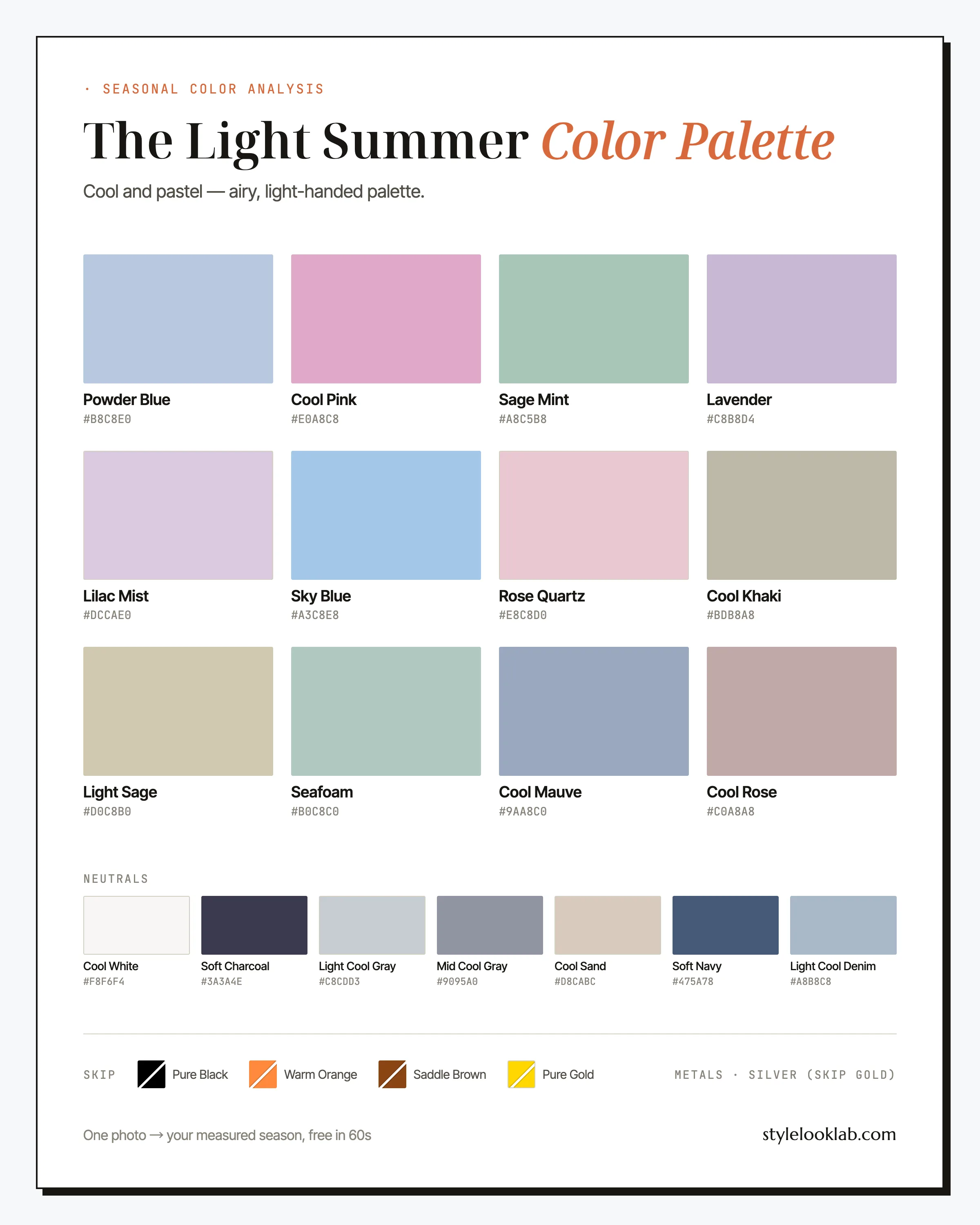
The Light Summer color palette is cool, light, and gently softened: powder blue, lavender, rose quartz, seafoam — watercolor shades built on a blue base with a drop of gray stirred in. Lightness is the defining trait, coolness a close second. If pastels make you look rested while black and jewel tones leave you looking faded inside your own clothes, Light Summer is the season to test first.
This guide names every color with its hex code, shows the combinations that get worn on repeat, flags the shades most likely to sabotage the palette, and ends with an honest way to check that the season is actually yours. The one-table version first:
| Best neutrals | Best accents | Usually avoid |
|---|---|---|
| Soft Charcoal, Cool White, Light Cool Gray | Powder Blue, Cool Pink, Lavender | True black, warm orange, saddle brown, metallic gold |
Are you a Light Summer?
Light Summer coloring is fair, cool, and quiet about it. Skin is light — commonly around MST 1–4 on the Monk Skin Tone scale, though depth alone never decides a season — and it flushes pink rather than tanning gold. Hair runs from light blonde to light ash brown with a matte, silvery cast instead of a golden sheen. Eyes are blue, gray, or a pale misty green. What ties it all together is proximity: skin, hair, and eyes sit near the light end of the scale, so the face reads as one soft, cool impression rather than a set of contrasts.
Run the quick checks:
- Silver jewelry tends to look cleaner on you than yellow gold.
- Cool pink blush reads like your own flush; peach blush sits on top of the skin.
- Light-wash denim and pale gray feel like yours; a black turtleneck feels like a loan.
- In sun you go pink long before you go brown, if brown ever arrives.
- Wrist veins lean blue-violet rather than olive green — a rough clue, nothing more.
Four or five yeses put Light Summer at the top of your test list; none of them confirms it. For a more systematic pass, take the free color season quiz before trusting any single mirror check. Lighting, filters, makeup, camera processing, and image selection can each nudge skin tone far enough to move a borderline result. Style Look Lab estimates undertone, depth, and contrast from submitted photos and returns an internal confidence score; that score describes support in the available photo evidence, not a calibrated probability of accuracy. See the methodology and limitations before treating a photo result as settled.
Light Summer on the three color dimensions
The 12-season system places every season on three axes: undertone from warm to cool, depth from light to deep, and chroma from soft to clear. Light Summer sits cool of center, at the pale extreme of depth, and just soft of the midpoint on chroma. Depth is the axis that names the season — this is a light palette before it is anything else.
Blue-based across the board, but it stops short of icy — the frozen extremes belong to the Winter seasons.
Nearly every shade sits at the pale end — this is where the season gets its name; the few darker pieces are supporting cast, not leads.
Softened by a drop of gray yet clearer than Soft Summer — fresh watercolor, not fog.
Those three positions are more useful than any list of swatches. A color that is light, cool-leaning, and gently softened will probably work on you whether or not it appears on this page, and a color that misses two of the three probably will not.
One thing worth saying plainly before the swatches: color season analysis is a way of sorting clothes, not a medical or biological classification of people. Numeric estimates can make inputs easier to inspect under comparable conditions, but the answer still lives inside whichever palette system does the sorting — this site uses the 12-season model, and the methodology page walks through what is estimated and how the internal confidence score is calculated.
Every color in the Light Summer palette
The working Light Summer color palette is built around two hero shades — Powder Blue (#b8c8e0) and Cool Pink (#e0a8c8) — backed by a full run of pastels: Lavender and Lilac Mist on the violet side, Sky Blue for clarity, Rose Quartz and Cool Rose on the pink line, Sage Mint and Seafoam covering green, Light Sage running the line between green and sand, and Cool Mauve as the closest thing to depth the accent row allows.
The neutrals
Nineteen names is a closet, not a memory exercise. Six of them do most of the work.
Powder Blue
The signature. This is your white-shirt-and-navy equivalent — shirting, knits, a spring coat. When in doubt at checkout, this is the answer.
Cool Pink
The loudest color you own, which tells you everything about the palette. Wear it near the face — it doubles as your lipstick family — and let the rest of the outfit stay quiet.
Lavender
This season wears lavender better than nearly anyone else on the wheel, and it remains one of the most underused office colors going. A lavender shirt under gray tailoring is a small power move.
Sky Blue
Summer dresses, linen shirting, swim: the clearest note in the box belongs anywhere you want the palette wide awake.
Seafoam
The green that goes with everything here, especially light denim. It behaves like a neutral in practice and earns its cost-per-wear fast.
Cool Mauve
Reach for it when an outfit needs somewhere for the eye to rest and Soft Navy feels too formal. This is the deepest accent in the lineup.
On neutrals: Soft Charcoal is the black substitute and Cool White the white, softened just enough to stop the glare. Light Cool Gray and Mid Cool Gray carry tailoring, Cool Sand and Cool Khaki are beige with the warmth carefully wrung out, Soft Navy is the darkest color worth owning in quantity, and Light Cool Denim beats dark indigo in nearly every casual outfit this season puts together.
Light Summer colors to avoid
Colors fail on this coloring in two directions: too dark or too warm. The four below fail hardest, each listed with its palette-native replacement.
- Pure Black
Black asks the face to match its weight, and Light Summer coloring rarely has a dark feature to answer with. Instead of drama you tend to get shadows — under the chin, under the eyes.
Wear insteadSoft Charcoal - Warm Orange
Warm, loud, and saturated at once — the exact opposite corner of the color space from this palette. Next to cool, fair skin it tends to read as sunburn rather than glow.
Wear insteadCool Rose - Saddle Brown
Deep golden brown is an Autumn workhorse with no job here. It muddies every pastel it touches and adds warmth exactly where the palette wants coolness.
Wear insteadCool Sand - Pure Gold
Metallic gold-yellow carries more heat and glare than this coloring can comfortably balance. Even a scarf-sized dose tends to pull fair, cool skin toward sallow.
Wear insteadLight Sage
Treat the list as defaults rather than law. Distance buys forgiveness — saddle brown boots three feet from your face are a footnote, a saddle brown coat collar is a decision — and so does fabric: sheer black chiffon lands far more gently than a dense black knit.
How Light Summer colors hang together
Match lightness first and hue second. Two pastels of different colors at the same value — powder blue with rose quartz, seafoam with lilac — agree with each other almost automatically, while one pastel against something dark turns the pastel into trim on somebody else's outfit. Build most looks from three light pieces, or two light pieces plus one mid-depth anchor (Soft Navy, Cool Mauve, Mid Cool Gray), and keep the darkest piece farthest from your face or buffered by a Cool White collar.
Prints follow the same physics. Watercolor florals, fine gingham in palette blues and pinks, faded stripes, and tonal dots all belong. The test is the print's background: a white or pastel ground usually fits, while a black or dark brown ground drags the whole print out of range no matter how pretty the motif sitting on it is.
Five combinations to copy
From safest to most opinionated, using only colors named above.
The gray-blue column
Shirt, trouser, sneaker. Three light cool pieces at matched value read tailored rather than timid — this is the outfit that convinces skeptics the palette works.
Double violet
Two violets a half-step apart over a solid gray base. Few seasons can wear this much purple without it turning costume; Light Summer can.
Pink, grounded
A pale pink and a brighter one, held down by cool sand so the sweetness stays adult. Silver jewelry, done.
Seafoam weekend
The most repeatable casual formula this season owns: a whisper of green over light denim. It photographs like a vacation.
The navy alternative
As much contrast as this palette ever needs. Wear it anywhere a black suit was about to happen.
Three Light Summer outfit formulas
For mornings when theory is not the assignment:
- Office: Mid Cool Gray suit + Powder Blue poplin shirt + slim silver watch. Reads calm and senior; the same suit over optic white reads ordinary by comparison.
- Weekend: Light Cool Denim jeans + Seafoam crewneck + Cool White sneakers. Three light values and one quiet green — the outfit people call fresh without being able to say why.
- Evening: Lavender slip dress + Soft Charcoal wrap + pearl drops. It covers every occasion a little black dress covers, minus the shadows.
Search terms that pull the right pieces: powder blue poplin shirt women, lavender satin slip dress, light gray wool trousers, seafoam green crewneck sweater, light wash straight leg jeans, pale pink cardigan women.
Pastels at work: how to look senior in powder blue
The fear is familiar: pastels read bridesmaid, or worse, intern. The fix is not abandoning the colors — it is changing what surrounds them. Pastels tend to read junior when they arrive as one sweet piece against dark basics, and expensive when they arrive as a system.
Three moves do most of the work. First, anchor in grayscale: the Light Summer color palette is conveniently rich in gray — Light Cool Gray, Mid Cool Gray, Soft Charcoal — and a pastel set against structured gray tailoring reads deliberate rather than decorative. Second, go tonal: a powder blue shirt with light gray trousers and a paler gray coat forms a column, and columns read authoritative at any depth. What reads young is the scatter — one baby-pink ruffle adrift on a sea of navy. Third, let fabric carry the seniority: crisp poplin, wool crepe, and heavy satin in pastel shades read boardroom, while the same colors in fuzzy knits and floaty chiffon read shower guest. Keep the hardware quiet — thin silver, small pearls — and one of the palest palettes in the system will out-dress the black suits in the room more often than seems fair.
Light Summer hair colors
The Light Summer color palette extends to the hair: cool, light, and low-shine is the brief.
- Ash blonde — the default; it keeps the natural silvery cast and asks for very little upkeep.
- Cool beige blonde — the softer-looking option that stays cool underneath; useful when pure ash feels flat.
- Light ash brown — depth without drama; about the darkest this coloring usually carries comfortably.
- Silver babylights — dimension the on-palette way, and a graceful on-ramp to gray.
The common misstep is golden or honey blonde: it warms the frame around a cool face, and suddenly your best blues are fighting your own hair. Espresso and blue-black bring more contrast than fair, low-contrast features tend to carry. Gray, when it comes, tends to arrive silvery on this coloring — which is to say, on palette. It often turns out to be the easiest hair color this season ever wears, and a cool toner remains the cheapest upgrade in this entire guide. Before committing to silver babylights, a minute with the AI hairstyle changer will show them on your own photo.
Light Summer makeup and metals
Makeup runs one notch lighter and cooler than instinct suggests: rose and petal-pink lips, cool pink cream blush, gray-taupe and soft mauve on the eyes, brown-black mascara instead of true black. The two makeup-counter mistakes to skip are warm bronzer and heavy contour — both add heat and shadow to a face whose whole appeal is lightness and coolness. Most days, a tinted balm and groomed brows are the job.
Metals are simple: silver first, then white gold and platinum, in light polished or brushed finishes. Pale stones — aquamarine, moonstone, rose quartz, pearl — suit the coloring better than dark gems. Yellow gold is less banned than demoted: if you love it, keep it thin and away from the face.
The two seasons Light Summer gets mistaken for
Both neighbors share two of Light Summer's three coordinates, so a close self-assessment can leave both plausible. Style Look Lab can estimate undertone and depth from submitted photos, but a close output and its internal confidence score should remain a shortlist rather than be framed as a definitive winner.
Light Summer vs Light Spring
Same lightness, different temperature. The Light Spring color palette runs on yellow — peach, buttercream, warm coral, hair with a golden sheen — while Light Summer runs on blue. Blush is a useful rough clue: cool pink tends to read more naturally on a Light Summer while peach often supports Light Spring. In daylight, hold powder blue and soft peach at your jaw and watch which one your skin settles into.
Light Summer vs True Summer
Same coolness, one step of depth apart. The True Summer color palette carries medium-depth colors — raspberry, true navy — as its everyday register, while Light Summer wears those same families two shades paler. If pastels feel like your natural setting and medium shades feel like dressing up, Light is the better bet. If pastels feel slightly bland and medium shades feel like home, take a hard look at True.
Light Summer celebrity inspiration
No one has published verified season results for these women, so read this as styling reference rather than diagnosis. Reese Witherspoon is most persuasive in her pale blue and soft rose red-carpet looks, which let low-contrast coloring stay the subject of the photo. Kirsten Dunst has been the pastel-editorial reference since the Marie Antoinette years — powder blue and lilac keep following her for a reason. Cate Blanchett has spent two decades in ice blue, silver, and seafoam couture that would swamp a deeper season; notice how consistently her most-praised looks stay light, cool, and tonal.
Light Summer FAQ
How do I know if I am a Light Summer?
Look for three signals together: coolness (silver tends to beat gold, pink blush beats peach), lightness, and low contrast between skin, hair, and eyes. Any one alone proves little, and self-checks build a shortlist rather than confirmation. Style Look Lab estimates undertone, depth, and contrast from submitted photos and returns an internal confidence score; the score is not a calibrated probability of accuracy, and lighting, filters, makeup, and camera processing can still shift the result.
Can a Light Summer wear black?
Rarely well near the face — black tends to be the harshest mainstream color on this coloring, deep enough to swallow fair, low-contrast features. Soft Charcoal and Soft Navy handle nearly every situation that seems to demand black, and when black is non-negotiable, keeping it below the waist or buffering it with a Cool White layer at the neckline limits the damage.
Light Summer vs Light Spring — what is the difference?
Temperature. Both seasons live in pastels, but Light Spring runs on yellow (peach, buttercream, warm coral) while Light Summer runs on blue (powder blue, cool pink, lavender). Ash-leaning hair, pink blush working better than peach, and silver flattering more than gold all point to Summer. When the tests split down the middle, the undertone is probably close to neutral and worth measuring rather than guessing.
What hair colors suit a Light Summer?
Ash blonde, cool beige blonde, and light ash brown — anything that preserves the soft, cool contrast the palette is built around. Golden and honey blondes are the common misstep: they add warmth the skin then has to argue with. If your hair pulls brassy, a cool toner does more for your colors than any new sweater would.
Can a Light Summer wear white?
Yes, with one adjustment: choose a soft cool white over blazing optic white. Cool White (#f8f6f4) flatters this season more than almost any other neutral, while stark optic white can out-glare fair skin in harsh light. Off-whites that lean yellow — cream, ivory — drift warm and usually sit better on the Spring seasons.
Can a Light Summer wear red?
The palette-native versions of red are rose-based and softened — Cool Rose and Cool Pink stand in for it near the face. A true fire-engine red usually overpowers this coloring, but it survives at a distance: shoes, a bag, a manicure, anywhere its heat never touches the face.
What are good Light Summer wedding guest colors?
Lavender, Sky Blue, and Rose Quartz all photograph gently in daylight and hold up indoors; Cool Mauve reads more evening. Silver or pearl jewelry finishes any of them. If the dress code says formal, a Soft Navy dress with Cool White or silver accessories carries the formality black would, without the shadows black casts on fair skin.
Do Light Summer colors still work when hair goes gray?
Usually better than before. Gray on cool-toned hair grows in silvery, which lands squarely inside this palette — plenty of Light Summers find their colors get more useful after going gray, not less. The one thing worth re-checking is contrast, and it is fair to re-run an analysis after a big hair change, since hair depth is part of the calculation.
Is Light Summer actually your season?
Use clear photos for a separate color estimate. Sign in to check free preview eligibility; the paid Complete Report includes the full recommendations. A photo result does not confirm or inherit a quiz result.
- Sign-in required
- Free preview if eligible
- Complete Report sold separately
Sources & limitations
These references support photographic color measurement and its limitations. They do not scientifically validate the 12-season taxonomy, celebrity typing, or the editorial wardrobe, makeup, hair, and jewelry recommendations on this page. A Style Look Lab result is an estimate from submitted photos, and its confidence score is not a calibrated probability of accuracy.
- CIE 256:2025 — Measurement of Human Skin Colour — Measurement conditions and limits for human skin colour.
- He et al. (2022) — Facial skin colour from digital images — Evidence on estimating facial skin colour from images.
- Wang et al. (2018) — Skin colour measurement variability — Shows why location and measurement conditions affect readings.
- Sharma, Wu & Dalal (2005) — The CIEDE2000 color-difference formula — Reference for perceptual colour-difference calculations.
- Google — Improving skin tone representation with the Monk Skin Tone Scale — Google’s introduction to the 10-tone representation scale; it does not define undertones or validate this site’s questionnaire.