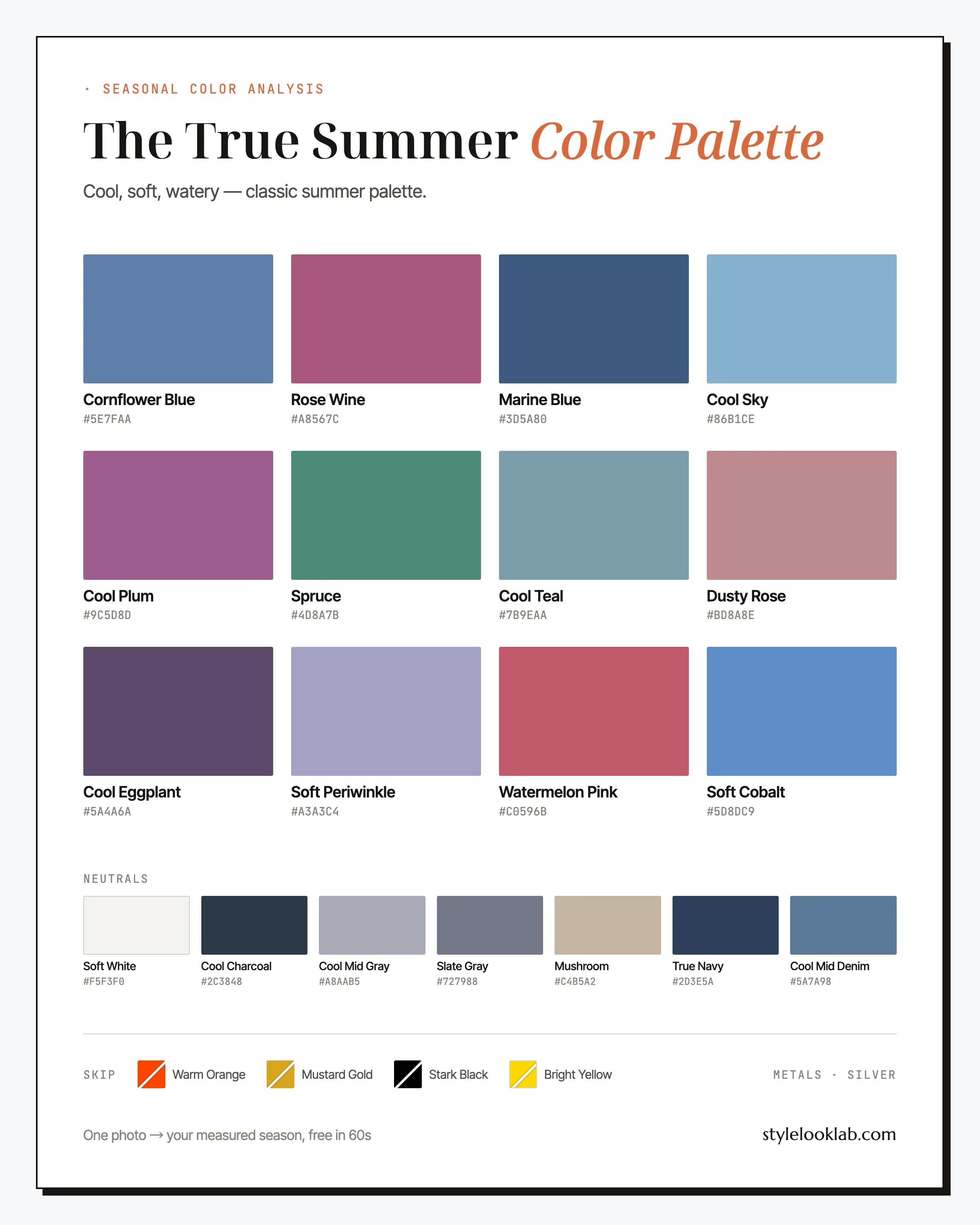
The True Summer color palette is cool, soft, and blue-based: cornflower blue, rose wine, cool plum, spruce, slate gray. Every shade carries a blue undertone and a gently lowered saturation — nothing hot, nothing harsh. Also called Cool Summer, this is the season for anyone whose skin calms down next to blue and pink and picks a fight with anything orange or gold.
This guide names every color with its hex code, shows which combinations earn their keep, flags the shades that usually work against you, and lays out an honest way to test the season before you rebuild a closet around it. The shortest possible version first:
| Best neutrals | Best accents | Usually avoid |
|---|---|---|
| True Navy, Soft White, Slate Gray | Cornflower Blue, Rose Wine, Cool Plum | Orange, mustard, true black, bright yellow |
Are you a True Summer?
True Summer coloring is fully cool with gentle contrast. Skin carries a pink or rosy-beige undertone and usually sits in the light-to-medium range — commonly around MST 2–5 on the Monk Skin Tone scale, though depth alone never decides a season. Hair runs ash: light brown through medium brown with no golden glint to it. Eyes are blue, gray, or a cool, grayed green. The whole impression is blended and cool rather than dark or vivid, which is why heavy black tends to overwhelm this coloring while blue seems bottomless on it.
A few quick checks before the swatches:
- Silver jewelry usually looks cleaner on you than yellow gold.
- Navy near your face reads calm and deliberate; camel and tan look like they were bought for someone else.
- White shirts work on you, but soft white works better than optic white.
- Your wrist veins look blue rather than olive-green — a rough clue, nothing more.
If most of those land, True Summer deserves a serious test — though checks like these raise a hypothesis rather than confirm one. The site's free what season am I quiz turns the same checks into a scored result. Lighting, filters, makeup, camera processing, and image selection can quietly re-tint the visible evidence. Style Look Lab estimates undertone, depth, and contrast from submitted photos and returns an internal confidence score; that score describes support in the available photo evidence, not a calibrated probability of accuracy. See the methodology and limitations before treating a photo result as settled.
True Summer in three dimensions
The 12-season system places each season on three axes: undertone (warm to cool), depth (light to deep), and chroma (soft to clear). True Summer is defined by the first. It sits hard against the cool end, keeps to the middle on depth, and stays softened — though not foggy — on chroma. Of the three Summers, this is the coolest, and everything else about the palette follows from that.
The defining axis. Blues, pinks, greens, plums — everything here sits on a cool base, and even the lone beige is kept too quiet to warm the frame.
Comfortable mid-range depth: dark enough for True Navy and Cool Plum, while true black and inky shades usually overshoot it.
Gently muted rather than foggy — cleaner than Soft Summer, and a full step calmer than anything a Winter palette carries.
Those three coordinates are worth more than any shopping list: a cool, mid-depth, quietly saturated color will usually behave on you even if it never earned an official name here.
One thing said plainly before the swatches: analyzing your color season is a way of organizing style decisions, not a scientific classification of your body. Measuring the three axes makes the outcome far more repeatable than eyeballing it, but the season you land in still depends on which color system is doing the sorting — this site uses the 12-season model.
Inside the True Summer color palette
Blues are the spine here, the way browns are for the Autumns. Cornflower Blue, Soft Cobalt, Marine Blue, and Cool Sky form a deeper bench of wearable blues than most seasons ever get, with Cool Mid Denim extending the run into weekend basics. Around them: Rose Wine, Watermelon Pink, and Dusty Rose hold the pink line; Cool Plum and Cool Eggplant supply evening depth; Spruce and Cool Teal are the greens, sea greens with the yellow drained out; Soft Periwinkle bridges blue and violet.
The neutrals
Six of these do most of the work, so get to know them by name.
Cornflower Blue
The signature. A mid-blue with gray in its bones, office-appropriate and camera-friendly at once. If you buy one non-neutral this year, this is the one.
Rose Wine
The statement color: pink aged into wine, cool from every angle. Wear it where other palettes wear red — a silk blouse, a knit dress, a lipstick.
Soft Cobalt
The loudest blue that still belongs to you. Reach for it when cornflower feels too quiet and the outfit needs one deliberate note.
Cool Plum
Evening depth without black. A plum dress does what the little black dress promises, and your face stays visible in the photos.
Spruce
The house green — gray-blue-green, like conifers in low light, nothing like leaf or olive. It behaves almost as a neutral next to every blue on this page.
Watermelon Pink
The warmest this palette ever gets, and it still reads cool on skin. For the days when rose feels too polite.
About the neutrals: Soft White takes optic white's job and Cool Charcoal takes black's. Slate Gray and Cool Mid Gray cover everything between them, and Mushroom is about as close as beige comes to staying quiet on cool skin. Then there is True Navy, which outranks them all — it gets its own section, because it changes how you shop.
A navy-first wardrobe: True Navy as your black
Most dark-neutral problems that closets solve with black, a True Summer usually solves better in navy — and this palette is unusually well stocked for the swap: True Navy as the anchor, Marine Blue as its lighter deputy, Cool Mid Denim as its off-duty form, and Cool Charcoal in reserve. That is a complete formality ladder without one harsh or warm rung on it.
Build the spine first: a navy blazer or coat, navy trousers or a skirt, one fine-gauge navy knit for layering, and mid-wash cool denim. Those four cover the roles a black suit, black pants, and black sweater play in other wardrobes — and they are easy to find, because navy is a menswear staple and tailoring in it exists at every price.
Then let the rest of the palette be the payoff. Navy grounds everything on this page: Soft White when you want crisp, Cornflower Blue for tonal dressing, Rose Wine for dinner, Watermelon Pink for summer weekends, Spruce when the day calls for quiet. A black-based wardrobe forces high contrast onto gentle coloring; a navy-based one delivers the same authority at a contrast level this season can actually meet.
Two buying notes. Navies vary — some are blackened until the blue barely survives. Hold the garment against something truly black in daylight; if you can hardly tell them apart, keep looking, because True Navy should read unmistakably blue. And extend the idea to leather: navy or cool-gray shoes and bags finish outfits that black accessories would harden.
How to wear True Summer colors
The governing rule is cool-on-cool at medium contrast. Build from two neutrals plus one accent — True Navy and Soft White under Cornflower Blue is the template — and let texture, not contrast, supply the interest. Blue-on-blue is this season's version of tone-on-tone dressing, and it is difficult to get wrong: any two blues on this page can share an outfit. What usually breaks an outfit is a single warm piece; one camel coat over a good navy-and-rose base warms the entire frame.
Prints follow the same physics: cool ground, moderate contrast, blurred rather than graphic. Watercolor florals, navy-on-soft-white stripes, chambray checks, and abstract prints in blues and plums all belong. Be suspicious of prints on cream or tan grounds — the base color touches your skin more than the motif does — and leave high-voltage black-and-white graphics to the Winters.
True Summer color combinations that work
Five combinations built entirely from the True Summer color palette above, starting tame and ending loud.
The navy column
Navy top to bottom, broken by soft white, lifted by cornflower. As authoritative as black tailoring and far kinder to gentle contrast.
Quiet office
Periwinkle does the work of a pastel without the fragility. Reads more polished in person than it sounds on paper.
Tide pool
Water greens over the quietest beige this palette allows. The most relaxed grouping on this page.
Wine at dusk
Two berries from the same cool register with gray as referee. Evening depth without borrowing a thing from the Winters.
Cold pink
The loudest color in the palette, grounded by denim and soft white. Saturday uniform material.
Three outfit formulas to steal
- Office: True Navy blazer + Soft White shirt + Slate Gray trousers + silver jewelry. The navy-for-black swap at its most useful — it reads senior without the shadow black casts on soft contrast.
- Weekend: Cool Mid Denim jeans + Cornflower Blue sweater + Soft White sneakers + Dusty Rose scarf. Blues on blues with one soft pink note doing the charm work.
- Evening: Rose Wine slip dress + Cool Charcoal wrap + pearl or silver earrings. Where other closets send a red dress, this one sends wine — and the room notices just the same.
Search terms that find these pieces: navy blazer women, cornflower blue sweater, soft white cotton shirt, slate gray trousers women, berry slip dress, medium wash straight leg jeans.
True Summer colors to avoid
Nearly everything that fails against the True Summer color palette fails warm — yellow-based shades are the whole opposing team. Black is the one cool offender, and it fails on weight rather than temperature. The four to put back on the rack, with their palette-native stand-ins:
- Warm Orange
The polar opposite of a blue-based palette. Orange meets cool, rosy skin and tends to turn natural redness into flush.
Wear insteadWatermelon Pink - Mustard Gold
Heavy yellow is among the hardest colors in the store for this season; next to pink-toned skin it usually goes sallow fast.
Wear insteadSpruce - Stark Black
Not warm, just too heavy. Black asks for more contrast than this coloring usually has, and tends to repay the attempt with shadows around the jaw.
Wear insteadTrue Navy - Bright Yellow
Warm and loud at the same time. Even as a bag or a shoe it tends to pull attention from the face and offers nothing cool in return.
Wear insteadCool Sky
None of these is an absolute ban. Distance from the face buys forgiveness — mustard shoes are a minor event, a mustard turtleneck is not — and so does fabric: a matte black skirt carries far less risk than a shiny black blouse at the jawline.
True Summer hair colors
Ash is the operating word. True Summer hair color should keep, or deepen, the cool cast that is already there rather than adding gold to it.
- Ash brown — home base for most True Summers; ask your colorist for cool or neutral tones, and decline anything sold as "warm dimension."
- Cool beige blonde — lightness without brass; budget for purple shampoo to keep it honest.
- Smoky light brown — soft depth with a gray undertone, and the lowest-maintenance option against rosy skin.
- Letting gray in — gray tends to arrive cool and silvery for this season, and often flatters more than covering it warm ever did.
Two directions to decline: golden or caramel anything, which argues with pink-toned skin right at the root line, and blue-black, which imports a Winter-grade contrast the rest of your coloring has to strain against. If highlights are the goal, ask for ash or beige ribbons and judge them in daylight before you sign off. You can also audition ash brown or cool beige blonde on a photo of yourself with the AI hairstyle changer ahead of the appointment.
Makeup and metals for True Summer
Makeup lives in the pink-to-berry corridor: rose, mauve, raspberry, and soft berry on lips; pink-based blush; taupe, gray, and soft navy on eyes. Navy eyeliner is a quiet upgrade over black — the same definition with less severity. The two counter habits worth breaking are warm bronzer and orange-red lipstick; both push warmth onto a face whose calm is its best feature.
Metals take almost no deliberation: silver first, then white gold and platinum, polished or brushed. Cool-toned pearls suit this season so naturally they may as well be listed in the palette. Yellow gold visibly warms the frame; rose gold is the workable compromise when a warm metal is non-negotiable.
True Summer vs its neighbors
True Summer shares a border with the other two Summers. If neither comparison below settles it, keep the neighboring season on the shortlist. Style Look Lab estimates undertone, depth, and contrast as separate inputs, and the methodology page explains how they and the internal confidence score are calculated.
True Summer vs Light Summer
Same temperature, different depth. The Light Summer color palette lives in pastels and can start to look heavy in Rose Wine or Marine Blue; True Summer carries those mid-depths comfortably and may turn slightly washed-out in pure pastel. Blue gives a rough read: baby blue beating cornflower leans Light, cornflower and marine winning leans True — a lead worth confirming, not a verdict.
True Summer vs Soft Summer
Same temperature again — chroma is the divider. The Soft Summer color palette wants every color pulled through a layer of fog and can find this palette's cleaner pigments a touch loud; True Summer wears them more easily. Put a crisp cornflower and a dusty gray-blue against your jaw in daylight: whichever settles in without announcing itself suggests your side of the line.
The third classic confusion, True Summer vs Cool Winter, is about volume rather than position on the wheel — the FAQ below takes it on.
True Summer celebrity inspiration
Read this section as styling reference, not classification — no one on this list has published a verified season, and we are not assigning them one. Sarah Jessica Parker's most-praised carpet looks run navy, dusty blue, and rose worn with silver — her warm-toned experiments rarely make the retrospectives. Kate Moss built a decades-long off-duty uniform from slate, denim, gray, and washed rose; it is the low-contrast cool formula working in the wild. Jodie Foster has spent recent award seasons in navy and plum tailoring where black would once have been automatic — the navy-first case from earlier on this page, worn in public.
True Summer FAQ
Is True Summer the same as Cool Summer?
Yes — two names for one season. Systems that label seasons by their dominant trait call it Cool Summer, since temperature is what defines it; the classic naming keeps it as the central, "truest" Summer. Both labels point to the same fully cool, medium-depth, gently softened palette on this page.
How do I know if I am a True Summer?
Look for the three markers together: a cool undertone, light-to-medium depth, and gentle contrast between skin, hair, and eyes. Mirror checks build a shortlist, not a confirmation. Style Look Lab estimates undertone, depth, and contrast from submitted photos and returns an internal confidence score; the score is not a calibrated probability of accuracy, and lighting, filters, makeup, and camera processing can still shift the result.
Can a True Summer wear black?
Not well near the face — black brings a weight this gentle-contrast coloring struggles to meet, and this season owns an unusually good alternative. True Navy reads every bit as formal while leaving the face lit. When black is required, keep it below the waist or buffer it with a Soft White or Cornflower Blue layer, and choose matte fabrics over shiny ones.
What colors should a True Summer avoid?
Yellow-based ones above all: orange, mustard, golden yellow, warm browns, tomato red. The palette runs entirely on blue undertones, so a single strongly warm piece near the face can undo an otherwise good outfit. A quick gut check: if the color could not plausibly appear in a photo of the sea on an overcast day, it is probably not yours.
True Summer vs Cool Winter — how do I tell them apart?
Both are cool; intensity is the split. Cool Winter carries icy brights, stark black, and saturated fuchsia that tend to flatten True Summer coloring, while True Summer glows in softened mid-tones a Winter would find dull. Try hot pink against Rose Wine at your jaw: hot pink winning points toward Winter, the wine settling in points toward Summer. It is a strong hint rather than a verdict — lighting can fake either result.
What hair colors suit a True Summer?
Ash tones: ash brown, cool beige blonde, smoky light brown. Golden and caramel shades tend to clash with pink-toned skin at the roots, and blue-black adds more contrast than most True Summer coloring can comfortably carry. Gray tends to come in cool and silvery for this season, so letting it show usually works better than covering it with warmth.
What lipstick shades work for a True Summer?
Rose, mauve, raspberry, berry, and soft plum, ideally in satin or sheer finishes. Two palette colors translate straight to the makeup bag: Rose Wine and Watermelon Pink both work as lip shades. The ones to leave at the counter are orange-reds and browned nudes — when you want a nude, pick one with visible pink in it.
What are good True Summer wedding guest colors?
Cornflower Blue and Dusty Rose photograph beautifully at daytime ceremonies; Cool Plum and Rose Wine hold their own at evening receptions. Finish any of them with silver jewelry and cool-toned shoes. If the dress code pushes toward black, True Navy with pearl accessories reads equally formal and keeps your face out of shadow.
Somewhere in the cool family, but not sure where?
Use clear photos for a separate color estimate. Sign in to check free preview eligibility; the paid Complete Report includes the full recommendations. A photo result does not confirm or inherit a quiz result.
- Sign-in required
- Free preview if eligible
- Complete Report sold separately
Sources & limitations
These references support photographic color measurement and its limitations. They do not scientifically validate the 12-season taxonomy, celebrity typing, or the editorial wardrobe, makeup, hair, and jewelry recommendations on this page. A Style Look Lab result is an estimate from submitted photos, and its confidence score is not a calibrated probability of accuracy.
- CIE 256:2025 — Measurement of Human Skin Colour — Measurement conditions and limits for human skin colour.
- He et al. (2022) — Facial skin colour from digital images — Evidence on estimating facial skin colour from images.
- Wang et al. (2018) — Skin colour measurement variability — Shows why location and measurement conditions affect readings.
- Sharma, Wu & Dalal (2005) — The CIEDE2000 color-difference formula — Reference for perceptual colour-difference calculations.
- Google — Improving skin tone representation with the Monk Skin Tone Scale — Google’s introduction to the 10-tone representation scale; it does not define undertones or validate this site’s questionnaire.