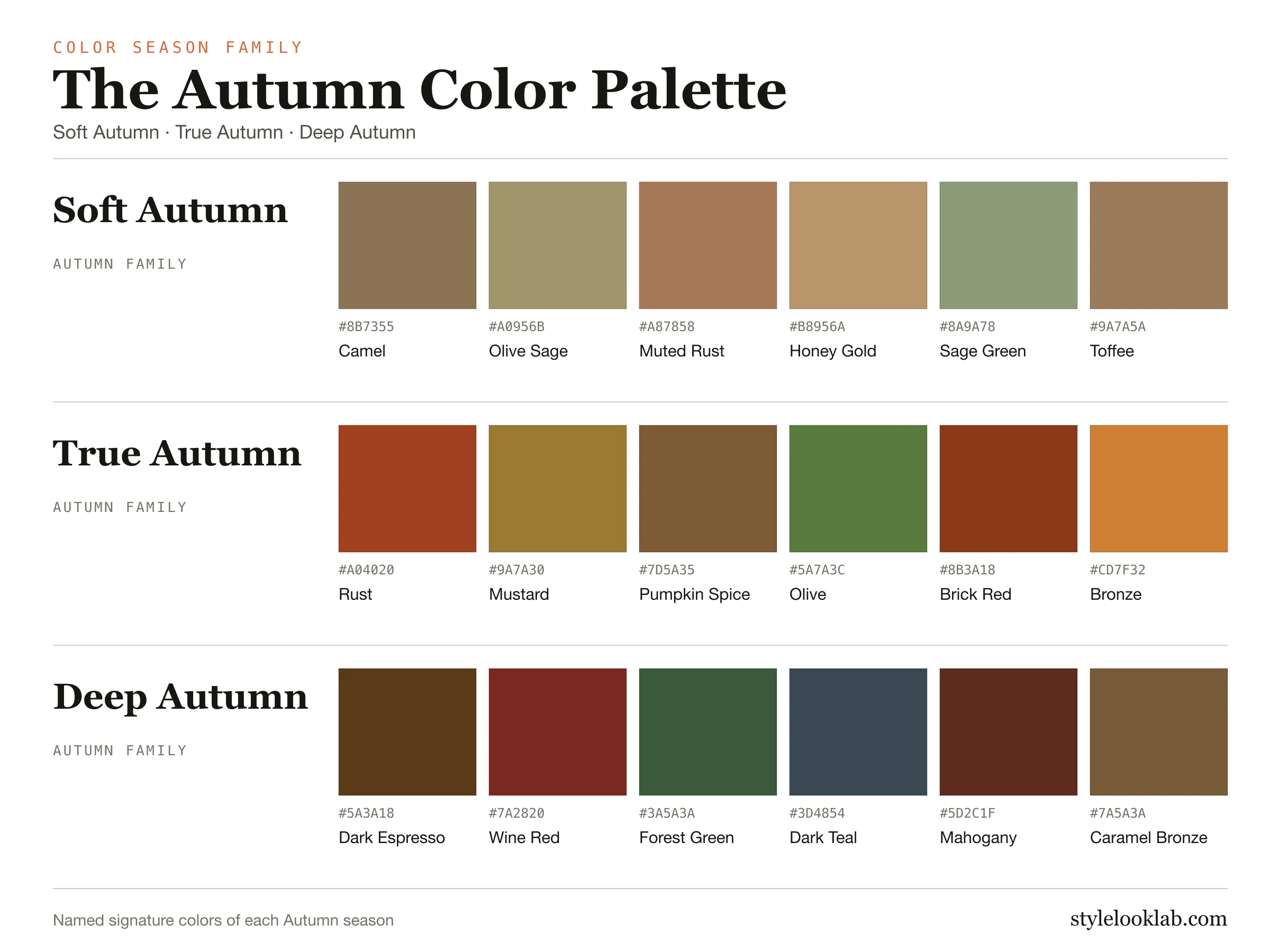
The Autumn color palette is warm, earthy and muted: camel, olive, rust, mustard, terracotta, forest green and espresso. Autumn colors carry a golden undertone and a rich but grounded saturation. Icy pastels, cool pinks, stark white and electric brights usually work against it.
This guide is about Autumn as a color season in personal color analysis, not about fall decorating palettes. It covers what the three Autumn seasons share, how Soft, True and Deep Autumn differ, how to tell which one fits you, and how Autumn compares with Spring and Winter.
What the Autumn palette has in common
In the 12-season system every family is defined by three dimensions: temperature (warm to cool), value (light to deep) and chroma (soft to clear). Autumn is the warm and muted family. Its colors lean golden rather than blue, and they are earthy and slightly grayed rather than bright and clear.
That is what separates Autumn from the other warm family. Spring is warm too, but its colors are fresher and clearer. An Autumn green is olive or moss rather than leaf green; an Autumn orange is rust or burnt sienna rather than coral. Autumn neutrals are camel, khaki, chocolate and espresso rather than black and optic white.
Inside the family, three seasons each let one trait lead:
- Soft Autumn leads with softness: the most muted Autumn, close to Soft Summer.
- True Autumn (also called Warm Autumn) leads with warmth: the most golden, classic Autumn.
- Deep Autumn (also called Dark Autumn) leads with depth: the darkest Autumn, close to Deep Winter.
Soft, True and Deep Autumn side by side
The three palettes below use the same color data as each season's full guide. Notice which one gets dustier, which stays most golden, and which becomes darkest.
Soft Autumn
The most muted Autumn. Camel, sage and softened rust.
True Autumn
Also called Warm Autumn. The most golden, classic Autumn.
Deep Autumn
Also called Dark Autumn. The darkest Autumn, close to Deep Winter.
| Season | Undertone | Depth | Chroma | Full guide |
|---|---|---|---|---|
| Soft Autumn | Neutral-warm | Medium | Muted | Soft Autumn → |
| True Autumn | Fully warm | Medium-deep | Rich, not bright | True Autumn → |
| Deep Autumn | Warm | Deep | Rich | Deep Autumn → |
Which Autumn are you?
Compare colors near your face in steady daylight, using fabrics of similar size.
- Bright colors look harsh, and soft, smoky warm colors look polished? Start with Soft Autumn. Its neighbor is Soft Summer, so compare camel with taupe.
- Rich golden colors look clearly better than anything cool, at a middle depth? Start with True Autumn. Temperature decides most choices here.
- Very dark, rich colors look natural, and light colors look washed out? Start with Deep Autumn. Its neighbor is Deep Winter, so compare espresso with black.
If two seasons still seem plausible, keep both and test the dimension that separates them. The free what season am I quiz can narrow the shortlist, and a photo color analysis compares colors against your own coloring.
Autumn vs Spring vs Winter
Autumn vs Spring. Both families are warm. The difference is chroma. Autumn suits muted, earthy warmth; Spring suits clear, fresh warmth. Compare rust with coral, and olive with leaf green. If the fresher versions look brighter on you, read the Spring palette.
Autumn vs Winter. Deep Autumn and Deep Winter are both dark. The difference is temperature. Compare espresso with black, and brick red with blue-red. If the cool versions look cleaner, read the Winter palette.
Autumn vs Summer. Soft Autumn and Soft Summer are both muted. Summer is cool and rosy; Autumn stays golden. Compare camel with taupe, and sage with olive. Read the Summer palette if the cool versions look better.
Wearing the Autumn palette
Clothing. Build around camel, khaki, olive, chocolate or espresso instead of black, with ivory or cream instead of optic white. Add one or two rich accents such as rust, mustard, terracotta or teal. Autumn outfits look best when the colors share an earthy base; icy pastels and neon brights are usually where Autumn looks disconnected.
Makeup. Brick, terracotta, warm brown and rust lip colors usually suit Autumn. Bronze or warm peach blush reads more natural than cool pink. Brown, olive or bronze eye colors tend to look richer than gray or icy shades.
Hair color. Warm brown, chestnut, auburn, copper and golden brown usually keep Autumn coloring balanced. Ash, platinum and blue-black shades can make warm skin look flat, though they are a matter of preference rather than a rule.
Jewelry. Yellow gold, brass, bronze and antique gold usually look easiest, including brushed finishes. Silver and mixed metals remain valid choices.
How to test the Autumn palette
- Use daylight from a window, no filter and no strong makeup.
- Hold two fabrics of similar depth near your face, for example camel and gray, or rust and fuchsia.
- Look at your skin rather than the fabric: which choice keeps your skin even and your features clear?
- Repeat with a second pair before deciding.
A color season is a way to organize styling decisions. It is not a medical or scientific classification of your skin, and lighting, cameras and screens can all shift how colors appear.
Not sure which Autumn you are?
Use clear photos for a separate color estimate. Sign in to check free preview eligibility; the paid Complete Report includes the full recommendations. A photo result does not confirm or inherit a quiz result.
- Sign-in required
- Free preview if eligible
- Complete Report sold separately
Autumn color palette FAQ
How do I tell if I'm an Autumn?
Autumn coloring usually looks best in warm, earthy, slightly muted colors. If camel, olive and rust make your skin look even and rich while icy pastels, cool pink and stark white look harsh, Autumn is worth testing. Compare it with Spring, which shares the warmth but is clearer and fresher.
How do you know which Autumn color palette you are?
Ask which quality matters most near your face. If soft, smoky warm colors look best, start with Soft Autumn. If golden warmth matters most at a middle depth, start with True Autumn. If very dark, rich colors look natural, start with Deep Autumn. Then compare the two closest seasons in daylight.
What colors do I wear if I'm an Autumn?
Camel, khaki, olive, rust, mustard, terracotta, brick red, forest green, teal, chocolate and espresso. Soft Autumn uses the dustiest versions, True Autumn the most golden, and Deep Autumn the darkest.
Is the Autumn color palette warm or cool?
Warm. All three Autumn seasons lean golden. Soft Autumn is the least warm of the three because softness leads and it sits close to Soft Summer, but it still reads warm-neutral.
Can an Autumn wear black?
True black is usually heavier than the Autumn palette needs. Espresso, chocolate and dark olive do the same job with warmth. Deep Autumn handles near-black best. If you wear black, keep it lower on the body or soften it with an Autumn color near the face.
Can an Autumn wear pink or purple?
Cool, bright pinks and purples usually work against Autumn. Warmer, muted versions such as salmon, terracotta pink, warm plum or aubergine are easier to wear.
What is the difference between Autumn and Spring?
Both are warm. Autumn suits muted, earthy warmth such as rust and olive; Spring suits clear, fresh warmth such as coral and leaf green. Compare one of each near your face to see which looks better.
Sources & limitations
These references support photographic color measurement and its limitations. They do not scientifically validate the 12-season taxonomy, the grouping of seasons into four families, or the editorial recommendations on this page. A Style Look Lab result is an estimate from submitted photos, and its confidence score is not a calibrated probability of accuracy.
- CIE 256:2025 — Measurement of Human Skin Colour — Measurement conditions and limits for human skin colour.
- He et al. (2022) — Facial skin colour from digital images — Evidence on estimating facial skin colour from images.
- Wang et al. (2018) — Skin colour measurement variability — Shows why location and measurement conditions affect readings.
- Sharma, Wu & Dalal (2005) — The CIEDE2000 color-difference formula — Reference for perceptual colour-difference calculations.
- Google — Improving skin tone representation with the Monk Skin Tone Scale — Google’s introduction to the 10-tone representation scale; it does not define undertones or validate this site’s questionnaire.