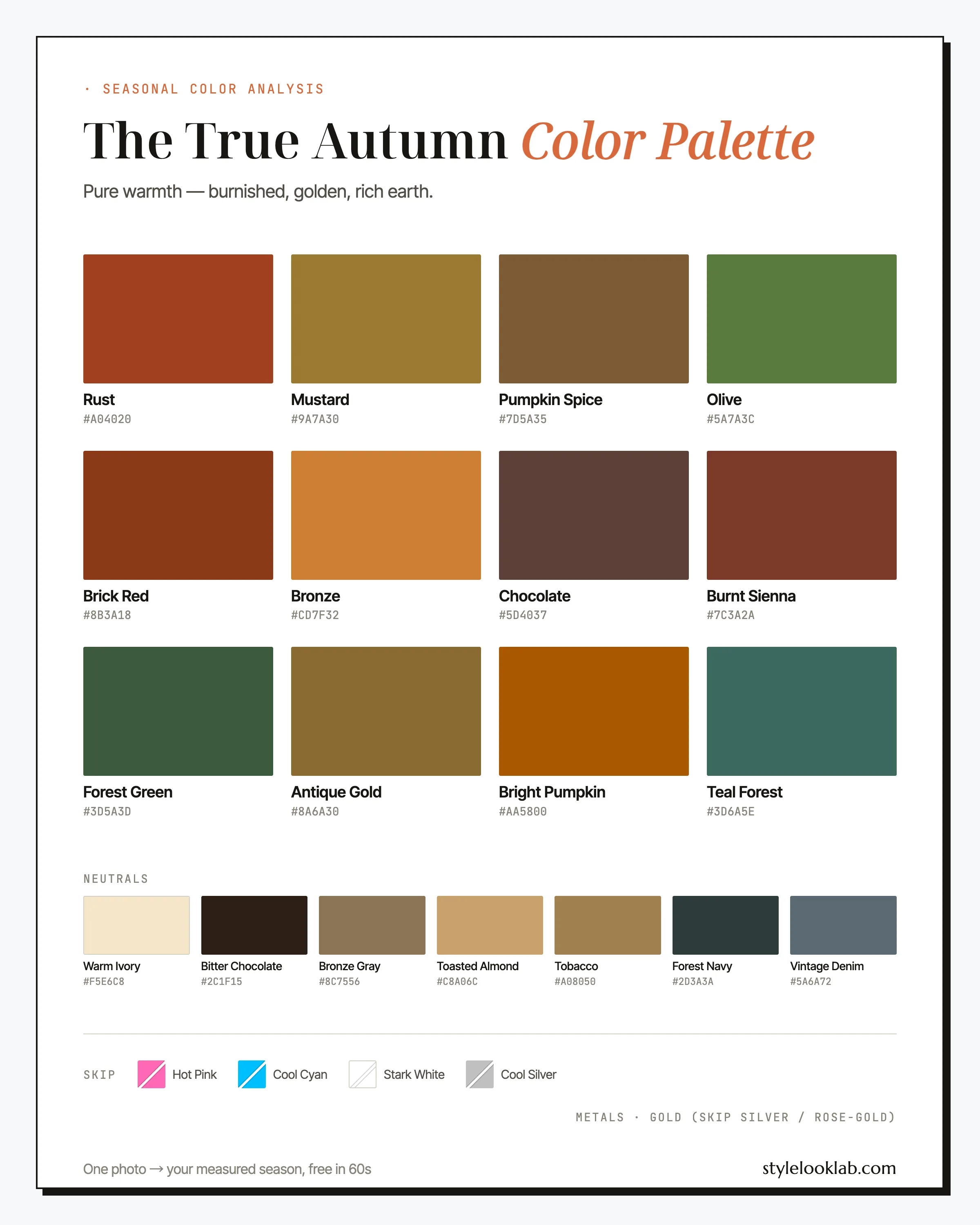
The True Autumn color palette is the warmest of the twelve seasons: rust, mustard, olive, burnt sienna, and chocolate, worn dense and golden, with barely a cool note in the lineup. Also called Warm Autumn, this season takes the colors October actually produces and wears them at full spice-cabinet strength. If burnt orange earns you compliments instead of stares, this is probably your palette.
Below: the full palette with names and hex codes, the combinations and outfit formulas that put it to work, the four shades most likely to sink an outfit, and a fair test of whether the season is actually yours. Shopping first, theory second. The short version:
| Best neutrals | Best accents | Usually avoid |
|---|---|---|
| Warm Ivory, Bitter Chocolate, Tobacco | Rust, Mustard, Olive | True black, optic white, hot pink, icy blue |
Are you a True Autumn?
Everything about this coloring runs golden. Skin carries a clearly warm undertone and commonly sits around MST 3–6 on the Monk Skin Tone scale; depth alone never decides a season, but that is the range where this coloring most often lives. Hair runs coppery brown, warm chestnut, or auburn, and eyes read amber, warm hazel, or light golden brown. Contrast stays medium: features are distinct from one another without any stark jumps, which is part of why pure black tends to look harsher on a True Autumn than on a Winter.
Quick checks worth running before you commit to a palette:
- Gold jewelry flatters you the moment it goes on; silver reads like borrowed hardware.
- Camel and chocolate feel safer near your face than black does.
- Burnt orange, the shade most shoppers fear, tends to draw compliments on you.
- Your wrist veins lean olive-green rather than blue. Vein checks are rough clues at best, so weight this one lightly.
Three or more yes answers put True Autumn firmly in the running — in the running is not the same as home. The free color season quiz can tighten the field before you commit to drapes or dye. Lighting, filters, makeup, camera processing, and image selection can skew color badly enough to reverse a close call. Style Look Lab estimates undertone, depth, and contrast from submitted photos and returns an internal confidence score; that score describes support in the available photo evidence, not a calibrated probability of accuracy. See the methodology and limitations before treating a photo result as settled.
True Autumn on the three color dimensions
The 12-season system places every season on three axes: undertone (warm to cool), depth (light to deep), and chroma (soft to clear). True Autumn anchors the far warm end of the undertone axis, and that position — not depth, not brightness — is what defines it. Depth lands just past the middle, and chroma sits at rich rather than electric.
The axis that settles this season. Nearly every color carries gold or orange in its base; the few blue-leaning entries, Teal Forest and Vintage Denim among them, stay muted enough not to break the warmth.
Darker than the midpoint but well short of black. Bitter Chocolate is the floor of this palette, and the palette visits it often.
Pigment-dense the way spices are, not the way neon is. Warm colors tend to read brighter to the eye than they measure, so this palette feels louder than its numbers.
One quirk is worth knowing: warm hues tend to read brighter to the eye than their measured chroma suggests. That is how a True Autumn can wear what looks like a wall of bold color while technically staying inside a muted season.
A framing note before the swatches. Sorting yourself into a color season is a way of organizing style decisions, not a scientific classification of your body. Measuring undertone, depth, and contrast makes the outcome far more repeatable than eyeballing, but the season you land in still depends on the color system doing the sorting — on this site, the 12-season model.
The True Autumn color palette, color by color
Rust and Mustard anchor the True Autumn color palette; treat them as signature colors rather than accents. Around them sit the daily workhorses — Olive, Brick Red, Burnt Sienna, Pumpkin Spice — with Chocolate and Forest Green supplying depth and Teal Forest offering the one sanctioned dip toward blue. Bronze and Antique Gold occupy a metallic middle ground almost no other season can wear as fabric, and Bright Pumpkin is the loudest safe note you own.
The neutrals
Here is what the six busiest colors actually do in a working wardrobe.
Rust
The signature. Wear it the way other seasons wear a red dress: as the main event, in knit or silk, near the face. It doubles as your lipstick family.
Mustard
The yellow that behaves at density. Lemon and neon tend to fail on this coloring; this ocher-gold succeeds precisely because it is dark and rich rather than sunny.
Olive
The green workhorse and an honorary neutral. It pairs with every other color on this page and holds the place gray holds in cooler wardrobes.
Burnt Sienna
Rust with the depth turned up a notch — the shade for when terracotta feels light and chocolate feels plain. At its best in suede and leather.
Bright Pumpkin
The loudest color in the lineup, best used deliberately: a scarf, a knit, one statement piece. It reads bold on this coloring and costume-like on most others.
Teal Forest
The exception that keeps the palette from monotony. A muted blue-green with enough yellow in it to stay friendly to golden skin, and the answer whenever an outfit needs something that is not brown, green, or orange.
On the neutrals row: Warm Ivory does the job of white and Bitter Chocolate the job of black, minus the drain each usually causes against warm skin. Bronze Gray replaces cool gray outright, Toasted Almond and Tobacco run the camel-to-caramel range, and Forest Navy with Vintage Denim covers the blue-shaped holes in any wardrobe.
Gold as a neutral: the True Autumn wardrobe method
Most wardrobe-building advice assumes cool neutrals: start with black, gray, and navy, then add color. That advice quietly fails the warmest season, because the True Autumn color palette contains no true black, no cool gray, and no standard navy. The fix is not to force substitutes — it is to promote a different family. In this wardrobe, gold is a neutral.
Concretely, that means treating Antique Gold, Bronze, Toasted Almond, and Tobacco the way other wardrobes treat charcoal, slate, and stone: the quiet base layer everything else sits on. Three rules make it work.
- Buy metallic tones as matte fabric. The point is the hue, not the shine — Antique Gold in washed silk, Bronze in a fine-gauge knit, Tobacco in suede. Sequins are a different conversation.
- Let spice colors sit on a gold base. Rust, Brick Red, and Olive behave on Toasted Almond the way brights behave on gray for other seasons: grounded, deliberate, easy.
- Go tonal without fear. Gold over gold over chocolate reads rich rather than repetitive, because the family carries enough built-in variation to hold interest.
The method is genuinely season-specific. Warm Spring golds run lighter and clearer, Soft Autumn golds are grayed down; True Autumn is the coloring dense and warm enough to wear metallic tones at full strength in daylight. It also compresses shopping into a single question: would this piece look at home next to brass hardware? If yes, it is probably yours.
How to wear True Autumn colors
The governing rule is density matching: pair colors of similar pigment weight and keep warmth running through the whole outfit. Unlike the softer seasons, this coloring handles all-color dressing well — a rust top over olive trousers needs no neutral referee, since both carry the same earthy weight. What breaks an outfit is a cold intruder: one icy-blue bag or stark white tee undoes more True Autumn looks than any wrong print.
Prints follow the same warmth-and-density logic. Leopard print is close to a True Autumn swatch card in its own right — a Toasted Almond ground with Chocolate spots — and paisley, botanicals, and plaids in spice tones all belong. The prints that fail are high-contrast graphics on white grounds, which carry the same problem as optic white itself.
True Autumn color combinations that work
Five combinations, graded from low-stakes to statement, using only colors named above.
The work uniform, warm edition
Three neutrals with zero cold in them. This trio does what a black suit does for a Winter, and it photographs warmer in every meeting.
Rust as the main event
The signature color gets top billing. Ivory keeps it fresh, olive grounds it, and one gold ring finishes the outfit.
Green and gold
An autumn-forest pairing that reads deliberate rather than seasonal. Keep the mustard nearest your face and let the green do the quiet work.
The blue-green loophole
Proof the palette is not all pumpkin. Teal against sienna is the most sophisticated pairing here, anchored by a brown that stands in for black.
All gold, no glitter
The gold-as-a-neutral method in one outfit: two metallic tones in matte fabric over a chocolate base. Tonal, dense, hard to get wrong.
Three ways to wear the True Autumn palette
For days when you want the palette to do the thinking:
- Office: Chocolate blazer + Warm Ivory blouse + Tobacco trousers + yellow-gold jewelry. On days that can carry more color, Olive takes the blouse's place.
- Weekend: Vintage Denim jeans + Mustard knit + Rust scarf + Chocolate boots. The scarf exists to put Rust next to your face; the rest just keeps the temperature steady.
- Evening: Rust silk dress + Bitter Chocolate wrap + hammered gold earrings. Commanding at the dinner table, kind in photographs, and far better company for golden skin than black-tie black.
Search terms ready to paste: rust knit midi dress, mustard yellow sweater women, olive green wide leg trousers, burnt orange blazer, chocolate brown leather boots, warm ivory silk blouse.
True Autumn colors to avoid
Colors that fail here almost always fail the same way: they are cold. Brightness alone is survivable — Bright Pumpkin proves it — but a cool undertone finds no foothold in a fully warm season. These four sink the most outfits, each listed with its palette-native replacement.
- Hot Pink
Blue-based pink at full volume asks golden skin to meet it halfway, and the skin usually loses: warm tones in the face drift sallow next to it.
Wear insteadBrick Red - Cool Cyan
An icy, electric blue with no yellow in it anywhere. Next to amber eyes and coppery hair it tends to read as costume rather than contrast.
Wear insteadTeal Forest - Stark White
Optic white behaves like a cool color and photographs even cooler. On warm coloring it often looks borrowed instead of crisp.
Wear insteadWarm Ivory - Cool Silver
Silvery gray tends to chill whatever sits beside it, which is the opposite of what this coloring needs anywhere near the face.
Wear insteadBronze Gray
The pattern in the swaps is the whole lesson: every problem color already has a warm understudy inside the palette. Fabric and distance buy leeway too — black shoes cost you nothing, while a black turtleneck costs the most. Read these as strong defaults, not commandments.
True Autumn hair colors
The rule for True Autumn hair color is to stay inside the golden family and deepen the warmth that is already there rather than lighten it away.
- Auburn — the reference shade for this season; it sharpens the effect of every color on this page.
- Copper — the boldest safe move, striking with amber or hazel eyes.
- Warm chestnut — depth without leaving the golden range; the everyday choice for darker starting points.
- Dark golden blonde — for lighter-haired True Autumns; ask your colorist for honey ribbons, not ash.
Two directions deserve caution: ash anything and blue-black. Both strip the warmth this palette is built to match, and the mismatch tends to show in the skin before it shows in the hair. Graying lowers natural contrast rather than changing undertone, so the palette holds — Bronze Gray and Toasted Almond simply earn more space near the face. A major color change is worth a re-test, though, since hair depth is one of the three measurements a season rests on. Auburn is a commitment, so let the AI hairstyle changer audition it on your own photo before a salon does it for real.
Makeup and metals for True Autumn
Makeup follows the clothing rule: warm and pigmented. Lips live in the brick family — terracotta, cinnamon red, burnt coral — and Rust itself is a working lipstick shade here. Copper and bronze own the eye, and blush stays peachy-terracotta. The two most common counter mistakes are blue-based berry and clear cherry red, both cool enough to argue with golden skin rather than finish it.
Metals require no deliberation at all: warm yellow gold, ideally brushed, antique, or hammered rather than mirror-polished. Bright silver tends to chill the skin beside it, and rose gold introduces a pink this palette has no match for. If you love a silver piece, wear it at the wrist and keep gold nearest your face.
True Autumn vs its neighbors
If both comparisons below read as "sort of me," keep both neighbors on the shortlist. Style Look Lab estimates the three dimensions from submitted photos and reports an internal confidence score, but a close result does not establish a definitive side of the line.
True Autumn vs Deep Autumn
Both wear warmth well; depth divides them. The Deep Autumn color palette carries near-black browns, black cherry, and the darkest forest shades, usually with more distance between dark hair and warm skin. True Autumn runs a step lighter and more golden throughout. Test with your darkest brown: if it frames your face, you lean Deep. If Chocolate is your comfortable floor and anything darker starts wearing you, stay True.
True Autumn vs Warm Spring
These two share temperature and part ways on weight. The Warm Spring color palette looks lit from within — clear coral, golden yellow, fresh leaf green — while True Autumn takes the same warmth and adds earth: Mustard over lemon, Rust over coral. Hold something peach-bright and something spice-dense under your chin in daylight. Spring coloring tends to freshen under the first; Autumn coloring often settles into the second.
The third miss direction, Soft Autumn, is a saturation question rather than a neighbor dispute: if full-strength Rust and Mustard switch your face on, you are likely True. If they arrive a beat before you do, test Soft.
True Autumn celebrity inspiration
Treat this section as a lookbook, not a set of verdicts — these are observations about styling, never rulings on the women themselves. Julia Roberts makes the strongest case: her most photographed looks cluster in terracotta, copper, and olive, colors that seem made for auburn hair. Isla Fisher's rust and olive red-carpet appearances are among her most often cited; save those images and skip her icy-toned outings. Amy Adams is instructive precisely because her shoots run in two directions — pin the dense, golden autumn-toned ones for this palette.
True Autumn FAQ
Is True Autumn the same as Warm Autumn?
Yes — the two names describe the same season. Warm Autumn is the label some systems and stylists use for the middle of the autumn family, while True Autumn is the more common name in the 12-season model this site uses. Both refer to fully warm, medium-deep, richly muted coloring, and the palette on this page applies under either name.
How do I know if I am a True Autumn?
Look for three signals together: a warm golden undertone, medium depth, and rich rather than bright coloring in hair and eyes. Self-checks are a reasonable start, not a confirmation. Style Look Lab estimates undertone, depth, and contrast from submitted photos and returns an internal confidence score; the score is not a calibrated probability of accuracy, and lighting, filters, makeup, and camera processing can still shift the result.
Can a True Autumn wear black?
Near the face it is usually the most draining choice for this coloring, though a black skirt or black shoes cost you little. Bitter Chocolate covers every job black does — boots, blazers, evening — while agreeing with golden skin. When a dress code insists, keep black below the waist and put Warm Ivory or Rust between it and your face.
Can True Autumn wear white?
Warm Ivory yes, optic white rarely. Stark White is a cool, high-contrast color in disguise, which is why the crisp-white-shirt formula tends to fall flat on golden skin. The ivory version of the same shirt delivers the identical polish and agrees with your undertone.
Can a True Autumn wear blue?
A few blues, chosen carefully. Teal Forest is the sanctioned blue-green, Forest Navy replaces standard navy, and Vintage Denim — a slightly gray-green wash rather than an icy one — is the everyday jeans answer. Crisp bright-blue denim behaves like Cool Cyan at ankle height and quietly cools a warm outfit; olive, chocolate, or caramel-toned denim usually serves better.
True Autumn vs Soft Autumn — which one am I?
Saturation is the divider. Both seasons wear the same earthy family, but Soft Autumn wears it with gray mixed in while True Autumn wears it at full spice strength. Hold burnt orange under your chin in daylight: if your skin looks lit and your eyes pick up gold, you lean True; if the color arrives before you do, you lean Soft.
What lipstick colors suit a True Autumn?
Stay in the brick family: terracotta, warm cinnamon red, burnt coral, and rich brown-reds, ideally in satin or demi-matte finishes. The two shades most likely to disappoint at the counter are blue-based berry and clear cherry red — both cool enough to argue with golden skin rather than finish it.
Do True Autumn colors still work with gray hair?
The undertone stays warm, so the palette holds, but graying lowers natural contrast and can nudge you toward the softer end of the family. Bronze Gray and Toasted Almond become more useful near the face, and full-strength Bright Pumpkin may start to feel louder than it used to. Re-testing after a major hair change is worth it, since hair depth is one of the three inputs.
Sound like your kind of warm?
Use clear photos for a separate color estimate. Sign in to check free preview eligibility; the paid Complete Report includes the full recommendations. A photo result does not confirm or inherit a quiz result.
- Sign-in required
- Free preview if eligible
- Complete Report sold separately
Sources & limitations
These references support photographic color measurement and its limitations. They do not scientifically validate the 12-season taxonomy, celebrity typing, or the editorial wardrobe, makeup, hair, and jewelry recommendations on this page. A Style Look Lab result is an estimate from submitted photos, and its confidence score is not a calibrated probability of accuracy.
- CIE 256:2025 — Measurement of Human Skin Colour — Measurement conditions and limits for human skin colour.
- He et al. (2022) — Facial skin colour from digital images — Evidence on estimating facial skin colour from images.
- Wang et al. (2018) — Skin colour measurement variability — Shows why location and measurement conditions affect readings.
- Sharma, Wu & Dalal (2005) — The CIEDE2000 color-difference formula — Reference for perceptual colour-difference calculations.
- Google — Improving skin tone representation with the Monk Skin Tone Scale — Google’s introduction to the 10-tone representation scale; it does not define undertones or validate this site’s questionnaire.