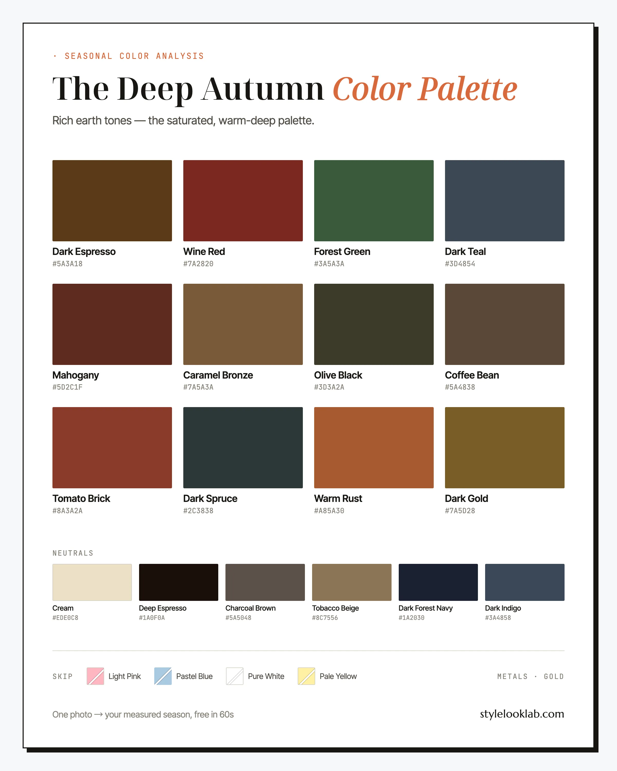
The Deep Autumn color palette is warm color at maximum depth: wine red, forest green, mahogany, dark gold — the shades of late October an hour before dark. Also called Dark Autumn, this season handles darkness better than any other warm type. If rich, spiced color makes you look expensive and pastels make you vanish, you are probably a Deep Autumn.
This guide names every color with its hex code, shows which combinations do the heavy lifting, flags the shades that tend to sabotage this coloring, and ends with a way to check the season against your own face instead of another quiz. The cheat sheet first:
| Best neutrals | Best accents | Usually avoid |
|---|---|---|
| Deep Espresso, Cream, Tobacco Beige | Wine Red, Forest Green, Warm Rust | Pure white, powder pink, pastel blue, pale yellow |
Are you a Deep Autumn?
Two things have to be true at once for this season: warmth and depth. Skin carries a golden or bronze undertone and runs tan to deep — commonly around MST 5–8 on the Monk Skin Tone scale, though depth alone never decides a season. Hair is dark brown to black with a warm cast; in sunlight it flashes mahogany or copper rather than blue. Eyes run deep amber, dark hazel, or a brown dark enough to read black across a room. Contrast between the features stays moderate: the overall impression is rich, not sharply light-against-dark.
Some quick mirror checks:
- Gold jewelry warms your face; bright silver looks like it belongs to someone else.
- Chocolate brown near your face does everything black does for other people, more kindly.
- Brick or oxblood lipstick looks natural on you, while pale nude-pink looks unfinished.
- Pastels — powder pink, baby blue — drain you the moment they go on.
- Your wrist veins lean olive or green-gold rather than blue. A rough clue, nothing more.
Four or five yes answers make Deep Autumn worth testing — they do not confirm it. The free what season am I quiz can pressure-test the hypothesis before you invest in drapes. Self-assessment has a specific blind spot here: depth is easy to see in a mirror, warmth is not, and lighting, filters, makeup, camera processing, and image selection can move a warm-deep versus cool-deep call. Style Look Lab estimates undertone, depth, and contrast from submitted photos and returns an internal confidence score; that score describes support in the available photo evidence, not a calibrated probability of accuracy. See the methodology and limitations before treating a photo result as settled.
Deep Autumn on the three axes
The 12-season system places every season on three axes: undertone (warm to cool), depth (light to deep), and chroma (soft to clear). Deep Autumn sits warm of center, far down the depth axis, and moderately high in chroma — pigment-dense without ever going neon. Depth is the headline; warmth is the qualifier that separates this season from the Winters beside it.
Golden-bronze warmth runs under almost every shade — even the teals and spruces are darkened until they can share an outfit with gold.
The defining axis. This palette begins around the depth where most other seasons stop, and its lightest note is still a mid-tone.
Pigment-dense but never neon: velvet, leather, and spice — saturated color with weight behind it rather than shine.
Those three positions matter more than any list of swatches. A color that is warm-leaning, dark, and rich will usually work even if it never appears on this page; a color that is pale, powdery, or icy usually will not, whatever the label says.
Worth stating plainly before the swatches: seasonal color typing is a styling framework, not a medical or scientific classification. Measuring undertone, depth, and contrast makes the answer far more repeatable, but the name you end up with still depends on the system doing the naming — this site uses the 12-season model, and the methodology page walks through how Style Look Lab measures each axis and builds its confidence score.
The Deep Autumn palette, color by color
As a working wardrobe, the deep autumn color palette splits into four jobs: dark anchors (Dark Espresso, Olive Black, Dark Spruce), statement colors (Wine Red, Forest Green, Tomato Brick, Mahogany), warm accents (Warm Rust, Dark Gold, Caramel Bronze), and one cooler-reading option, Dark Teal, grayed and deepened until it sits next to bronze without an argument.
The neutrals
Six of these earn their keep faster than the rest.
Wine Red
The signature. It does the work of a red dress and a dark suit in a single color — drama with authority behind it. If you buy one statement piece this season, make it wine.
Forest Green
The most underrated color here. Deep green against warm-deep skin photographs unusually well, reads polished at the office, and pairs with every neutral on this page.
Mahogany
Red-brown with real depth. It shines in leather — boots, belt, bag — where one mahogany piece quietly upgrades everything around it.
Warm Rust
The brightest note you get and the fastest route to looking awake. One rust piece, a scarf or a knit, warms an all-dark outfit the moment it goes on.
Dark Gold
Mustard with the lights dimmed. Use it as an accent against espresso or forest rather than as a full garment; it prefers dark company.
Dark Teal
The blue of this palette, muted until it stops being icy. Reach for it when an outfit wants a cool-looking color that will still get along with gold jewelry.
On the neutrals: this row is where Deep Autumn quietly wins. Deep Espresso runs darker than most seasons' dark neutral — dark enough to pass for black across a dinner table — and replaces black outright. Cream takes over from optic white, Charcoal Brown covers the gray jobs without going cold, Tobacco Beige does everything camel usually does, and Dark Forest Navy with Dark Indigo denim handle the blue basics.
How to wear Deep Autumn colors
One rule organizes everything: keep the depth, and let warmth do the varying. Deep Autumn outfits work depth-on-depth — wine over espresso, forest over coffee, teal over navy — in a way most seasons cannot pull off without looking heavy. Contrast comes from a single warm-light note per outfit (Cream, Caramel Bronze, Dark Gold), not from stark white; one light piece is usually plenty, and a second starts to dilute the effect. Dark tonal columns in matched depth are the house specialty and tend to read expensive with almost no effort at the closet.
Prints follow the same physics: dark ground, warm figures. Paisley, dark florals on an espresso or forest base, tonal plaids in brown and rust, and leopard — which is practically native to this palette — all belong. What fails is the reverse print: bright figures on a white ground, which drags the outfit toward the high-contrast coolness that belongs to the Winters next door.
Deep Autumn combinations that work
Five combinations below, opening cautious and finishing theatrical, every color from the palette above.
The wine-dark suit
Wine over near-black espresso with a cream shell does the black-suit-white-shirt job with color the face can actually answer. The interview outfit.
Forest floor
Deep green flanked by two warm mid-tones photographs like old money. The most underrated trio in the palette.
The spice cabinet
Neighboring warm shades, rust nearest the face, coffee at the base. Golden-hour dressing in three pieces.
Teal and ember
The cool-warm pairing this season is allowed: grayed teal against red-brown leather, with cream keeping the middle calm.
The denim version
Proof the palette survives casual: dark denim, a bronze knit, wine accessories. Weekend uniform, solved.
Deep Autumn outfit formulas for real weeks
For days when theory can wait:
- Office: Deep Espresso trousers + Cream silk shell + Forest Green blazer + gold hoops. Reads as senior as any black suit while keeping warmth in the face; trade the blazer for Wine Red on days you present.
- Weekend: Dark Indigo jeans + Caramel Bronze sweater + Mahogany boots. Three warm depths, stacked and done — add a Warm Rust scarf only if the day needs a lift.
- Evening: Wine Red velvet or silk dress + Deep Espresso wrap + bronze drop earrings. Forget the little black dress: Wine Red delivers the same drama and lights the face instead of shadowing it.
Search terms worth pasting straight into a shopping tab: burgundy wool coat women, forest green silk blouse, dark chocolate brown trousers, cream cable knit sweater, rust knit midi dress, cognac leather boots women.
Deep Autumn colors to avoid
Everything the deep autumn color palette rejects shares one quality: no pigment to meet yours. Pale, powdery, and icy shades tend to leave the clothes looking fine and the face looking tired. The four repeat offenders, each with its palette-native replacement:
- Light Pink
Powder pink is the opposite of everything here — light, cool, low-pigment. Near warm-deep skin it tends to read as borrowed from someone else’s closet.
Wear insteadWine Red - Pastel Blue
An icy tint with no weight behind it. Against this much natural depth it hollows the face rather than framing it.
Wear insteadDark Teal - Pure White
Optic white is a cool, maximum-contrast color, and this is a warm, deep season. It glares where cream glows.
Wear insteadCream - Pale Yellow
Warm on paper, anemic in person. Butter yellow has no depth to answer yours, and a yellow this pale tends to amplify sallowness in golden skin.
Wear insteadDark Gold
None of this is binary. A pale piece below the waist costs far less than one at the collar, and matte fabric forgives more than shine — the risk concentrates near the face. Read the list as where trouble starts, not as a set of laws.
Formalwear without black: the Deep Autumn advantage
Every dress code eventually demands formal darkness, and most color advice stops at "avoid black," which is no help the night before a gala. Deep Autumn is unusually well equipped to solve this: no other warm season's neutrals go as dark, and the deep autumn color palette holds one of the strongest no-black formal benches in the 12-season system.
Start with Deep Espresso. By any casual measurement it is nearly black — across a candlelit room nobody registers the difference — but it is warm where black is a void, so evening light and camera flashes come back bronze instead of gray. Dark Forest Navy and Olive Black round out the bench: one cooler-reading, one greener, both dark enough for any dress code that stops short of specifying black by name.
The deeper point is that formality was never really about blackness. It is silhouette, fabric, and a single-color column. An espresso suit in matte wool over a cream shell hits every formal cue a black suit hits; a Wine Red velvet dress outranks most black ones at a winter party; a Dark Forest Navy column with antique gold jewelry reads correct at black-tie. When an invitation genuinely insists on black, keep it in the trousers or skirt and put wine, forest, or cream at the neckline.
In fairness to black: Deep Autumn tolerates it better than any other Autumn, and one black piece rarely ruins an outfit at this depth. The argument is not fear of black — it is that espresso does the identical job and flatters more, so black keeps losing the audition.
Deep Autumn hair colors
The brief is dark, warm, glossy. Deep Autumn hair usually starts dark, so the work is protecting depth and adding warmth, not lightening.
- Espresso brown — the default: deep, warm, low-risk against a bronze undertone.
- Black-brown with mahogany glints — near-black that flashes red in sunlight instead of blue.
- Deep chestnut — the lightest end worth visiting; warmth keeps it from thinning the palette.
- Copper-threaded lowlights — dimension the depth-safe way, woven under the surface rather than painted on top.
Two directions cost this coloring the most: ash tones, which gray warm skin, and heavy honey or caramel balayage, which strips out the depth the whole palette is built on. Blue-black is a smaller error, but the glints should run red, not blue. Gray arriving changes contrast more than temperature — a rich gloss carries the transition, and hair depth is one of the analysis inputs, so a re-test after any major color change is worth the minute. Before the salon visit, previewing espresso or mahogany on your own photo makes the depth question concrete instead of hypothetical.
Makeup and metals for Deep Autumn
This is the rare coloring that carries a genuinely dark lip in daylight: brick, oxblood, espresso-rose. The common mistake runs the other way — lightening everything to be safe — and a pale nude-pink lip here reads unfinished rather than natural. Eyes take bronze, copper, and warm browns; blush leans terracotta or brick over pink; brows stay rich rather than softened.
Metals are settled quickly: gold, and the deeper the better. Antique gold, bronze, and brass beat bright polish, and bright silver tends to sharpen harshly against warm-deep skin. Where a piece matters more than its metal, mixed jewelry with gold nearest the face keeps the balance. Stones follow the clothes — garnet, amber, tiger's-eye, and emerald over anything icy.
Deep Autumn vs its neighbors
Mistypes here run in two opposite directions: keep the depth but miss the warmth and you land in Deep Winter; keep the warmth but miss the depth and you land in True Autumn. If either comparison below feels genuinely close, that closeness deserves a measurement rather than a coin flip.
Deep Autumn vs True Autumn
The two share warmth and part ways on depth. The True Autumn color palette peaks at pumpkin, olive, and camel, while Deep Autumn keeps descending into wine, espresso, and forest. Hold a near-black brown to your face in daylight: striking points Deep, heavy points True. If mid-tone rust and mustard are your best colors and darker shades start wearing you instead of the reverse, True Autumn is the likelier home.
Deep Autumn vs Deep Winter
Here the two share depth and part ways on temperature, because the palettes overlap very little. Run the black test against the Deep Winter color palette: in daylight, true black against bare skin tends to suit Deep Winter more easily than Deep Autumn, while espresso often reverses the result. Gold outperforming silver points Autumn; icy pink looking crisp rather than costume-like points Winter. Deep Winter contrast also tends to run higher — sharper light-dark jumps between skin, hair, and eyes — where Deep Autumn reads rich rather than sharp.
Deep Autumn celebrity inspiration
Read these as references for how the palette photographs, not as claims about anyone's true season. Eva Mendes' most cited red-carpet looks run wine, bronze, and forest against near-black warm hair — depth-on-depth dressing done exactly as this page describes. Mindy Kaling's richest press-tour looks are saturated warm color — deep berry, burnt orange, jewel-warm greens — and they consistently out-photograph her black outfits, which is the whole Deep Autumn argument in one wardrobe. Jennifer Lopez, in her darker-haired eras, trades signature honey for bronze and espresso, and those deeper looks are the best public catalogue of this palette worn deliberately. Study the styling, skip the labels.
Deep Autumn FAQ
Is Deep Autumn the same as Dark Autumn?
Same season, two names. "Dark Autumn" comes from the older classic 12-season terminology; "Deep Autumn" is the label most people search today. The palette, the traits, and the advice are identical — warmth plus depth, gold over silver, espresso over black — so read any Dark Autumn guide and this page as covering one season.
How do I know if I am a Deep Autumn?
Two traits have to show up together: a warm golden-bronze undertone and real depth across skin, hair, or eyes. Mirror checks get you partway, not to confirmation. Style Look Lab estimates undertone, depth, and contrast from submitted photos and returns an internal confidence score; the score is not a calibrated probability of accuracy, and lighting, filters, makeup, and camera processing can still shift the result.
Can a Deep Autumn wear black?
More easily than any other warm season, less well than any Winter. Black rarely ruins an outfit at this depth, but Deep Espresso and Dark Forest Navy do the same formal work while returning warmth to the face. A practical compromise: keep black below the waist and put Wine Red or Forest Green at the neckline.
Is Deep Autumn warm or cool?
Warm — golden-bronze rather than orange, and deep enough that the warmth reads as richness instead of brightness. The palette does include cooler-looking colors like Dark Teal and Dark Forest Navy, but each is darkened and muted until it works alongside gold jewelry. Truly icy shades stay off the list.
Why did an app type me Deep Autumn when I think I am a Winter?
Some automated tools appear to lean on depth alone — deep skin plus dark hair routes to an Autumn result without the undertone ever being measured. Temperature is the dividing question: cool-deep coloring (Deep Winter) comes alive in true black, pure white, and icy pink, while warm-deep coloring glows in espresso, cream, and rust. Test both trios in daylight, and prefer tools that show what they measured and how confident they are.
What hair colors suit a Deep Autumn?
Espresso brown, black-brown with mahogany or copper glints, and deep chestnut cover the reliable range. The two costly directions are ash tones, which gray warm skin, and heavy honey balayage, which strips out the depth the palette is built on. Dark, warm, and glossy is the entire brief.
What are good Deep Autumn wedding guest colors?
Wine Red and Forest Green photograph beautifully from afternoon into evening, and Dark Teal or Warm Rust are strong second picks in golden-hour light. Ground any of them with Cream or Tobacco Beige accessories and gold jewelry. Skip pastels — the shades that make paler guests look sweet tend to make this coloring look faded.
Can a Deep Autumn wear white?
Cream, yes — optic white, rarely. Pure white is a cool, maximum-contrast color that glares against warm-deep skin, while Cream carries a drop of gold that flatters it. When shopping, look for ivory, ecru, oatmeal, and unbleached linen instead of "bright white," and keep the crispest whites below the waist.
Deep, yes — but warm or cool?
Use clear photos for a separate color estimate. Sign in to check free preview eligibility; the paid Complete Report includes the full recommendations. A photo result does not confirm or inherit a quiz result.
- Sign-in required
- Free preview if eligible
- Complete Report sold separately
Sources & limitations
These references support photographic color measurement and its limitations. They do not scientifically validate the 12-season taxonomy, celebrity typing, or the editorial wardrobe, makeup, hair, and jewelry recommendations on this page. A Style Look Lab result is an estimate from submitted photos, and its confidence score is not a calibrated probability of accuracy.
- CIE 256:2025 — Measurement of Human Skin Colour — Measurement conditions and limits for human skin colour.
- He et al. (2022) — Facial skin colour from digital images — Evidence on estimating facial skin colour from images.
- Wang et al. (2018) — Skin colour measurement variability — Shows why location and measurement conditions affect readings.
- Sharma, Wu & Dalal (2005) — The CIEDE2000 color-difference formula — Reference for perceptual colour-difference calculations.
- Google — Improving skin tone representation with the Monk Skin Tone Scale — Google’s introduction to the 10-tone representation scale; it does not define undertones or validate this site’s questionnaire.