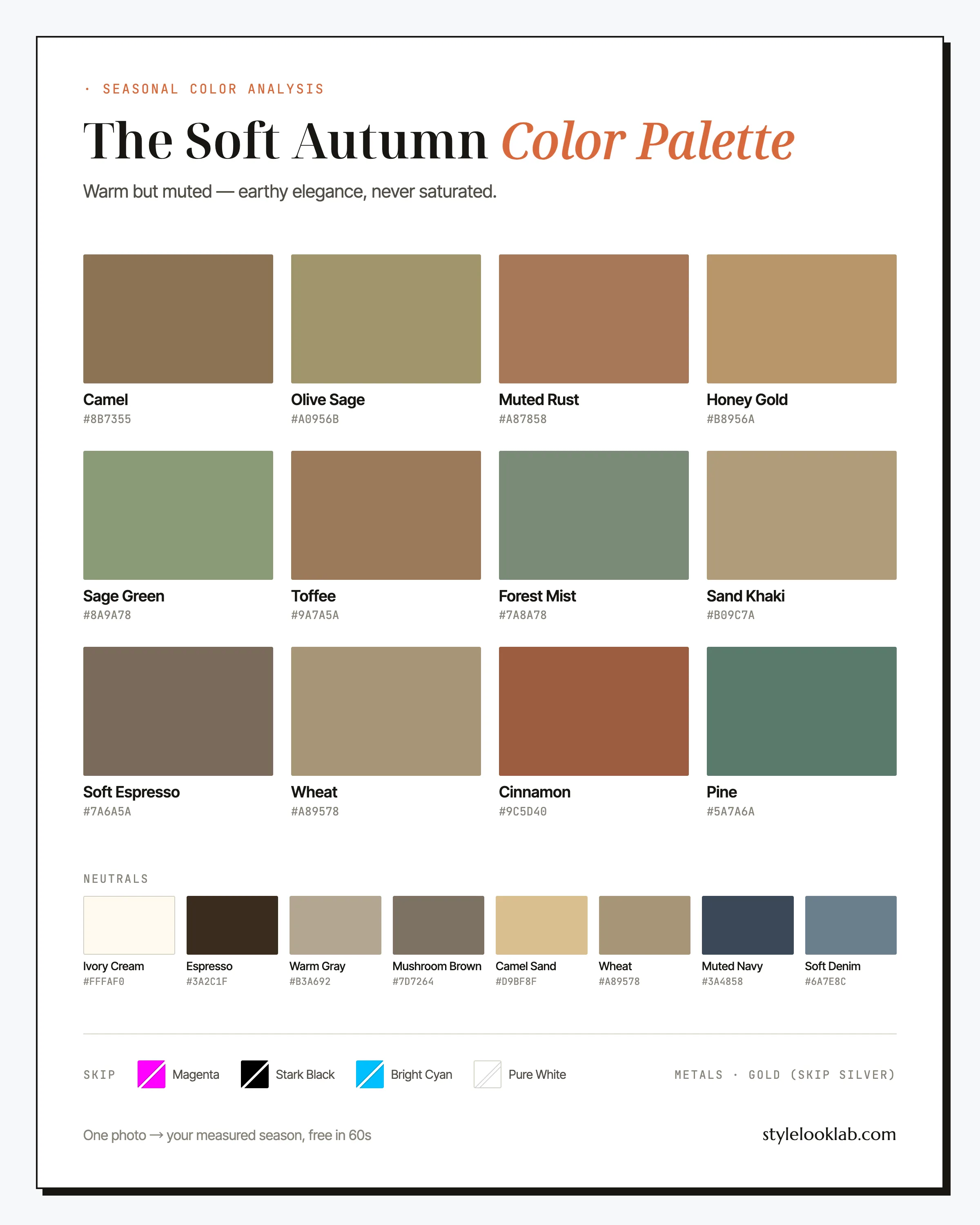
The Soft Autumn color palette is warm-leaning and muted: camel, sage green, cinnamon, and honey gold. It is a set of softened colors to try when you want a warmer direction. If both warm and cool muted colors seem plausible, compare Soft Autumn with Soft Summer rather than choosing from skin color alone.
This guide includes named colors and hex codes, outfit combinations, and alternatives to compare. It helps you use a palette as a shopping reference without claiming to confirm a season. Start here:
| Neutrals to try | Accents to try | Compare with softer alternatives |
|---|---|---|
| Camel, Espresso, Ivory Cream | Sage Green, Cinnamon, Muted Rust | Optic white, true black, magenta, icy blue |
Are you a Soft Autumn?
Consider Soft Autumn when you want to investigate muted colors with a warmer lean. No skin-depth range, eye color, hair color, or vein observation defines the category. Olive undertone does not automatically point here either; compare the colors rather than matching physical features to a checklist.
Use a few controlled comparisons before choosing a direction:
- Compare muted camel and a similarly muted cool gray at a similar depth.
- Compare a softer warm color with a brighter warm neighbor to investigate saturation.
- Compare medium and deeper warm neutrals to explore contrast.
- Keep the light, distance, material, and coverage similar; repeat with another pair.
Write down what you notice rather than adding up yes answers. Jewelry and makeup may suggest shopping preferences, but finish and formula can change the comparison. If warm and cool fabrics remain equally useful, keep Soft Summer beside Soft Autumn on the shortlist.
The free what season am I quiz can organize those observations. Style Look Lab separately estimates undertone, depth, and contrast from submitted photos and returns an internal confidence score; the score is not a calibrated probability of accuracy. Neither route confirms the other. Read the methodology and limitations before treating an uncertain photo result as settled.
Where Soft Autumn sits on the three axes
The 12-season framework describes palettes through temperature, depth, and chroma. Soft Autumn sits on the warmer side, around medium depth, and toward softer chroma. The muted quality leads the palette, with warmth providing its direction.
Warm-leaning colors to compare with similarly muted cool alternatives; this axis describes the palette.
Medium depth provides a starting point. Try a deeper or lighter accent to compare the contrast you prefer.
Softness leads the palette. Compare muted and clearer warm fabrics while keeping depth similar.
Use those positions as a guide to comparing garments, not as a biological description. A warm mid-tone with softened saturation may be worth trying even if its name is not listed here. Fabric and coverage can change its appearance, and the same color can serve different purposes in a coat, scarf, or pair of shoes.
color season analysis is a styling framework, not a medical or biological classification. Consistent comparison conditions help you interpret differences but do not establish a validated seasonal result. This site uses the 12-season system; other providers may divide or name palettes differently.
The Soft Autumn color palette, color by color
The working Soft Autumn color palette is built around warm earth mid-tones. Camel and Olive Sage are useful anchors to compare with your usual dark neutrals. Cinnamon, Muted Rust, and Toffee bring warmth; Sage Green, Forest Mist, and Pine cool the mix down without going icy. Honey Gold and Wheat offer brighter accents within this set.
The neutrals
Twelve names is a lot to hold in your head at a sale rack, so here is how the six hardest-working ones earn their place.
Camel
A warm neutral to try in coats, blazers, or knits. Compare it with your existing neutrals before choosing where to use it.
Cinnamon
Your statement red. Loud enough to register at dinner, muted enough to stay inside the palette. Best in silk or fine knit near the face.
Sage Green
The signature Soft Autumn green. Try it with Camel or Ivory Cream, then compare a darker neutral if you want more contrast.
Honey Gold
The brightest yellow that still behaves. Use it as the accent in an otherwise neutral outfit rather than as a full garment.
Muted Rust
Terracotta with the volume down. A rust skirt or scarf warms up sage and camel instantly.
Pine
The closest this palette comes to a dark accent. Reach for it when an outfit needs weight but espresso feels too brown.
The neutrals row offers Espresso and Ivory Cream as softer alternatives to black and white. Soft Denim provides another wash to compare with raw indigo. Use these options when you prefer their effect rather than replacing basics solely because of a season label.
How to wear Soft Autumn colors
For a coordinated Soft Autumn outfit, start with two warm-leaning neutrals and one accent. Camel, Ivory Cream, Espresso, and Soft Denim offer bases; Cinnamon, Sage Green, or Muted Rust can provide the accent. A roughly 70/30 balance is one styling exercise, not a required ratio.
Try related greens or browns at similar intensity when you want a blended look. Add a brighter or cooler piece when you want deliberate contrast, then decide whether that effect suits the occasion. You do not need to replace a favorite item simply because it falls outside the chart.
Muted florals, tonal plaids, and washed stripes are print options. Compare their scale and spacing as well as the color. A print that blends from a distance may create more activity close up, so inspect it at the distance at which you normally see an outfit.
Soft Autumn color combinations that work
Five combinations, from safest to boldest. Each uses only colors from the palette above.
The desk-to-dinner neutral stack
Three warm neutrals to compare with a black-and-white uniform when you want softer contrast.
Green on green
Tone-on-tone greens with a wheat base look expensive precisely because the contrast stays low. Add gold jewelry and stop there.
The warm statement
Cinnamon is the boldest this palette gets. Ground it with toffee and cream so it reads intentional, not loud.
Forest quiet
The darkest combination available here — for dress codes that say somber, on days when black feels heavy on you.
Golden hour
Honey gold near the face, camel in the middle, espresso at the base. Built for October light.
Three outfit formulas to start with
If you want to skip the theory and get dressed, start here.
- Office: Camel blazer + Ivory Cream shell + Espresso trousers + gold jewelry. A warm, muted alternative to a black suit. Swap the shell for Sage Green on days that need color.
- Weekend: Soft Denim jeans + Wheat knit + Muted Rust scarf + Toffee boots. Four mid-tones, zero effort — the rust scarf is doing the work.
- Evening: Cinnamon silk dress + Espresso wrap + antique gold earrings. Cinnamon offers a muted warm option to compare with a brighter red dress.
Ready-to-paste search terms for the pieces above: camel blazer women, sage green silk blouse, cinnamon rust midi skirt, espresso brown trousers, ivory cream knit sweater, olive cardigan women.
Soft Autumn colors to avoid
Use these swaps when you want a softer or warmer alternative near your face. The Soft Autumn color palette does not prohibit bright or cool colors; an outfit can deliberately use contrast. Try both options with the same coverage and light before deciding which you prefer.
- Magenta
Compare a bright cool accent with a softened warm one. The goal is to choose the emphasis, not to predict a skin change.
Wear insteadCinnamon - Stark Black
Compare strong darkness with a softer brown at the neckline. Surrounding colors and fabric finish may change your preference.
Wear insteadEspresso - Bright Cyan
Compare a clear blue accent with a quieter green, keeping the area of color similar.
Wear insteadPine - Pure White
Compare a crisp light neutral with a warmer off-white in similar fabric and lighting.
Wear insteadIvory Cream
A black skirt places less color near your face than a black turtleneck. If you prefer a softer neckline, try a layer rather than treating every black item as unsuitable. Material, cut, and personal preference can outweigh a palette recommendation.
Does olive undertone make you a Soft Autumn?
No. Style Look Lab uses olive as an undertone label that may also have a warm or cool lean. It is separate from skin depth and is not another name for Soft Autumn. It does not describe a surface layer sitting over a different undertone.
Soft Autumn combines warmth with softness. Compare warm and cool fabrics at similar depth and mutedness before choosing between it and Soft Summer. If a clearer or deeper direction is useful, explore that separately instead of forcing an olive observation into a soft palette.
The Monk Skin Tone scale is a representation aid for depth; it neither defines olive nor assigns seasonal categories. See the methodology page for the scope of the photo estimates.
Soft Autumn hair colors
The Soft Autumn color palette suggests warm, softened hair colors to preview if you want that direction. It cannot predict how dye will behave, which maintenance routine you need, or whether a color is achievable from your starting hair. Ask a colorist about previous treatments and the practical steps involved.
- Honey brown: compare with a neutral brown at a similar depth to judge how much warmth you want.
- Warm chestnut: a deeper option to compare while keeping the overall silhouette unchanged.
- Caramel balayage: preview softer ribbons and stronger highlights separately.
- Soft copper: compare a quieter copper with a brighter version before choosing the emphasis.
Ash, platinum, and black are not forbidden. They produce different contrasts, so compare them directly if they interest you. Natural gray does not have to follow a season label. The hairstyle preview can help you describe a visual preference using available styles; it cannot prescribe dye or guarantee the salon result.
Makeup and metals for Soft Autumn
For a muted warm direction, try terracotta or rose-brown blush, warm brown eye colors, and cinnamon or brick-toned lips. Compare with cooler or brighter neighbors from the same formula at similar coverage. Natural lip color, opacity, and finish can change how a product appears; a name or swatch in the packaging is not enough to choose a match.
Gold offers a warm metal option, including brushed and antique finishes. Silver and mixed metals remain valid choices. Compare finishes under the same light, since reflection can change the effect independently of metal color. Choose the balance you enjoy instead of treating a jewelry preference as proof of a season.
Soft Autumn vs its neighbors
The closest comparisons on this guide are True Autumn and Soft Summer. They help separate warmth from softness. If neither comparison gives a repeatable preference, keep more than one palette rather than assuming an additional measurement will settle it.
Soft Autumn vs True Autumn
Both lean warm; compare saturation while holding depth close. The True Autumn color palette offers richer rust, mustard, and olive directions, while Soft Autumn emphasizes quieter colors. Try a richer warm fabric and a muted warm fabric with similar coverage, then record how much intensity you prefer. One garment does not establish the category.
Soft Autumn vs Soft Summer
Both are muted and around medium depth; temperature is the main comparison. Soft Autumn leans warm, while the Soft Summer color palette leans cool.
| Hold steady | Warm direction to try | Cool direction to try | What to record |
|---|---|---|---|
| Similar depth, softness, material, and coverage | A muted camel | A gray-mauve | Whether you prefer the visible shadows, color balance, and definition around the face |
| Same light, mirror, and distance | Another softened warm fabric | A softened cool fabric of similar depth | Whether the preference repeats or remains unclear |
Use indirect daylight and change only the fabric. A shinier or more saturated sample changes more than temperature. Jewelry, vein color, or a lipstick can suggest another observation but cannot settle this comparison alone. If the two directions remain close, start with their shared colors and keep both palettes available. An olive undertone label does not choose between them.
Soft Autumn celebrity inspiration
Use individual public looks as outfit inspiration rather than verified seasonal classifications. A bronze-and-camel look associated with Jennifer Lopez, a sage outfit associated with Drew Barrymore, or warm beige styling associated with Gisele Bündchen can prompt combinations to explore. These editorial references do not classify the people or establish a pattern across their wardrobes.
Look at the actual outfit, fabric, and styling in a chosen image. Photography and editing can change the color relationships, so similar features do not mean you should choose the same palette. Your own controlled comparison is a more relevant starting point.
Soft Autumn FAQ
How do I know if I am a Soft Autumn?
Compare warm-leaning, muted fabrics with cooler or brighter alternatives at similar depth, material, and coverage. Repeated observations can create a shortlist, not a confirmation. Style Look Lab estimates from photos and provides an internal confidence score, not a calibrated probability of accuracy.
Can a Soft Autumn wear black?
Yes. Black can be a deliberate contrast or a dress-code choice. Compare it with Espresso if you want a softer dark, or try an Ivory Cream or Camel layer at the neckline. Material, coverage, and preference matter more than a prohibition.
Is Soft Autumn warm or cool?
The Soft Autumn palette is warm-leaning and muted. This describes the colors, not a measured category of skin. Compare it with Soft Summer using fabrics of similar softness and depth when you want to investigate the temperature difference.
What are the best Soft Autumn wedding guest colors?
Sage Green, Muted Rust, Cinnamon, Pine, and Espresso are options from the palette. Choose according to the dress code, material, and the effect you want. Ivory Cream or Camel accessories can complete a warmer combination; colors do not guarantee a photographic result.
What lipstick colors suit a Soft Autumn?
Try cinnamon, brick, terracotta-rose, or dusty rose-brown if you want a muted warm direction. Compare a cooler or brighter neighbor from the same formula at similar coverage. Lip pigment, opacity, and finish can matter more than the shade name.
Can a Soft Autumn wear jewel tones?
Yes. Jewel tones provide a clearer or cooler contrast with this palette. Compare them with quieter options such as Pine or Muted Navy when you want less saturation, but keep the brighter color if that is your preference.
Soft Autumn vs Dark Autumn — which one am I?
Depth is a useful comparison: try a medium warm neutral beside a deeper warm neutral, keeping softness and material similar. Record the amount of contrast you prefer and repeat with another pair. A single successful color does not confirm Soft or Deep Autumn.
Do Soft Autumn colors change with age or gray hair?
A change in visible hair color can alter the overall contrast you see, so you may want to compare your usual outfits again. It does not automatically assign a new season, and natural gray is not required to be warm or cool for a palette. Keep the colors you prefer.
Think you might be a Soft Autumn?
Use clear photos for a separate color estimate. Sign in to check free preview eligibility; the paid Complete Report includes the full recommendations. A photo result does not confirm or inherit a quiz result.
- Sign-in required
- Free preview if eligible
- Complete Report sold separately
Sources & limitations
These references support photographic color measurement and its limitations. They do not scientifically validate the 12-season taxonomy, celebrity typing, or the editorial wardrobe, makeup, hair, and jewelry recommendations on this page. A Style Look Lab result is an estimate from submitted photos, and its confidence score is not a calibrated probability of accuracy.
- CIE 256:2025 — Measurement of Human Skin Colour — Measurement conditions and limits for human skin colour.
- He et al. (2022) — Facial skin colour from digital images — Evidence on estimating facial skin colour from images.
- Wang et al. (2018) — Skin colour measurement variability — Shows why location and measurement conditions affect readings.
- Sharma, Wu & Dalal (2005) — The CIEDE2000 color-difference formula — Reference for perceptual colour-difference calculations.
- Google — Improving skin tone representation with the Monk Skin Tone Scale — Google’s introduction to the 10-tone representation scale; it does not define undertones or validate this site’s questionnaire.