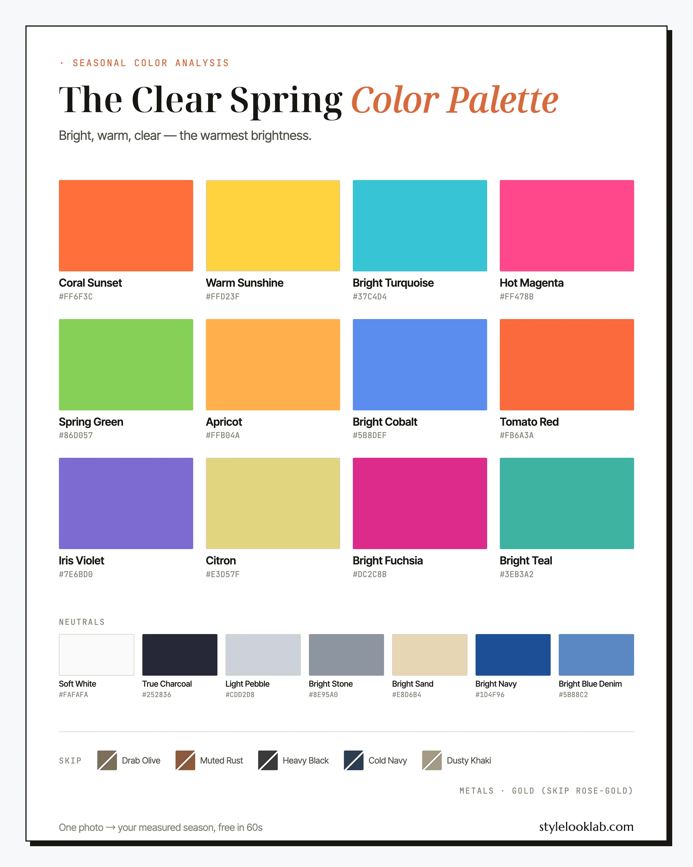
The Clear Spring color palette is warm and vivid at full saturation: coral, sunny yellow, turquoise, and hot magenta, all worn straight out of the box. Also called Bright Spring, the season combines a warm undertone with Winter-grade clarity, which is why softened, dusty shades rarely earn their keep here. If bright color calms your face instead of fighting it, start here.
Below: the full nineteen-color palette with hex codes, the pairings that hold up in real life, the shades that quietly sabotage the look, and a grounded way to check whether the season is actually yours. First, the cheat sheet:
| Best neutrals | Best accents | Usually avoid |
|---|---|---|
| Bright Navy, Soft White, True Charcoal | Coral Sunset, Bright Turquoise, Hot Magenta | Dusty pastels, muted earth tones, faded black |
Are you a Clear Spring?
Clear Spring coloring asks for three things at once: warmth, brightness, and contrast. Skin runs fair to tan with a warm, lit-from-within quality, commonly around MST 2–5 on the Monk Skin Tone scale — though depth alone never decides a season. Hair tends toward golden brown, warm dark brown, or light copper. The eyes usually settle the question: brilliant green, bright hazel, or a blue clear enough that strangers mention it. Drop any one of the three traits and you usually land in a neighboring season instead, which is a big part of why this season appears to be mistyped so often.
Some quick checks before the swatches:
- Saturated color looks oddly normal on you. In coral or cobalt, people compliment you, not the top.
- Beige, greige, and dusty pastels read like the early stage of a cold on your face.
- Your eyes are the feature people bring up first.
- Both polished gold and bright silver sit comfortably on your skin; antiqued or brushed metal looks borrowed.
If three or four of those ring true, Clear Spring belongs on your shortlist — worth testing, still short of confirmed. The free color season quiz walks the same checks in a structured order if you want a firmer shortlist first. Self-assessment is fragile because lighting, filters, makeup, and camera processing can shift the evidence. Style Look Lab estimates undertone, depth, and contrast from submitted photos and returns an internal confidence score; that score describes support in the available photo evidence, not a calibrated probability of accuracy. See the methodology and limitations before treating a photo result as settled.
Where Clear Spring sits on the three axes
The 12-season system places each season on three axes: undertone from warm to cool, depth from light to deep, and chroma from soft to clear. Clear Spring sits warm of center, light-to-medium in depth, and pressed hard against the clear end of the chroma axis. Chroma leads; warmth follows. That ranking predicts which borrowed colors survive: a cool bright like Hot Magenta earns its place; a warm muted like rust usually does not.
Warm without going golden-brown. There is enough Winter in the mix that cool brights like Hot Magenta still land.
Fresh rather than heavy. The palette bottoms out at Bright Navy and True Charcoal; flat black sits past its range.
The axis that runs the season. Colors need to look box-fresh — one visible drop of gray pushes a shade off the palette.
A note on what this does and does not claim: color seasons are a styling convention, not a medical or biological category. Measuring undertone, depth, and chroma makes the sorting repeatable, but the label at the end still depends on the system doing the sorting. This site uses the 12-season model, and Style Look Lab documents how the measurement and its confidence score work on the methodology page.
The Clear Spring color palette, color by color
The working Clear Spring color palette runs on three heroes — Coral Sunset, Warm Sunshine, and Bright Turquoise — backed by serious color in Tomato Red and Hot Magenta, daytime ease in Apricot and Citron, and a blue-violet wing held down by Bright Cobalt and Iris Violet. Bright Fuchsia and Bright Teal are accents: small doses, loud results.
The neutrals
Nobody memorizes nineteen swatches before a fitting room. Start with the six hardest workers and what each one is for.
Coral Sunset
The signature. Orange-leaning pink at full saturation, and the single most reliable color in the set — top, dress, or lipstick. When in doubt at checkout, this is the answer.
Warm Sunshine
A yellow with no apology in it. Most seasons handle yellow at arm's length; on this coloring it works right at the face. Pair it with Bright Navy and it turns from risky to crisp.
Bright Turquoise
The vacation color that also works on a Tuesday. It flatters warm skin the way icy blue flatters Winters, and it plays well with nearly everything else on this page.
Hot Magenta
The cool guest at a warm party — proof of the Winter edge in this season. Wear it when coral starts to feel too polite. It does its best work in one clean block.
Spring Green
Apple green with the brightness intact. A harder find in stores than the others, which is exactly why it reads so distinctive when you do track it down.
Bright Cobalt
The palette's answer to a classic blue shirt. More saturated than office blue, less severe than Winter cobalt, and a dependable base under gold jewelry.
The neutrals run brighter than other seasons' on purpose. Soft White replaces cream, True Charcoal stands in for black, and Bright Navy does the daily anchor work most wardrobes assign to charcoal. Light Pebble and Bright Stone cover gray duty, Bright Sand handles beige, and Bright Blue Denim — a clean mid-blue wash, not a faded one — belongs in almost every casual outfit you own.
How to wear Clear Spring colors
The Clear Spring color palette combines by a rule that reverses most color advice: contrast is your friend, and clarity must match across every piece. Two vivid colors at equal saturation look intentional on this coloring; one vivid piece next to one dusty piece tends to read as a mistake, because the dusty piece drags the whole outfit — and your face — down with it. Build around one saturated color plus one or two bright neutrals, and check new purchases against a simple question: does this shade look freshly printed, or slightly faded? Faded fails.
Prints follow the same physics. Crisp stripes, clean color-blocking, graphic geometrics, and tropical botanicals in true palette colors all belong. Watercolor florals, washed vintage motifs, and anything sold with the word "faded" in the description tend to work against you. Step back from a print: if the motif stays sharp at distance, it fits; if it blurs into a haze, it was designed for a softer season.
Bright without the costume
Every fitting room produces the same objection to this palette: "I'd look like a children's TV presenter." Fair worry, wrong conclusion. Loud color reads as costume when everything shouts at once; it reads as style when one thing shouts and the rest of the outfit holds still. Four habits keep the volume flattering:
Let one color lead. A Coral Sunset top over Bright Blue Denim is a statement. A coral top, turquoise bag, and magenta shoes is a parade. Two brights can share an outfit when they share warmth and clarity — see the combinations below — but one of them should clearly be in charge.
Buy the fabric as much as the shade. Saturated color in crisp poplin, dense cotton, or matte silk looks deliberate; the same hue in thin, shiny synthetic looks like a costume rental. Fabric quality does more work on a bright palette than on any muted one.
Keep the lines quiet. A vivid color in a classic cut — straight trouser, structured blazer, simple crew neck — reads confident. Vivid color plus novelty silhouette is where "fun" tips into "fancy dress." Save the experimental shapes for your neutrals.
Dose it when the room is conservative. In formal offices, run Bright Navy and True Charcoal as the visible uniform and let the palette in through a Coral Sunset lip or a Warm Sunshine scarf. A small dose of full-strength color beats a full outfit of watered-down color on this skin.
Clear Spring color combinations that work
These five pairings run from everyday-safe to memorable, all drawn from the named palette above.
First proof
Coral top, clean mid-blue jeans, white sneakers. The cheapest possible demonstration that this palette works, and it survives brunch, meetings, and school pickup alike.
Nautical, corrected
Classic navy-and-white with the yellow turned up to your actual wattage. The navy does the credibility, the yellow does the flattering.
Boardroom workaround
For dress codes that expect dark. Charcoal reads sober from across the room while magenta at the neckline keeps your face switched on.
Opposites on the wheel
Turquoise and apricot sit across the color wheel, which is why the pairing hums instead of clashing. Sand keeps it from turning into resort wear.
The garden party
The boldest pairing here, and the most memorable. Split it 70/30 — green leading, violet as bag or shoe — and let white referee.
Three Clear Spring outfit formulas
Three no-decision starting points for days when theory is too much:
- Office: Bright Navy blazer + Soft White shell + True Charcoal trousers + Coral Sunset lipstick + polished gold jewelry. Every bit as boardroom-ready as a black suit, minus the shadow true black tends to throw across bright warm skin.
- Weekend: Bright Blue Denim jeans + Bright Turquoise knit + Soft White sneakers + Apricot scarf. Nothing to overthink here; the turquoise knit carries the whole outfit.
- Evening: Hot Magenta or Tomato Red silk dress + gold earrings + True Charcoal coat. This palette's stand-in for the little black dress, and it usually draws more attention than the original does.
Search terms that paste straight into a shopping tab: bright coral blazer women, lemon yellow silk dress, turquoise blouse women, cobalt blue top, hot pink midi dress, bright navy blazer, warm white tee.
Clear Spring colors to avoid
Failure has one flavor here: mutedness. Anything grayed, dusted, or faded tends to flatten the brightness that is this coloring's best feature. These five show up in every closet, each with its palette-native replacement.
- Drab Olive
Gray-green with the pulse removed — it tends to mute the eyes first and the rest of the face shortly after. Camouflage, in the least useful sense.
Wear insteadSpring Green - Muted Rust
Rust is an Autumn color wearing your temperature. The brown haze in it sits on bright warm skin like brick dust and usually reads tired by mid-morning.
Wear insteadTomato Red - Heavy Black
A sooty, faded black — muted and heavy at once, which is the double fault. It tends to hollow the eyes and cancel the contrast you naturally bring.
Wear insteadTrue Charcoal - Cold Navy
Navy drained of saturation. On the hanger it looks responsible; on you it usually reads drained — your blues have to be vivid to pay rent.
Wear insteadBright Navy - Dusty Khaki
Beige under a layer of fog. The gray cast tends to dull warm skin the instant it goes on, dragging the whole outfit toward laundry day.
Wear insteadBright Sand
None of these swaps costs you darkness or practicality — only dustiness. And distance from the face buys forgiveness (a khaki skirt is a far smaller risk than a khaki turtleneck), so read the list as guidance for the top half of an outfit, not law for the whole closet.
Clear Spring hair colors
Hair on this coloring has one job: keep the brightness honest. Warm and glossy works; ashy and matte tends to fight the palette from above.
- Golden brown — the low-maintenance default, deepening warm skin without dimming it.
- Warm chocolate — as dark as most Clear Springs should go; it preserves contrast without tipping into the flat near-black range.
- Light copper — the boldest natural-looking move, and striking next to green or bright hazel eyes.
- Golden blonde — sunny rather than icy; ask your colorist for honey and gold ribbons, not beige ones.
The directions to approach carefully are ash — ash blonde, mushroom brown, and smoky balayage all tend to cast gray onto skin that runs on clarity — and heavy single-process black. Gray itself tends to arrive usefully here: on high-contrast warm coloring it often comes in as bright silver-white, which suits the palette's clarity better than a fading ash dye job does. A gloss treatment is the cheapest palette upgrade in this section; shine reads as chroma. And if light copper tempts you but feels like a leap, you can preview these shades on your own photo before a colorist makes anything permanent.
Makeup and metals for Clear Spring
Makeup mirrors the closet: clear, warm, and committed. Lips carry the look, and the palette tags four shades for the job: Coral Sunset and Tomato Red for daytime, Hot Magenta and Bright Fuchsia after dark. Blush stays peach or coral. Eyes want clean golden tones; Apricot works as a single-sweep wash with defined lashes doing the rest. The two counter mistakes to skip: brownish nude lipstick, which tends to read unwell rather than understated on this coloring, and smoky gray eyeshadow, which mutes the exact eyes people usually notice first.
Metals are simple. Polished yellow gold is the default, and polished is the load-bearing word — high shine echoes high chroma, while brushed and antiqued finishes read like the muted colors you just cleared out. The Winter streak in this season also carries bright mirror silver as a second metal. Rose gold is usually the one to pass on; its pink-beige softness belongs to gentler palettes.
Clear Spring vs its neighbors
Mistypes arrive from two directions: Warm Spring (right temperature, lower volume) and Clear Winter (right volume, opposite temperature). Each call comes down to one honest check against bare skin in daylight.
Clear Spring vs Warm Spring
Both are warm; saturation is the split. The Warm Spring color palette wears golden, sun-soaked color at conversational volume — honey, mellow coral, leaf green — while Clear Spring needs the dial at the top of its range: Tomato Red where Warm Spring wears terracotta, Hot Magenta where it wears warm rose. Hold something borderline-fluorescent near your face. If your skin switches on, Clear is the likelier call; if the color wears you like a costume while golden mid-tones make you glow, Warm Spring is the better fit.
Clear Spring vs Clear Winter
Same brilliance, opposite lean. The Clear Winter color palette runs on icy fuchsia, true black, and blue-based red; Clear Spring runs on coral, sunny yellow, and turquoise. Orange is the most revealing single check — suggestive, not decisive: Coral Sunset tends to look expensive on a Clear Spring and sunburn-adjacent on a Clear Winter. Black works the same test in reverse: if a true-black turtleneck sharpens your features instead of flattening them, you have likely crossed the border into Winter.
Clear Spring celebrity inspiration
Read this as a lookbook, not a verdict: celebrities do not publish their drape results, so the useful material is the styling itself. Hayden Panettiere's most photographed looks pair golden blonde hair with turquoise, coral, and clear aqua, and her less flattering press moments tend to cluster in beige — a pattern worth copying in reverse. Olivia Wilde seems to get typed differently by every analyst who tries, which is exactly what makes her instructive: her vivid cobalt and clear emerald carpet looks show what full-chroma dressing does for bright eyes, while her muted phases show what it costs. Cameron Diaz left a decade of reference images — vivid yellow, turquoise, coral — that arguably flattered her more than the black she wore between them. Study the outfits; skip the labels.
Clear Spring FAQ
Is Clear Spring the same as Bright Spring?
Yes — two names for one palette: warm undertone, light-to-medium depth, very high chroma. Bright Spring is the term many twelve-season systems use (including the engine behind this site); Clear Spring files the identical colors under a different adjective. If one guide calls you Bright and another calls you Clear, your palette has not changed.
How do I know if I am a Clear Spring?
Look for three traits arriving together: a warm undertone, noticeably bright eyes, and saturated color that looks more natural on you than muted color does. Self-checks build a shortlist, not a confirmation. Style Look Lab estimates undertone, depth, and contrast from submitted photos and returns an internal confidence score; the score is not a calibrated probability of accuracy, and lighting, filters, makeup, and camera processing can still shift the result.
Can a Clear Spring wear black?
More gracefully than the other Springs, thanks to the Winter streak in this coloring — but a wall of black at the face still tends to dim its best feature. Keep black in shoes and bottoms, reach for True Charcoal in tailoring, and when a dress code insists on black up top, put Coral Sunset or Hot Magenta between the fabric and your skin.
Can Clear Springs wear pastels?
Only the crisp ones. A pastel that stays clean and luminous — close to Citron, or a sharp barely-there aqua — works in small doses. Powdery, grayed pastels like dusty pink and sage tend to flatten this coloring the same way any muted shade does. The quick test is to look for the gray: if the color would blend into a nursery mural, put it back.
What lipstick colors suit a Clear Spring?
Coral Sunset and Tomato Red are the daytime pair, with Hot Magenta and Bright Fuchsia for evenings — all four sit in this palette specifically tagged for lipstick. The shades to walk past are brown-based nudes and mauves, which tend to gray out a naturally bright lip instead of amplifying it. A clear watermelon tinted balm tends to beat an expensive greige nude on this coloring.
Is Clear Spring a rare season?
There is no reliable population study showing how common each of the twelve seasons is, so a precise rarity claim would be guesswork. Clear Spring does require an unusual combination — warmth, high clarity, and noticeable contrast — but that does not translate into a trustworthy percentage. Treat “rare” as an internet label, not evidence for or against your own result.
What colors should a Clear Spring avoid?
Muted ones, in every temperature. The five most common offenders are Drab Olive, Muted Rust, Heavy Black, Cold Navy, and Dusty Khaki — each fails by dustiness rather than by hue, and each has a vivid stand-in already on the palette (Spring Green, Tomato Red, True Charcoal, Bright Navy, and Bright Sand, in that order).
Do Clear Spring colors still work with gray hair?
Usually, yes. Gray removes pigment from the hair, so the visible mix can look silver-white even when the skin stays warm. The vivid accents can keep working; what often shifts is the most flattering depth of your neutrals and how much contrast an outfit needs. Since hair depth is one of the measured inputs, a re-test after a major hair change is useful.
Think Clear Spring might be yours?
Use clear photos for a separate color estimate. Sign in to check free preview eligibility; the paid Complete Report includes the full recommendations. A photo result does not confirm or inherit a quiz result.
- Sign-in required
- Free preview if eligible
- Complete Report sold separately
Sources & limitations
These references support photographic color measurement and its limitations. They do not scientifically validate the 12-season taxonomy, celebrity typing, or the editorial wardrobe, makeup, hair, and jewelry recommendations on this page. A Style Look Lab result is an estimate from submitted photos, and its confidence score is not a calibrated probability of accuracy.
- CIE 256:2025 — Measurement of Human Skin Colour — Measurement conditions and limits for human skin colour.
- He et al. (2022) — Facial skin colour from digital images — Evidence on estimating facial skin colour from images.
- Wang et al. (2018) — Skin colour measurement variability — Shows why location and measurement conditions affect readings.
- Sharma, Wu & Dalal (2005) — The CIEDE2000 color-difference formula — Reference for perceptual colour-difference calculations.
- Google — Improving skin tone representation with the Monk Skin Tone Scale — Google’s introduction to the 10-tone representation scale; it does not define undertones or validate this site’s questionnaire.