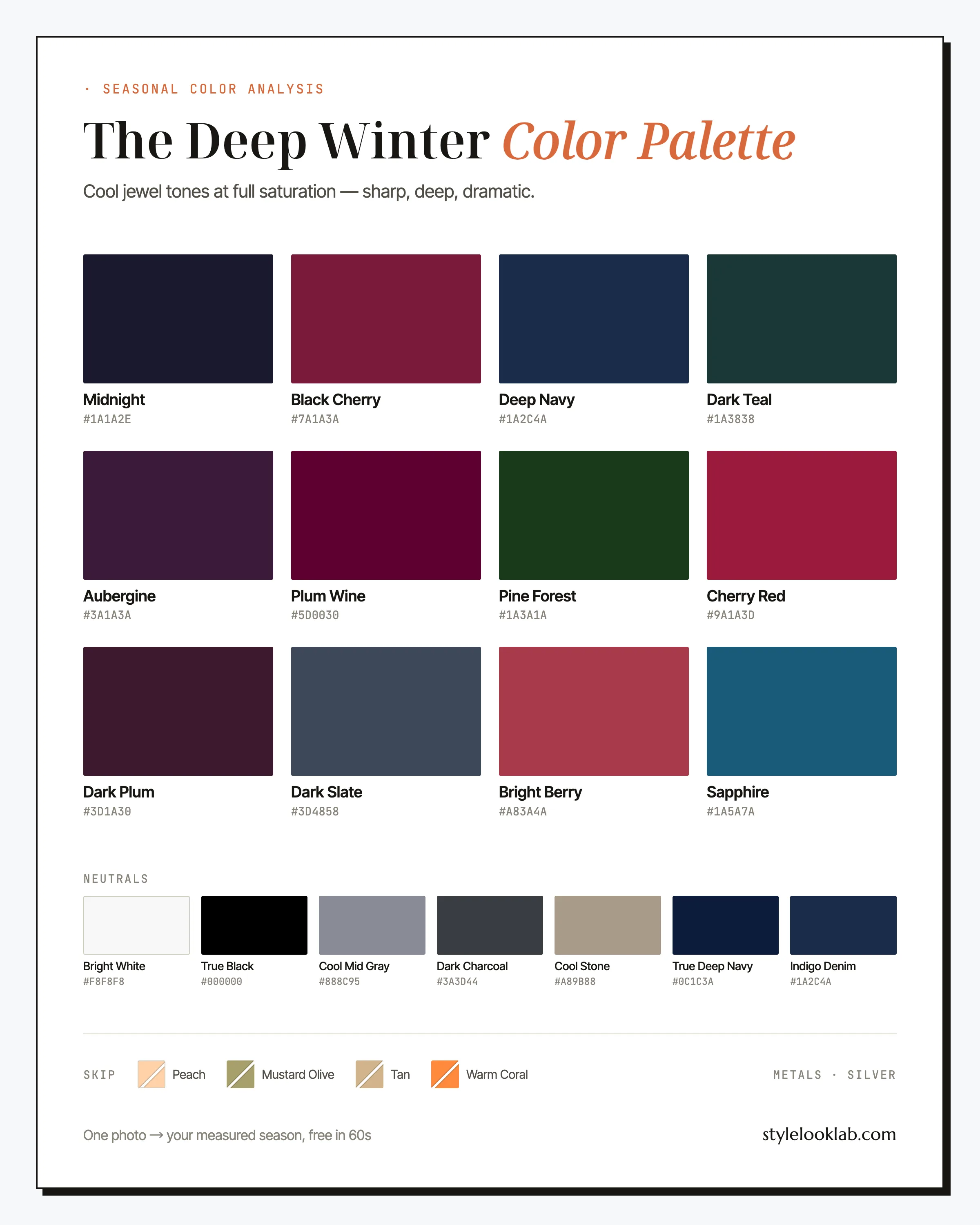
The Deep Winter color palette, also called Dark Winter, is cool, dark, and high-contrast: true black, black cherry, sapphire, aubergine, cherry red. It is the deepest palette in the 12-season system, made for coloring where near-black hair, dark eyes, and a cool undertone meet. If black sharpens your face instead of draining it, Deep Winter deserves a serious look.
This guide names every color with its hex code, shows the combinations and outfit formulas that put them to work, lists the warm shades that quietly undermine this coloring, and ends with a reliable way to check the season against your own face. The aim is a working wardrobe, not a color-theory seminar. The essentials in one table before anything else:
| Best neutrals | Best accents | Usually avoid |
|---|---|---|
| True Black, Bright White, Dark Charcoal | Cherry Red, Sapphire, Black Cherry | Peach, tan, mustard olive, warm coral |
Are you a Deep Winter?
Deep Winter coloring leads with depth and finishes with coolness. Hair is black or near-black. Eyes run dark brown to near-black, often dark enough that the whites seem backlit. Skin covers one of the widest ranges in the system, commonly around MST 6–10 on the Monk Skin Tone scale, though fair-skinned Deep Winters exist and depth alone never decides a season. What the whole range shares is a cool or neutral-cool base and, above everything, contrast: features that stay sharply separate rather than blending into each other.
Some quick checks before the swatches:
- Silver jewelry tends to look natural on you; yellow gold looks borrowed.
- A black top sharpens your face. On most other coloring it does the opposite.
- Nude lipstick and soft neutral makeup vanish on you, reading as no makeup at all.
- Your wrist veins look blue rather than olive-green, which hints cool but proves nothing.
Three or more yes answers put Deep Winter on your shortlist — shortlisted, not settled. Running the free color season quiz is a fast way to check whether the shortlist holds. Lighting, filters, makeup, camera processing, and image selection can shift skin tone enough to flip a self-test. Style Look Lab estimates undertone, depth, and contrast from submitted photos and returns an internal confidence score; that score describes support in the available photo evidence, not a calibrated probability of accuracy. See the methodology and limitations before treating a photo result as settled.
Where Deep Winter sits on the three axes
Every season in the 12-season system is a position on three axes: undertone (warm to cool), depth (light to deep), and chroma (soft to clear). On those axes the Deep Winter color palette sits cool of center, at the very bottom of the depth scale, and well toward the clear end. Depth is the headline trait, but chroma is the trap: deep does not mean muted here. A dusty, grayed-out version of any color on this page belongs to a different season.
Blue runs under everything here. The reds are cherry and berry, the green is pine — no brick, no rust, no golden cast anywhere in the range.
The darkest palette of the twelve. Shades most seasons save for outerwear — midnight, near-black plum — are the everyday middle of this one.
Dark but not dusty. Each color keeps a clean, saturated edge; gray one out and it stops belonging to this palette.
Those three coordinates matter more than any single swatch: cool, dark, saturated colors will generally behave on you, whatever a label calls them.
One thing worth stating plainly: finding your color season is a way of organizing style decisions, not a scientific or medical classification of your body. Measuring undertone, depth, and contrast makes the outcome far more repeatable, but the name you land on still depends on the color model doing the naming — this site works in the 12-season system.
Why deep skin keeps getting handed an Autumn palette
If one mistyping deserves its own section, it is deep skin being handed an Autumn palette by default. Many quizzes and automated tools appear to treat darkness as the whole answer: skin past a certain depth gets read as warm, camel and rust follow, and the undertone question never gets asked. Cool-deep coloring, the kind that gains polish in black and berry, ends up dressed in earth tones it never chose.
Depth and undertone are different dimensions, so darkness alone should not be used to infer warmth. Style Look Lab estimates them separately and uses the 10-level Monk Skin Tone scale as a representation aid; that scale itself does not determine undertone or assign a season. The methodology page explains the analysis and its internal confidence score. If you have deep skin and an Autumn result that never felt convincing, Deep Winter is one alternative worth comparing.
Inside the Deep Winter color palette
The working Deep Winter color palette runs on two hero shades, Midnight and Black Cherry, with the rest of the range fanning out from them. Deep Navy, Dark Teal, and Sapphire hold the blue line; Aubergine, Plum Wine, and Dark Plum carry the violets; Cherry Red and Bright Berry are the statement notes; Pine Forest is the lone green with enough weight to keep up; Dark Slate bridges into the neutrals.
The neutrals
Six of these do the heaviest lifting. Here is what each one is for.
Midnight
Black with a pulse. It reads nearly as sharp as true black but photographs with more dimension, which makes it the better pick for full suits and long coats.
Black Cherry
The signature shade: dark enough to work like a neutral, saturated enough to register as color. Wear it wherever burgundy is the safe suggestion — this is the cooler, sharper version.
Cherry Red
The loudest color in the palette and the easiest to justify. A blue-based red at this depth suits cool-deep skin in a way few other seasons can borrow. Silk shirt, dress, or lipstick.
Sapphire
The workhorse accent. It bridges office navy and evening jewel tones, and a single sapphire scarf wakes an all-black outfit without breaking its temperature.
Aubergine
Near-black purple for occasions that ask for drama without brightness. It reads richest in plush surfaces: velvet, suede, heavy knit.
Pine Forest
The one green that belongs here — deep, cool, and clean. Reach for it where others reach for hunter green, or when navy starts to feel expected.
On neutrals, this is the rare season whose defaults need no replacing: True Black and Bright White are genuinely yours, worn together if you like. Dark Charcoal and Cool Mid Gray cover the middle registers, Cool Stone stands in for beige — a grayed putty, nothing like camel — and Indigo Denim keeps casual wear inside the lines. True Deep Navy is the black alternative for settings where head-to-toe black feels severe.
Deep Winter colors to avoid
When an outfit fails on this coloring, warmth is usually the reason. Golden, earthy, and peachy shades pull against a cool undertone, and light, dusty shades drain the contrast that carries the face. The four most frequent offenders, each with its palette-native replacement:
- Peach
Light, warm, and soft at once — the opposite of this palette on all three axes. Next to cool-deep skin it tends to look chalky and pulls the face toward tired.
Wear insteadBright Berry - Mustard Olive
A yellowed, dusty mid-tone that blurs the crisp edges this coloring depends on. Where the palette wants clarity, mustard olive reads as murk.
Wear insteadPine Forest - Tan
Camel tones reward warm depth. On a cool base, tan does nothing for the skin and flattens the outfit around it — beige for its own sake.
Wear insteadCool Stone - Warm Coral
Right saturation, wrong temperature. An orange-based red this loud amplifies warmth the undertone does not have, and the mismatch shows most near the face.
Wear insteadCherry Red
Every swap keeps the depth or intensity and corrects only the temperature — that is the pattern worth taking shopping. Placement matters as well: a tan trench over a black outfit is a far smaller compromise than a peach blouse at your jaw. Read these as strong defaults, with your mirror holding the final vote.
How to wear Deep Winter colors
One rule governs outfits here: protect the contrast. Where soft seasons blend, this one separates. Pair your darkest dark with your brightest light, or with one saturated accent, and let the gap between them do the work. A dependable formula is two dark anchors plus one point of light or color — True Black and Aubergine with a Bright White collar, Deep Navy and Black Cherry with polished silver at the ear. What tends to fail is the all-mid-tone outfit: gray head to toe with nothing sharp in it can mute this coloring almost as thoroughly as beige does.
Prints follow the same logic. High-contrast patterns belong — black-and-white stripes, houndstooth, a cherry motif on a black ground, crisp geometrics — while faded washes, watercolor florals, and anything a product page calls "dusty" fight the palette. A quick test at arm's length: if the colors in a print still separate cleanly, it will probably behave; if they melt into one soft blur, it was drawn for a softer season.
Deep Winter color combinations that work
Five starting points, each built entirely from the named colors above, ordered from foolproof to fashion-forward.
Contrast at full volume
The sharpest three-color chord in the twelve seasons, and this is the coloring that can wear it without the outfit taking over the face.
The jewel box
Two jewel tones grounded in black. Keep surfaces sleek — satin, velvet, fine knit — so the colors stay the loudest thing on you.
Dark romance
Wine into plum with gray as the buffer: moody without costume. Polished silver finishes it.
Deep water
The quiet option — two blues that read almost as one, cut by a white collar. Built for offices where cherry red feels loud.
Berry on stone
The closest this palette comes to casual softness: one bright note over grayed neutrals, weekend-proof.
Three Deep Winter outfit formulas
Theory aside, here is how the palette gets dressed.
- Office: True Black blazer + Bright White shirt + Dark Charcoal trousers + polished silver jewelry. Corporate dress codes might as well have been written for this palette; swap the shirt for Sapphire on days that need color.
- Weekend: Indigo Denim jeans + Black Cherry sweater + True Black boots + Cool Mid Gray scarf. Dark casuals hold together here without looking heavy, because the contrast is native to the face wearing them.
- Evening: Aubergine velvet dress + silver earrings + Cherry Red lip. The palette's whole argument in one outfit — depth, coolness, one clear accent.
To find the pieces, drop these terms into any shop search: black tailored blazer women, crisp white poplin shirt, sapphire blue silk blouse, black cherry sweater women, aubergine velvet midi dress, dark wash straight leg jeans.
Deep Winter hair colors
Hair is half of this season's contrast, so the goal of any color change is to keep the frame dark and cool. Warming it up with caramel balayage, golden brown, or honey highlights softens the exact feature the palette is built around.
- Blue-black — the signature move. It deepens the contrast with skin and makes a cool undertone look deliberate.
- True black or soft black — the low-maintenance default, especially when it is close to your natural depth.
- Cool espresso — the darkest brown before black, with no golden cast; the gentlest step lighter.
- Dark cherry or plum tint — the bold option. A burgundy cast in near-black hair echoes Black Cherry and stays inside the palette.
If you add highlights, keep them ash-toned and subtle. Gray, when it arrives, tends to come in cool and silver on this coloring — one of the easier transitions in the system, since silver against dark reads as contrast rather than fade. If you are weighing blue-black against a plum tint, the AI hairstyle changer will show both on your own photo before you commit either way.
Makeup and metals for Deep Winter
Deep Winter makeup can match the wardrobe's intensity, and usually should. This is the coloring on which a true-red or berry lip looks composed rather than dramatic, while nude and barely-there shades are the actual risk: on a high-contrast face they tend to read as absence, not subtlety. Reach for lips in cherry, berry, plum, or wine, eyes lined in black or deepest plum, and blush kept cool and minimal. Bronzer usually works against the face here, painting in warmth the undertone will argue with.
Metals settle quickly: silver, platinum, and white gold, polished rather than brushed, because this palette rewards shine. Yellow gold reintroduces the warmth the clothes are busy avoiding. For stones, the high-contrast classics — onyx, ruby, sapphire, diamond — behave exactly as hoped.
Deep Winter vs its neighbors
Mistypes around this season arrive from two directions: Cool Winter shares the coolness but not the depth, and Deep Autumn shares the depth but not the coolness. If either comparison below feels genuinely close, that borderline is worth measuring rather than calling by eye.
Deep Winter vs Cool Winter
Depth divides them. The Cool Winter color palette runs on icy contrast — frosted pinks and blues against dark hair — and those icy shades tend to go chalky on a Deep Winter, while Deep Winter's near-blacks can sit heavy on Cool Winter's brighter coloring. Put frost and midnight near your face in daylight: if the icy pastels light you up, look at Cool; if the near-black shades do, stay Deep.
Deep Winter vs Deep Autumn
Undertone divides them, since the depth is shared. Compare the Deep Autumn color palette with two shirts in daylight: true black against espresso brown. Skin that gains definition in black and goes flat in espresso points to Winter; skin that warms in espresso and hollows in black points to Autumn. Silver-versus-gold jewelry can support the same comparison, and vein color is a rough extra clue at best.
Deep Winter celebrity inspiration
Take these as styling references, not verdicts — a red-carpet photo cannot settle anyone's season. Lupita Nyong'o is the study to start with: her looks in cobalt, emerald, and optic white show what saturated cool color does beside deep skin and high contrast. Naomi Campbell's decades of black-on-black tailoring demonstrate the palette's core trick, contrast worn as color. Anne Hathaway's black-gown-and-berry-lip standby shows the formula at its most repeatable, and how it reads on fair skin. Study the outfits and leave the labels alone.
Deep Winter FAQ
Is Deep Winter the same as Dark Winter?
They are two names for one season. "Dark Winter" comes from the traditional 12-season literature, while "Deep Winter" is the term most people search now. Both describe the same combination: cool undertone, very deep value, clear chroma. A quiz that calls you Dark Winter and an analyst who says Deep Winter are in full agreement.
How do I know if I am a Deep Winter?
Look for three signals together: coolness (silver tends to beat gold on you), depth (hair and eyes dark, often near-black), and contrast (black sharpens your face rather than flattening it). Self-checks are a starting point, not an answer. Style Look Lab estimates undertone, depth, and contrast from submitted photos and returns an internal confidence score; the score is not a calibrated probability of accuracy, and lighting, filters, makeup, and camera processing can still shift the result.
Can a Deep Winter wear brown?
Rarely well. The browns that work are the coolest and darkest ones, espresso on the edge of black, and even those usually lose to black, charcoal, or deep navy. Golden and caramel browns are the real problem: they bring warmth into a palette built on coolness and dim the contrast that carries this coloring.
Can a Deep Winter wear pastels?
Usually not. Powdery pastels sit at the opposite end of both depth and chroma, and they tend to leave cool-deep coloring looking washed out. Icy near-whites belong to Cool Winter rather than Deep Winter in the 12-season model; when an outfit needs lightness, Bright White does the job with the contrast intact.
Is Deep Winter warm or cool?
Cool — that is the second defining trait after depth. Undertones run blue or neutral-cool, which is why silver, black, and blue-based reds tend to work while golden shades fall flat. Surface skin color can read tan, olive, or deep brown and still sit on a cool base, so undertone is worth measuring rather than guessing from the mirror.
What are the best Deep Winter colors for work?
True Black or Deep Navy tailoring, a Bright White shirt, and one saturated accent near the face — Sapphire, Cherry Red, or Black Cherry. Corporate dress codes and this palette overlap almost completely, so the office uniform and the best-color wardrobe turn out to be the same rack of clothes.
What colors should a Deep Winter avoid?
Warm, light, and dusty shades: peach, tan, camel, mustard, olive-gold, warm coral, and most pastels. Each either adds warmth a cool undertone will argue with or lowers the contrast the palette depends on. The swap logic stays consistent — trade warm for cool at the same depth, so tan becomes Cool Stone and coral becomes Cherry Red.
Deep Winter vs Deep Autumn — which one am I?
Undertone decides it, since the depth is shared. Hold true black and espresso brown beside your bare face in daylight: cool-deep skin gains definition in black and goes dull in espresso, while warm-deep skin does the reverse. Jewelry gives a faster read of the same divide — if silver looks natural and gold looks borrowed, Winter is the likelier family.
Testing Deep Winter against your mirror?
Use clear photos for a separate color estimate. Sign in to check free preview eligibility; the paid Complete Report includes the full recommendations. A photo result does not confirm or inherit a quiz result.
- Sign-in required
- Free preview if eligible
- Complete Report sold separately
Sources & limitations
These references support photographic color measurement and its limitations. They do not scientifically validate the 12-season taxonomy, celebrity typing, or the editorial wardrobe, makeup, hair, and jewelry recommendations on this page. A Style Look Lab result is an estimate from submitted photos, and its confidence score is not a calibrated probability of accuracy.
- CIE 256:2025 — Measurement of Human Skin Colour — Measurement conditions and limits for human skin colour.
- He et al. (2022) — Facial skin colour from digital images — Evidence on estimating facial skin colour from images.
- Wang et al. (2018) — Skin colour measurement variability — Shows why location and measurement conditions affect readings.
- Sharma, Wu & Dalal (2005) — The CIEDE2000 color-difference formula — Reference for perceptual colour-difference calculations.
- Google — Improving skin tone representation with the Monk Skin Tone Scale — Google’s introduction to the 10-tone representation scale; it does not define undertones or validate this site’s questionnaire.