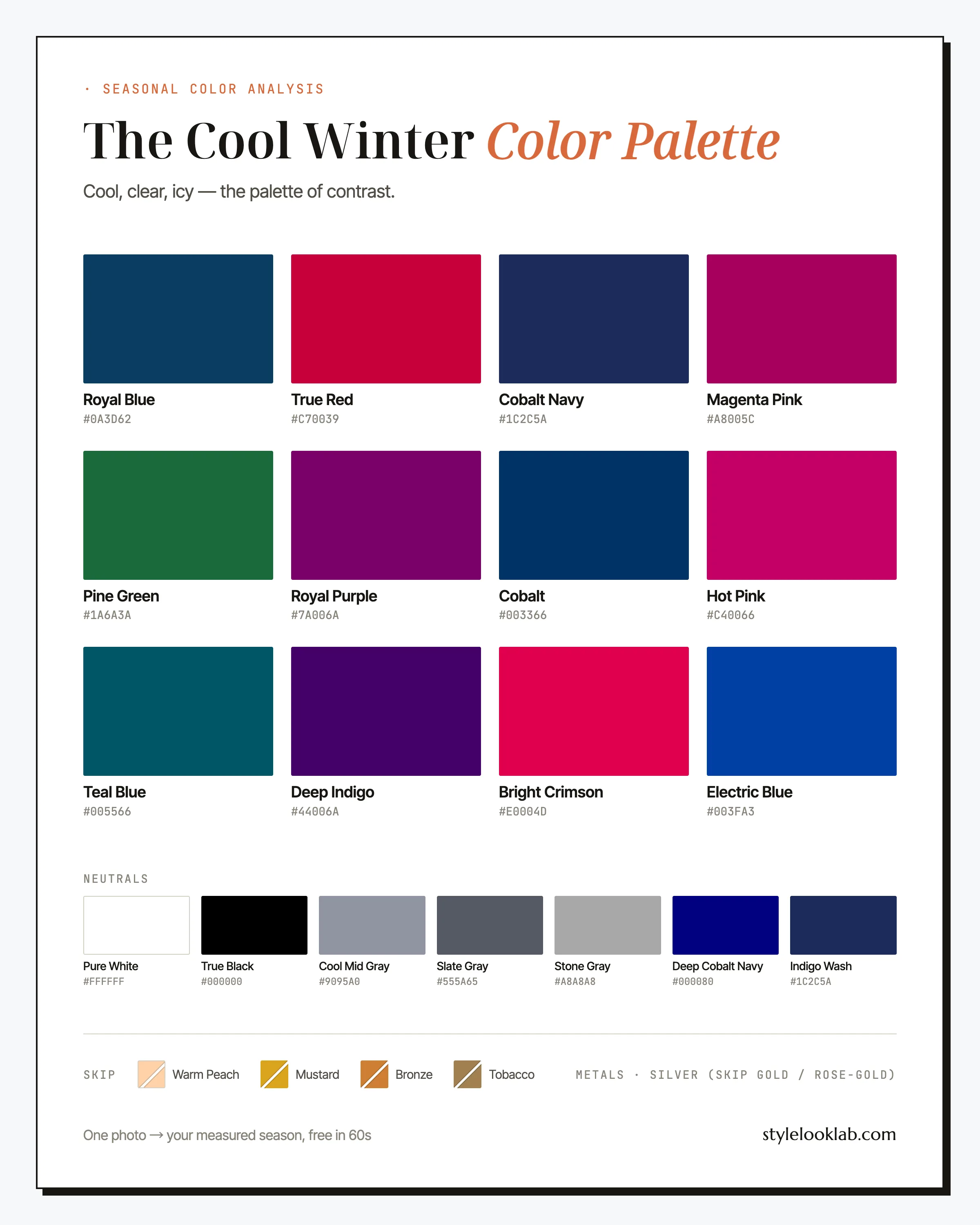
The Cool Winter color palette, also called True Winter, is built from blue-based, high-contrast color: True Black, Pure White, Royal Blue, True Red, and a case of icy jewel tones. Nothing warm and nothing dusty makes the cut. If saturated cool color sharpens your face while beige, gold, and camel drain it, this is likely your season.
This guide names every color with its hex code, shows the combinations that hold up in real outfits, covers the warm shades that quietly undo good ones, and ends with a way to confirm the season instead of guessing at it. The one-table summary comes first:
| Best neutrals | Best accents | Usually avoid |
|---|---|---|
| True Black, Pure White, Slate Gray | Royal Blue, True Red, Magenta Pink | Mustard, bronze, camel, warm peach |
Are you a Cool Winter?
Two things define Cool Winter coloring: temperature and contrast. Skin carries a cool blue-pink or neutral cast across a wide range of depths, commonly around MST 3–7 on the Monk Skin Tone scale, though depth alone never decides a season. Hair runs dark brown to black with an ash edge rather than a golden one, and eyes stay cool: gray, blue, or a brown deep enough to read black across a room. The real tell is the distance between features. Skin and hair that sit far apart in depth are what let this season wear combinations that overwhelm nearly everyone else.
A few quick checks before the swatches:
- Silver jewelry usually reads cleaner on you than gold.
- Pure white looks crisp near your face, while cream and ivory tend to look faintly dingy.
- Black next to your skin sharpens your features instead of casting shadows under them.
- Your wrist veins look blue or violet rather than olive, which is a rough clue and nothing more.
Mostly yes answers make Cool Winter worth testing properly, and worth testing is not the same as confirmed. A quick structured next step is the free color season quiz, which runs checks like these in sequence. Mirrors and phone cameras are unreliable witnesses here: lighting, filters, makeup, camera processing, and image selection can push a borderline face to the wrong side of the line. Style Look Lab estimates undertone, depth, and contrast from submitted photos and returns an internal confidence score; that score describes support in the available photo evidence, not a calibrated probability of accuracy. See the methodology and limitations before treating a photo result as settled.
Cool Winter on the three color axes
The 12-season system places every season on three axes: undertone (warm to cool), depth (light to deep), and chroma (soft to clear). Cool Winter sits at the extreme cold end of the undertone axis, deep of center in value, and well toward the clear end of chroma. Temperature is the axis that names the season. Depth and brightness both allow some negotiation; warmth allows close to none.
As far cold as the system goes. Every shade is blue-based, and even a small dose of yellow is enough to push a color off this palette.
The palette clusters at the two ends of the light-dark scale — deep anchors below, icy accents above — and mostly skips the middle. That gap is where the contrast lives.
Saturated and clean, one step short of maximum. Clear Winter is brighter; nothing is colder. Grayed-down color tends to read static on this coloring.
Held together, those three positions beat any memorized list. A cold, saturated color at medium-to-deep value belongs in the Cool Winter color palette even when it is not printed on this page; a warmed or grayed-down one does not, no matter how current it looks in stores.
One thing worth stating plainly: color analysis is a styling framework, not a scientific classification of your body. Measured inputs make the answer far more repeatable — the methodology page explains how Style Look Lab measures each axis and how the confidence score is built — but the season you land in still depends on the color system in use, which on this site is the 12-season model.
Every color in the Cool Winter palette
The working Cool Winter color palette leads with two statement colors: Royal Blue and True Red, the coldest available versions of the two most useful brights in fashion. Behind them sit the jewel tones (Pine Green, Royal Purple, Teal Blue, Magenta Pink), then the electric end of the range in Hot Pink, Bright Crimson, and Electric Blue. Deep Indigo, Cobalt, and Cobalt Navy handle the near-dark territory. Scan the grid and notice what is missing: no brown, no gold, no olive, nothing muddy.
The neutrals
Nobody walks into a fitting room holding twenty-odd names, so start with the six that do the heaviest lifting.
Royal Blue
The signature. A royal blue top does for this season what camel does for the warm ones: it reads polished at work, photographs well everywhere, and repeats without anyone minding. If you test one color from this page against your face, make it this.
True Red
A red with a cool spine, closer to raspberry than to tomato. Blue-based red tends to make teeth look whiter and skin clearer on cool coloring, and it works at any scale, from a full coat down to a lip.
Pine Green
Your answer to emerald. Cold, deep, and clean, it is the green to reach for when olive and forest both turn muddy on you, which on this coloring they usually do.
Hot Pink
Not a novelty color here. Blue-based pink at full saturation suits high-contrast coloring the way soft pink suits the Summer seasons. Wear it in one confident block rather than as trim.
Electric Blue
Royal Blue with the voltage turned up. Best as the single statement in an otherwise black-and-white outfit; two electrics in one look start competing with each other, and with you.
Deep Indigo
The moody option, a violet-leaning near-dark for evenings when black feels expected and navy feels safe. It photographs richer than either.
About the neutrals: this column is the strongest in the whole 12-season system. True Black and Pure White work at full strength with no softening required, Slate Gray and Cool Mid Gray hold down the daytime middle, and Stone Gray does the job beige does for everyone else. Deep Cobalt Navy is the ready black alternative. For denim, an unfaded Indigo Wash keeps casual clothes inside the palette; dusty, stone-washed blue belongs to the Summers.
Black and white belong to Cool Winter
Wardrobe advice treats black and white as universal, which is only half true. Almost anyone can put them on; a much smaller group actually benefits. Black is a cool, maximally deep, high-contrast color, and worn near the face it demands coloring that can answer it. Most seasons meet black with a faint shadow under the jaw and a face working against its own outfit. Cool Winter coloring, with its built-in distance between dark hair and cool skin, is the pattern black was cut for. Optic white tells the same story: functionally it is a cold color, one that can turn stark against warm or muted coloring while reading simply crisp here.
So the black-and-white uniform, from the tuxedo dress code to the white-shirt-black-trouser standby, works here as a baseline to build on rather than a compromise to manage.
The flip side deserves naming too. Camel coats, oatmeal knits, and the warm minimalism sold as quiet luxury currently fill half of every store, and nearly all of it sits on this palette's avoid side. A Cool Winter shopping trip usually goes better in the racks other seasons find difficult, the eveningwear, the jewel tones, the stark monochrome, than at the safe beige tables by the entrance.
How to wear Cool Winter colors
Two rules run through everything: keep the temperature cold and let the contrast show. Where the soft seasons blend, this palette blocks. A practical default is a high-contrast 80/20: one or two extreme neutrals as the base (True Black, Pure White, Slate Gray) plus a single saturated accent (Royal Blue, True Red, Magenta Pink). What tends to fail is the low-contrast blend, tone-on-tone taupe and greige, which makes high-contrast coloring look switched off rather than serene.
Prints follow the same logic in miniature. Graphic prints work: black-and-white stripes, houndstooth, sharp geometrics, polka dots, one jewel tone on a black ground. The soft end of the print rack, watercolor florals and faded washes, fails at a distance; if a print melts into one hazy mid-tone from across the room, it was drawn for a different season.
Cool Winter color combinations that work
Five combinations, ordered from everyday-safe to full-volume, each using only colors from the grid above.
The tuxedo baseline
The highest-contrast pairing in fashion, on the coloring it was made for. Keep the red to one block, a lip, a coat, or a shoe, and let black and white do the framing.
Blue on blue on white
Tonal blue holds together when every layer is equally cold. These three match in temperature, so the stack reads deliberate instead of accidental.
Office, thawed slightly
The workday answer for days when head-to-toe black feels heavy. Slate does the quiet work while royal blue keeps the outfit from going flat.
The jewel box
Loud on the hanger, correct on the body. Saturation at this level needs high-contrast coloring underneath it, which is exactly what this season brings.
Weekend, still cold
Dark unfaded denim, a crisp white tee, one crimson accent. Casual clothes obey the same temperature rules as evening ones.
Cool Winter outfit formulas to copy
For mornings that have no patience for theory:
- Office: Slate Gray trousers + Pure White poplin shirt + Royal Blue fine-gauge knit + polished silver jewelry. Sharper than the beige version of the same outfit, and every piece re-pairs with the others all week.
- Weekend: Indigo Wash straight-leg jeans + Pure White tee + True Black leather jacket + Bright Crimson scarf or lip. Four pieces, one accent, no thinking required.
- Evening: True Red silk dress + True Black heels + polished silver earrings. The red dress is practically a Cool Winter birthright; blue-based red does the work that sequins do for other people.
Shopping-search phrases that surface the pieces above: royal blue silk blouse, true red midi dress, black tailored blazer women, crisp white poplin shirt, dark indigo straight leg jeans, fuchsia pink sweater women, silver statement earrings.
Cool Winter colors to avoid
Only one kind of color can really break the Cool Winter color palette: a warm one. Yellow, gold, and orange undertones tend to argue with blue-based skin, and the argument usually shows up as sallowness. Here are the four most common offenders, each with its palette-native replacement.
- Warm Peach
Peach is warmth dressed up as a pastel. It reads gentle on the hanger and sallow on cool skin, and it usually leaves this coloring looking short on sleep.
Wear insteadHot Pink - Mustard
Saturated warm yellow is one of the hardest directions a blue-based complexion can take. Even a mustard scarf can pull the skin toward khaki from two feet away.
Wear insteadPine Green - Bronze
A metallic warm brown keeps tugging the eye toward gold while the skin underneath stays firmly cool, so the pairing looks borrowed rather than chosen.
Wear insteadSlate Gray - Tobacco
Warm, muted, and mid-toned at once, three qualities this palette runs from. On high-contrast coloring, tobacco brown reads dusty where a neutral should read clean.
Wear insteadStone Gray
Note the pattern in the swaps: something cold and clear stands in for something warm and soft, and distance from the face buys forgiveness. At shoe level, tobacco is harmless; wrapped at the collar, it argues with your skin all day.
Cool Winter hair colors
Cool Winter hair color keeps the depth and drops the warmth. The natural range, dark brown through black with an ash cast, is usually already the right answer, which makes this one of the cheaper seasons to maintain at a salon.
- Blue-black — the boldest fit: maximum contrast against cool skin, and a shade this coloring carries better than almost any other.
- Cool espresso — dark brown with the gold filtered out; the low-commitment default.
- Deep ash brown — about as light as this coloring tends to go while keeping the contrast that defines it.
- Silver and salt-and-pepper — gray usually grows in cool here, so going gray tends to sharpen a Cool Winter rather than wash her out.
The direction to avoid is golden. Caramel balayage, honey highlights, and copper all warm the hair while the skin stays cool, and the mismatch shows clearly in photos. For dimension, ask your colorist for ash or smoky ribbons instead of golden ones. Or settle the blue-black question before the consultation: the AI hairstyle changer shows any of these shades on your own photo first.
Makeup and metals for Cool Winter
Makeup repeats the wardrobe rule: blue-based or skip it. The palette itself tags True Red, Bright Crimson, and Hot Pink for lips, and the berry family (raspberry, plum, wine) extends the range for quieter days. Blush stays cool pink rather than coral. On eyes, charcoal, slate, and true black liner usually do more than warm brown. One of the most common counter mistakes for this season is a warm beige nude lip, which tends to blank out the mouth on cool skin.
The metal question has a short answer: silver, platinum, and white gold, polished rather than brushed, since hard shine suits high-contrast coloring in a way matte metal rarely does. Yellow gold and rose gold sit on this palette's avoid list for the same reason mustard does. A warm glow at the jawline reintroduces exactly the cast the clothes are keeping out.
Cool Winter vs its neighbors
Cool Winter shares a border with two other Winters, and most mistypes land on one side or the other. Each comparison comes down to a single question. If neither answer feels decisive, that borderline reading is itself useful information, and the honest next step is a measurement rather than another quiz.
Cool Winter vs Clear Winter
Both wear saturated color; the divider is what happens when a shade warms up slightly. The Clear Winter color palette is organized around brightness and tolerates a hint of warmth, which is why a hot coral-pink can survive there. Cool Winter is organized around temperature and does not extend that tolerance. Hold a slightly warmed bright near your face: if it merely dims you, Clear is the likelier answer; if it visibly yellows your skin, you are on the Cool side of the line.
Cool Winter vs Deep Winter
Depth decides this one. The Deep Winter color palette owns the near-black range and can absorb a trace of warmth in shades like black cherry and dark espresso. Cool Winter refuses the warmth but wins the icy end, the frosted pinks and ice blues that tend to turn a Deep Winter chalky. Test the extremes in turn: frost that sharpens your face argues for Cool, while frost that fades you as near-black turns regal argues for Deep.
Cool Winter celebrity inspiration
Read this section as styling reference, not classification; a red-carpet archive is evidence of styling choices, never of a verified season. Jennifer Connelly is one of the names color analysis communities cite most often around this palette, and her strongest red-carpet run is built on black, white, and saturated cool blue with barely a warm metal in sight. Krysten Ritter is the case study for black worn at full strength: blue-black hair against cool skin, a wardrobe that leans hard on this palette's neutral column. Liv Tyler's most photographed looks cluster in deep blue, berry, and black, while camel and bronze are conspicuously rare among them. Study the outfits and the color placement, and skip the urge to certify anyone.
Cool Winter FAQ
Is Cool Winter the same as True Winter?
Same season, two labels. "Cool Winter" names it by its defining axis, temperature, while "True Winter" marks it as the purest of the three Winters, the one with no Spring or Autumn influence bleeding in. Different naming systems pick different labels, but the palette and the rules are identical.
How do I know if I am a Cool Winter?
Look for three signals together: a cool undertone (silver usually flatters more than gold), high contrast between skin and hair, and saturated color working better on you than dusty color. Self-checks build a shortlist, not a confirmation. Style Look Lab estimates undertone, depth, and contrast from submitted photos and returns an internal confidence score; the score is not a calibrated probability of accuracy, and lighting, filters, makeup, and camera processing can still shift the result.
Can a Cool Winter wear gold jewelry?
Not next to the face, if you can help it. This palette lists both yellow gold and rose gold as avoids, because a warm metal at the jawline brings back the yellow cast the rest of the outfit is filtering out. A sentimental gold piece still works at the wrist, ideally mixed into a stack with silver.
Can a Cool Winter wear brown?
There is no brown anywhere in this palette, and the omission is deliberate: nearly every brown carries warmth. The jobs brown handles for other seasons go to Slate Gray, Cobalt Navy, and True Black here. When a dress code truly requires brown, the darkest, coldest espresso available with a Pure White layer between it and your skin limits the damage.
What is the difference between Cool Winter and Cool Summer?
Cool Summer is the season this site covers as True Summer, and what separates it from Cool Winter is saturation, mostly, since both seasons are fully cool. True Red is the quick test: on a Cool Winter it usually looks intentional, while on a Cool Summer it tends to wear the person. Reverse the test with dusty rose and the result flips. Contrast breaks any remaining tie, and Winter carries far more of it.
What lipstick colors suit a Cool Winter?
Start with the three the palette already tags for lips: True Red, Bright Crimson, and Hot Pink. Cool berry, raspberry, and plum cover quieter days. All of them are blue-based, which keeps teeth looking white on cool skin. The shades to walk past are brick, coral, and warm beige nude — a warm nude in particular tends to erase the mouth on this coloring.
Can a Cool Winter have brown hair?
Yes, provided the brown is dark and cool. Espresso, blue-brown, and deep ash brown all sit comfortably inside this coloring; it is golden warmth, not brownness, that causes trouble. Caramel and honey balayage tend to split the difference badly, warming the hair while the skin stays cool.
Can a Cool Winter wear pastels?
Only the icy kind. Frosted pink, ice blue, and icy lavender read as light versions of this palette because they are white-based rather than cream-based. The pastels that usually fail are the warm, powdery ones — peach, butter yellow, soft coral — which land in the same trap as beige.
Is Cool Winter your season?
Use clear photos for a separate color estimate. Sign in to check free preview eligibility; the paid Complete Report includes the full recommendations. A photo result does not confirm or inherit a quiz result.
- Sign-in required
- Free preview if eligible
- Complete Report sold separately
Sources & limitations
These references support photographic color measurement and its limitations. They do not scientifically validate the 12-season taxonomy, celebrity typing, or the editorial wardrobe, makeup, hair, and jewelry recommendations on this page. A Style Look Lab result is an estimate from submitted photos, and its confidence score is not a calibrated probability of accuracy.
- CIE 256:2025 — Measurement of Human Skin Colour — Measurement conditions and limits for human skin colour.
- He et al. (2022) — Facial skin colour from digital images — Evidence on estimating facial skin colour from images.
- Wang et al. (2018) — Skin colour measurement variability — Shows why location and measurement conditions affect readings.
- Sharma, Wu & Dalal (2005) — The CIEDE2000 color-difference formula — Reference for perceptual colour-difference calculations.
- Google — Improving skin tone representation with the Monk Skin Tone Scale — Google’s introduction to the 10-tone representation scale; it does not define undertones or validate this site’s questionnaire.