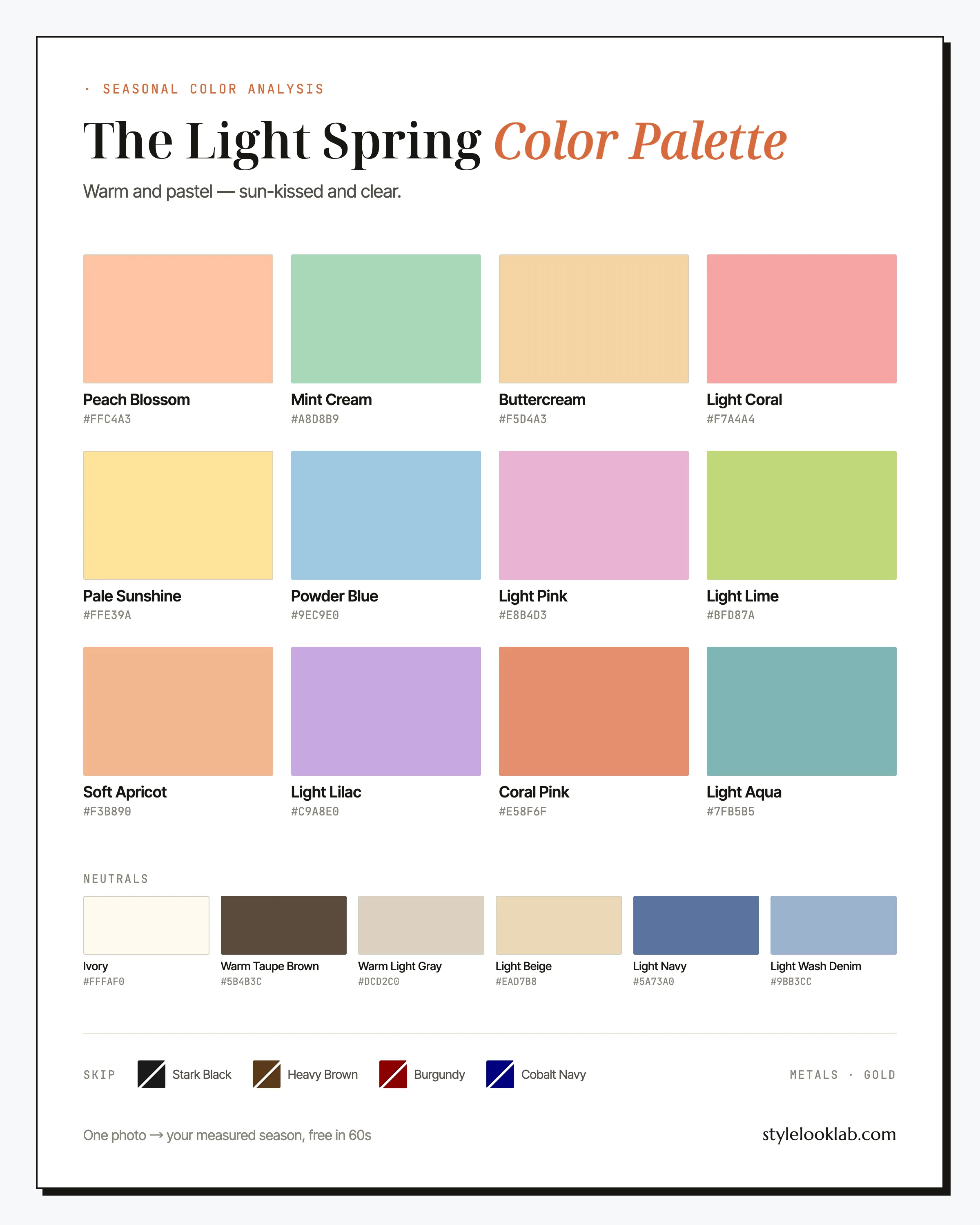
The Light Spring color palette is warm and very light: peach, buttercream, mint, powder blue, soft coral. These are pastels mixed with sunlight rather than gray. The palette suits coloring that is fair, golden, and low in contrast, where dark or dusty shades tend to overwhelm. Its neutrals are Ivory and Warm Taupe Brown instead of white and black.
If that sounds like you, what follows is the whole palette — names, hex codes, the combinations worth copying — plus the four shades most likely to work against you, and a step-by-step peach-or-pink test for telling Light Spring apart from its nearest lookalike. The condensed version first:
| Best neutrals | Best accents | Usually avoid |
|---|---|---|
| Ivory, Warm Taupe Brown, Light Beige | Peach Blossom, Coral Pink, Mint Cream | True black, dark chocolate brown, burgundy, inky navy |
How to tell if you are a Light Spring
Light Spring coloring stacks three qualities: warm, light, and low-contrast. Skin is fair with a golden or peachy cast, and its depth commonly lands around MST 1–4 on the Monk Skin Tone scale, with the standing caveat that depth alone never decides a season. Hair sits somewhere between golden blonde and strawberry blonde, often with copper glints in the sun. Eyes are usually blue, green, or light hazel, and gold flecks around the pupil are a strong hint. The overall effect is delicate rather than dramatic: no single feature dominates, which is exactly why heavy color can bury the whole face.
A few quick checks:
- Gold jewelry tends to look like part of you; silver reads a touch clinical.
- A peach or butter-yellow top makes your skin look rested; black near the face does the opposite.
- Your childhood hair was blonde or reddish, and sunlight still pulls gold out of it.
- Wrist veins lean greenish rather than clearly blue — a rough clue, nothing more.
Mostly-yes answers earn Light Spring a proper test; on their own they close nothing. The free what season am I quiz gives the same checks a scored, step-by-step format. Mirrors and phone cameras mislead more than people expect: lighting, filters, makeup, camera processing, and image selection can change the visible evidence. Style Look Lab estimates undertone, depth, and contrast from submitted photos and returns an internal confidence score; that score describes support in the available photo evidence, not a calibrated probability of accuracy. See the methodology and limitations before treating a photo result as settled.
Where Light Spring sits on the three axes
The 12-season system places every season on three axes: undertone runs warm to cool, depth runs light to deep, and chroma runs soft to clear. Light Spring sits warm of center, at the far light end, and a step toward the clear side. Depth is the headline: lightness defines this coloring even before warmth does, which is why a Light Spring can usually borrow a pale color from a neighboring palette more safely than a dark color from her own warm family.
Golden-peach warmth at low volume. Light Spring shares its sunshine with the other Springs but wears a much paler version of it.
The axis that names the season. Nearly everything in this palette would look pale on a hanger, because depth is the one thing this coloring cannot return.
Light does not mean dusty. These pastels stay clean and clear; once a color picks up a gray haze, it belongs to Light Summer instead.
Worth stating plainly before the swatches: seasonal color analysis is a system for organizing style decisions, not a medical or biological classification. Measuring undertone, depth, and contrast makes the answer far more repeatable than eyeballing a mirror, but the season you land in still depends on which color model does the sorting — this site works in the 12-season system.
The Light Spring color palette, color by color
Every shade in the Light Spring color palette follows one recipe: take a warm, clear color and add light until it glows. Peach Blossom and Mint Cream set the register, one warm anchor and one fresh counterweight. Buttercream, Pale Sunshine, and Soft Apricot carry the golden side; Powder Blue, Light Aqua, and Light Lilac keep the mix from turning saccharine; Light Pink and Light Coral cover the romantic middle. Coral Pink is the loudest thing you own, and Light Lime the most unexpected.
The neutrals
Six of these do most of the work, so they are worth knowing by name.
Peach Blossom
The signature. It splits the difference between pink and orange, which is precisely the territory this season owns. First choice for tops, dresses, and anything within a foot of your face.
Buttercream
Butter yellow is having a long retail moment, and this is the version calibrated to you: mellow, golden, zero acid. It behaves like a neutral here and pairs with everything on this page.
Mint Cream
The palette's cool exhale. Reach for it when an outfit feels too sweet — mint next to peach or apricot reads fresh instead of sugary.
Coral Pink
Your red. It delivers the punch a red dress promises, at a depth your coloring can actually answer. Save it for days you want to be looked at.
Powder Blue
The shirt color. Where a crisp optic-white shirt tends to read stark on this coloring, powder blue brings the same polish with none of the glare.
Pale Sunshine
The brightest note in the box, best deployed the way jewelry is: one hit near the face, everything else quiet.
The neutrals deserve their own paragraph. Ivory is your white. Warm Taupe Brown, a soft milk-chocolate tone, is your black. Light Beige and Warm Light Gray handle tailoring, Light Navy stands in wherever true navy would land too hard, and Light Wash Denim beats the dark rinses hanging next to it.
Light Spring colors to avoid
When an outfit fails on a Light Spring, the cause is almost always the same: weight. Dark, saturated, wine-deep shades demand a level of contrast this coloring does not have, so the color wins and the face loses. Four repeat offenders, each with the swap that rescues the outfit.
- Stark Black
The heaviest color in the store meeting some of the lightest coloring in the system. Near the face it tends to deepen shadows, sharpen lines, and turn fair golden skin faintly gray.
Wear insteadWarm Taupe Brown - Heavy Brown
Dark chocolate is an Autumn neutral. At this depth it stops reading warm and starts reading heavy, and it drags every pastel around it toward mud.
Wear insteadLight Beige - Burgundy
Wine red concentrates depth and blue pigment at once. Beside it, Light Spring lips tend to lose their color and skin its glow — a poor trade for one dramatic dress.
Wear insteadCoral Pink - Cobalt Navy
Inky navy is black with a passport. It brings the same crushing contrast plus a coldness that argues with a golden undertone.
Wear insteadLight Navy
Two consolations. Distance buys forgiveness: these warnings matter most within a foot of your face, so Burgundy at the hem costs far less than Burgundy at the collar. And nothing here leaves a hole in a working wardrobe, because the Light Spring color palette already carries a lighter stand-in for each of the four.
How to wear Light Spring colors
The governing principle is light-on-light. Most wardrobes build from dark bottoms and pale tops; a Light Spring flips that default. Pale trousers, pale knits, pale outerwear, with interest coming from texture and one clean accent rather than from darkness. A workable ratio is two neutrals plus one color: Ivory and Light Beige with a Peach Blossom sweater, say. Head-to-toe pastel, which can read like a costume on deeper coloring, reads intentional here — one of the genuine perks of the season.
Prints follow the same math. Choose patterns whose darkest color is still light: watercolor florals, gingham in peach or aqua, thin stripes on ivory grounds. A print that includes true black or chocolate brown usually pulls the whole garment out of range, however pretty the rest of it is. A quick filter when shopping: look at the background color of the print. If the ground is ivory, cream, or a pastel, the print usually belongs; if it is black or navy, it usually does not.
Light Spring color combinations that work
Five combinations built entirely from the palette above, ordered from everyday to occasion.
The cream base
Three warm near-whites that read finished rather than faded. Add gold jewelry and the outfit is done.
Peach over mint
The two anchors together. Give one piece sharp tailoring so the sweetness has something to push against.
Sky and butter
Blue and yellow at whisper volume. A powder blue shirt with a pale yellow knit over the shoulders is a spring classic for a reason.
The garden party
The most unexpected pairing on this page. Lilac and lime sound risky and land charming when both stay this pale.
Coral with backbone
The statement option. Light Navy gives coral enough ground to stand on without dragging the outfit dark.
Light Spring outfit formulas for busy mornings
For days when theory is too much, copy one of these.
- Office: Light Beige trousers + Ivory silk shirt + Warm Light Gray blazer + gold jewelry. Quiet, credible, and noticeably fresher than the same outfit in navy and charcoal.
- Weekend: Light Wash Denim jeans + Buttercream knit + white sneakers + Soft Apricot scarf. Four light pieces, no thinking required — the scarf carries the color.
- Evening: Coral Pink dress + gold sandals + Warm Taupe Brown clutch. This fills the little-black-dress slot, recast in the boldest color the palette allows.
Search terms that go straight into a shopping tab: peach linen dress, butter yellow cardigan women, mint green silk blouse, powder blue shirt women, light wash straight leg jeans, soft coral midi dress.
Light Spring hair colors
Hair for this season lives in the golden-to-copper corridor; the two moves that deserve caution are ash and depth. The goal is to preserve the low-contrast harmony between hair and skin, not to manufacture drama the face cannot echo.
- Golden blonde — the default; it matches the skin's warmth and asks little upkeep.
- Honey or caramel highlights — dimension without cooling; the brief for your colorist is gold, not beige.
- Strawberry blonde — arguably the most Light Spring color that exists in hair form, striking with green or blue eyes.
- Light copper — the boldest safe move; fair skin plus soft copper is a classic pairing for good reason.
Ash blonde tends to drain the golden cast from fair skin, and single-process dark brown or black builds a contrast that usually lands closer to severe than striking. Gray arrives relatively kindly here: it tends to come in as a warm ivory-silver that the palette's light neutrals flatter without much adjustment. Strawberry blonde is a bigger leap than most, so trying it on your own photo first is the lower-stakes way to find out whether the copper current suits you.
Makeup and metals for Light Spring
Makeup works best when it repeats the palette at lower volume: peach or apricot blush, champagne and soft gold on the eyes, and lips anywhere in the Light Coral to Coral Pink range, with a sheer coral gloss covering most days. Brown mascara and brown liner genuinely earn their keep on this coloring; heavy black liner tends to shrink light eyes and harden the face. The other counter mistake is deep berry lipstick, which packs Burgundy's problems into a smaller tube.
Metals are simple: gold, in light, polished, delicate forms — thin chains, small hoops, nothing chunky or antiqued. Bright silver tends to sit coldly against golden-flecked coloring. If you love your silver, wear it at the wrist and let gold handle the earrings and necklace.
Light Spring vs its neighbors
Light Spring mistypes tend to land one door over on the season wheel, and two comparisons cover most of them.
Light Spring vs Warm Spring
Both seasons are golden, but the Warm Spring color palette can carry marigold, tomato coral, and camel at full strength, where Light Spring needs the same warmth diluted by several shades. Hold a saturated warm color against your face in daylight: if the full-strength version dominates the mirror while its pale cousin flatters, you are Light rather than Warm.
Light Spring vs Light Summer
This is an easy confusion to make: both seasons are very light and gently contrasted, and their palettes overlap at pink and blue. The divider is temperature. Light Spring runs golden and clear; the Light Summer color palette is cool and faintly misted. The question deserves more than a paragraph, so the next section gives it the space it needs.
The peach-or-pink test, step by step
If you have narrowed yourself down to "light season, unsure which," this test is worth ten careful minutes, because the two candidate palettes disagree most sharply at one point: warm peach versus cool pink.
Set up honestly. Daylight from a window, no direct sun. A clean mirror, bare skin — foundation and tinted moisturizer both defeat the test. Pull dyed hair back so it stays out of frame. Skip the phone screen entirely; front cameras auto-correct white balance, which is the very variable you are measuring.
Gather two swatches. One warm peach or apricot piece and one cool rose or baby-pink piece — fabric, paper, or a folded scarf all work. Bigger is better: a full garment beats a lipstick tube.
Hold each at your jaw and watch four things. Skin evenness: does redness calm or flare? Shadows: does the area under your chin lighten or deepen? Eyes: brighter or unchanged? Lips: more defined or more faded? Peach winning most of the four points toward Spring; rose winning points toward Summer.
Cross-check with white. Optic white against one side of your face, ivory against the other. A clear ivory win supports the warm answer; a tie, or a stark-white win, supports the cool one.
Two warnings before trusting the verdict. Surface color is not undertone: warm-undertoned skin can still flush pink, and reading surface pink as automatically cool is a common way this test goes wrong. No single check settles the matter — the vein test included, which is a rough clue at best. Tally everything, and treat a split result as a reason to keep more than one season on the shortlist. Style Look Lab estimates undertone and depth from submitted photos and reports an internal confidence score; the methodology page explains the calculation and why the number is not a calibrated probability of accuracy.
Light Spring celebrity inspiration
No one can certify a stranger's season from red-carpet photos, so read these as styling references rather than rulings. Amy Adams is the standing reference: her most praised red-carpet looks cluster in cream, peach, and soft gold, while the occasional dark-gown outlier shows what this guide means about weight. Nicole Kidman's stylists have long paired porcelain skin with champagne, blush, and pale butter rather than icy white — worth studying for anyone told that fair automatically means cool. Emma Stone covers the palette's redhead lane, often styled in apricot, mint, and warm nude so the strawberry hair does the contrast work. Study the outfits, not the labels.
Light Spring FAQ
How do I know if I am a Light Spring?
Look for three signals together: warmth (gold jewelry and peach tend to flatter more than silver and cool rose), lightness, and low contrast between skin, hair, and eyes. Mirror checks get you partway, not to confirmation. Style Look Lab estimates undertone, depth, and contrast from submitted photos and returns an internal confidence score; the score is not a calibrated probability of accuracy, and lighting, filters, makeup, and camera processing can still shift the result.
Can a Light Spring wear black?
In shoes, bags, and bottoms, yes. Near the face it is usually the most draining choice available for this coloring, because black demands a level of contrast that fair, golden, low-contrast features cannot supply. Warm Taupe Brown and Light Navy do the anchoring job with far less cost.
Is Light Spring warm or cool?
Warm, though it is the gentlest warmth in the Spring family. The undertone is golden-peach rather than fiery, which is why Light Springs tend to suit butter yellow and apricot while still drowning in the deep spice tones that belong to the Autumn seasons.
What is the difference between Light Spring and Light Summer?
Temperature. Both seasons are light and low-contrast, and the two palettes look like cousins at a glance, but Light Spring runs golden and clear while Light Summer runs cool and slightly grayed. The fastest check is the peach-or-pink test: hold a warm peach and a cool rose against bare skin in daylight and watch which one makes your face look healthier.
What color jeans should a Light Spring buy?
Light wash is the workhorse. Faded, sky-toned denim sits inside the palette, while inky and black rinses behave like the dark colors this season avoids. For dressier days, Light Beige and Warm Light Gray trousers cover the same ground.
What hair colors suit a Light Spring?
Golden blonde, honey blonde, strawberry blonde, and light copper keep the natural warmth intact. Ash tones tend to dull the skin, and very dark single-process color builds more contrast than the rest of the coloring can match. If you highlight, keep the pieces golden rather than cool beige.
What are good Light Spring wedding guest colors?
Peach Blossom, Soft Apricot, and Mint Cream photograph well in daylight, and Coral Pink holds its own at an evening reception. Ground any of them with Light Beige accessories and gold jewelry. Where the dress code allows a choice, skip burgundy and black — both tend to overpower this coloring in photos.
Can a Light Spring wear red?
The classic blue-based red usually reads harsh on this coloring, but the palette carries its own version: Coral Pink, a warm red at pastel depth. Worn as a dress or a lip color, it does what red is supposed to do without overwhelming light features. Burgundy is the red to leave on the rack.
Think Light Spring might be your season?
Use clear photos for a separate color estimate. Sign in to check free preview eligibility; the paid Complete Report includes the full recommendations. A photo result does not confirm or inherit a quiz result.
- Sign-in required
- Free preview if eligible
- Complete Report sold separately
Sources & limitations
These references support photographic color measurement and its limitations. They do not scientifically validate the 12-season taxonomy, celebrity typing, or the editorial wardrobe, makeup, hair, and jewelry recommendations on this page. A Style Look Lab result is an estimate from submitted photos, and its confidence score is not a calibrated probability of accuracy.
- CIE 256:2025 — Measurement of Human Skin Colour — Measurement conditions and limits for human skin colour.
- He et al. (2022) — Facial skin colour from digital images — Evidence on estimating facial skin colour from images.
- Wang et al. (2018) — Skin colour measurement variability — Shows why location and measurement conditions affect readings.
- Sharma, Wu & Dalal (2005) — The CIEDE2000 color-difference formula — Reference for perceptual colour-difference calculations.
- Google — Improving skin tone representation with the Monk Skin Tone Scale — Google’s introduction to the 10-tone representation scale; it does not define undertones or validate this site’s questionnaire.