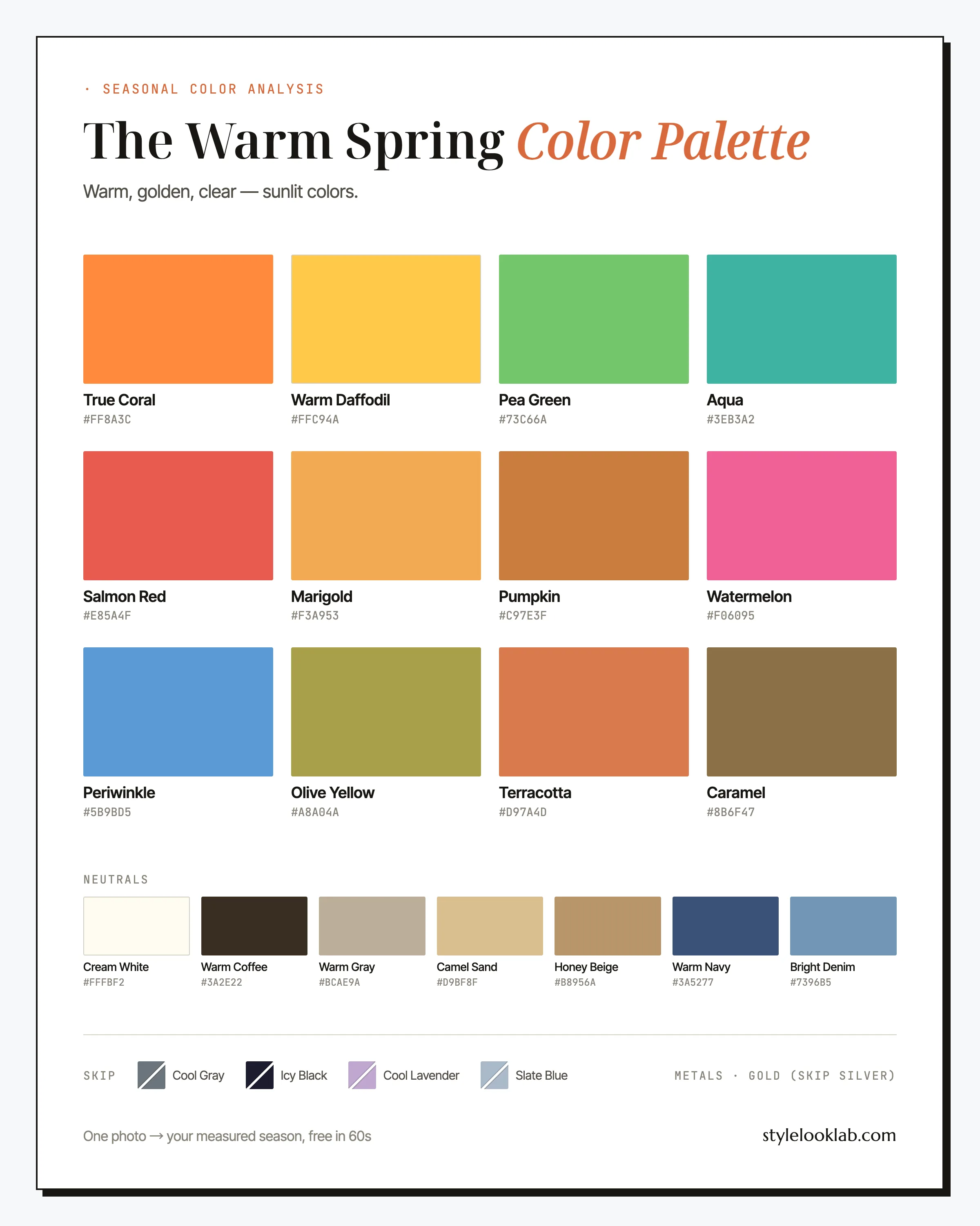
The Warm Spring color palette, also called True Spring, is the spring family at its warmest: golden through and through, with the brightness left on. Its colors read like early June — True Coral, Warm Daffodil, Pea Green, warm turquoise. Two things sink it: anything icy and anything grayed. Warmth plus clarity, together, are what make this season what it is.
Below: the full palette with names and hex codes, the combinations and outfit formulas that put it to work, the shades that tend to fight it, and a sane way to check the season is actually yours before you rebuild a wardrobe around it. Cheat sheet first:
| Best neutrals | Best accents | Usually avoid |
|---|---|---|
| Camel Sand, Cream White, Warm Coffee | True Coral, Warm Daffodil, Pea Green | Cool gray, blue-black, icy lavender, dusty pastels |
Are you a Warm Spring?
Warm Spring coloring is golden from top to bottom, with nothing stark about it. Skin carries a peachy-golden undertone and tans toward apricot rather than bronze; its depth commonly lands around MST 2–5 on the Monk Skin Tone scale, though depth is one input among several and settles nothing on its own. Hair sits between golden blonde and light copper, often with visible sun streaks by August. Eyes are warm hazel, green with gold flecks, or a bright warm blue. Contrast is medium: features are distinct, but without the drama of a Winter.
Five quick checks, best run in daylight:
- Gold jewelry tends to flatter you more than silver, and polished gold more than antiqued.
- Cream looks fresh near your face, while optic white reads a little clinical.
- Charcoal and cool gray make you look like you slept badly.
- Mustard and olive, warm as they are, feel heavier on you than they should.
- Wrist veins that look green rather than blue count in your favor — a rough clue, nothing more.
Four or five yeses put Warm Spring on your shortlist — as a lead worth testing, not a confirmed result. Take the free color season quiz if you want a structured second pass at the same signals. Lighting, filters, makeup, camera processing, and image selection can shift the visible evidence enough to move a close call. Style Look Lab estimates undertone, depth, and contrast from submitted photos and returns an internal confidence score; that score describes support in the available photo evidence, not a calibrated probability of accuracy. See the methodology and limitations before treating a photo result as settled.
Warm Spring on the three color dimensions
The 12-season system places every season on three axes: undertone (warm to cool), depth (light to deep), and chroma (soft to clear). Warm Spring sits hard against the warm end, light-to-medium in depth, and clearly on the bright side of center, a notch below Clear Spring at full saturation. Undertone is the headline: this is the one Spring with no cool variant. Chroma is the quiet second act, and it does most of the work of separating Spring from Autumn later in this guide.
The headline trait — this is the one Spring with no cool version. Even the blues, Aqua and Periwinkle, are chosen for how comfortably they sit next to gold.
Lighter than any Autumn, more substantial than Light Spring. The range runs from Cream White down to Warm Coffee and stops well short of true black.
Bright and clean, with no gray mixed in. Clarity is what separates this palette from True Autumn — a grayed-down shade reads dusty on this coloring almost immediately.
Those coordinates matter more than any single swatch: a color that is warm-based, light-to-medium, and clean will usually behave on you whether or not it appears on this page.
A note on what kind of claim that is: seasonal color analysis is a styling framework, not a medical or biological fact about your body. Measurement makes the answer more repeatable — the same face in the same light should land in the same place — but the final label still depends on the system doing the labeling, which on this site is the 12-season model. The Style Look Lab methodology page walks through the measurements and how the confidence score behind each result is built.
Inside the Warm Spring color palette
As a working wardrobe, the Warm Spring color palette runs on sunshine. True Coral and Warm Daffodil are the heroes, and both work at full strength. Salmon Red and Watermelon cover the red-to-pink territory without a drop of blue. Pea Green and Olive Yellow bring the leaf tones, while Aqua and Periwinkle handle the blue jobs in a yellow-friendly way. Marigold, Pumpkin, and Terracotta reach toward richer ground while keeping the freshness, and Caramel quietly anchors the lot.
The neutrals
Six of them do the bulk of the work and deserve introductions.
True Coral
The signature. Coral does for Warm Spring what red does for Winter, with far less effort. Wear it where it can be seen: tops, dresses, lipstick.
Warm Daffodil
Sunlight in fabric form. A daffodil knit over jeans is the fastest good outfit this palette offers, and it steps in wherever cooler seasons would reach for pale pink.
Pea Green
Fresh, leafy, and easier to wear than the swatch suggests. It pairs with nearly everything on this page, and it is the green to try if olive has always felt slightly off on you.
Salmon Red
Your red, warmed. It carries the authority of a classic red without the blue base that argues with golden skin. First pick for occasions, and for lipstick with intent.
Marigold
The bridge color: deeper than Warm Daffodil, fresher than mustard. It behaves in the office next to Warm Navy and works as well on the eyes as on the body.
Aqua
Proof this palette does blue. Aqua is a warm-water turquoise chosen for its yellow undercurrent; it keeps things fresh where a steely blue would flatten them.
The neutrals row is where the season shows its character most: Cream White replaces optic white, Warm Coffee stands in for black, and Camel Sand with Honey Beige do the daily work gray does for cooler seasons. When something genuinely gray is required, Warm Gray carries enough yellow to behave, and Warm Navy plus Bright Denim cover the cold-weather and casual jobs.
How to wear it: freshness over drama
Warm Spring colors combine on a simple logic: warm base, one clear accent, medium contrast. Build most outfits from two golden neutrals — Camel Sand, Cream White, Honey Beige, Warm Coffee — and let one bright do the talking near your face. Unlike the soft seasons, tone-on-tone mutedness is not your trick; an all-taupe outfit tends to dim this coloring rather than refine it. What you want is light, with one saturated note where people look first.
Fabric and print follow the same rule. Crisp cotton, silk, and fine knits keep light moving; heavy matte textures drag the palette toward Autumn. In prints, look for multicolor florals and fruit-toned stripes on a cream or camel ground. The ground matters more than the motif, and a black ground can undo a print full of otherwise perfect colors. If a print looks like it spent a decade fading in the sun, it has drifted too muted for you.
Warm Spring color combinations that work
Five combinations, ordered safe to bold, each built from colors on this page.
The no-black uniform
Camel, cream, and coffee deliver the polish a black suit promises, minus the shadows black tends to throw on golden skin.
Garden at noon
The two hero directions in one outfit. Louder on paper than in person; with cream between them it reads fresh, not tropical.
Marigold, office edition
Warm Navy does the serious work so Marigold can sit near the face. The most corporate this palette gets without going gray.
Jeans, warmed up
Denim stays. Bright Denim reads friendly instead of cold the moment daffodil and caramel join it.
Watermelon, anchored
The boldest pink here, held steady by navy. For the day a dress code says color and you intend to comply.
Three Warm Spring outfit formulas
Three formulas for mornings when the theory can wait.
- Office: Warm Navy blazer + Cream White shell + Camel Sand trousers + polished gold jewelry. Reads as put-together as the navy-and-white classic it is. Swap the shell for Marigold on days that can take color.
- Weekend: Bright Denim jeans + Warm Daffodil crewneck + Caramel suede boots + Terracotta tote. Four warm notes that agree with each other; the daffodil earns the compliments.
- Evening: Salmon Red silk dress + Warm Coffee wrap + gold hoops. Everything a little black dress promises, minus what black usually costs golden skin.
To shop the formulas, search: warm coral blouse women, golden yellow silk dress, camel trench coat, cream crewneck sweater, warm navy blazer women, terracotta midi skirt.
Warm Spring colors to avoid
Colors get cut from the Warm Spring color palette for one of two reasons: too cool or too gray. The four below are the repeat offenders, each with a swap that keeps the outfit idea intact.
- Cool Gray
Blue-gray with no warmth in it tends to pull the golden tones out of the face, leaving a tired, flat cast where the glow was.
Wear insteadWarm Gray - Icy Black
Blue-black is about the harshest neighbor golden skin can have. It tends to carve shadows along the jaw and dull warm hazel eyes.
Wear insteadWarm Coffee - Cool Lavender
Blue-violet sits directly opposite a yellow undertone, and the argument usually shows up on the skin as sallowness.
Wear insteadPeriwinkle - Slate Blue
Cool and muted at once, the double fault. It can dim this coloring faster than either one manages alone.
Wear insteadBright Denim
Each offender, note, already has an understudy in the palette doing the same job in a warmer key. Distance buys forgiveness too: slate-blue trousers are a far smaller gamble than a slate-blue turtleneck. Read the list as defaults rather than bans.
Warm Spring hair colors
Warm Spring hair stays inside the golden family, and the two directions to treat with caution are ash and blue-black, because both work against the warmth the rest of the palette is built on.
- Honey blonde — the default: golden, light-reflecting, low-drama against peachy skin.
- Golden balayage — the low-commitment route to dimension; brief your colorist on warm ribbons, not ash.
- Strawberry blonde — leans into the copper current many Warm Springs already have, and striking with green or hazel eyes.
- Golden chestnut — the depth option. Stop well before espresso; past a certain darkness the contrast starts to overwhelm this coloring.
Gray tends to arrive cooler than this coloring likes, which is why many Warm Springs keep a golden gloss going longer than other seasons would bother to. If you let it silver, moving Cream White and True Coral closer to the face usually keeps the palette workable. Curious how strawberry blonde would actually land? The AI hairstyle changer previews it on your own photo, no dye involved.
Warm Spring makeup and metals
Makeup follows the clothes: warm and clear. Lipstick lives in the True Coral, Salmon Red, and Pumpkin range — coral for daytime, salmon red for impact, pumpkin on quieter days. Blush leans peach or apricot rather than mauve. On eyes, golden tones like Marigold tend to flatter more than taupe, and warm brown liner is kinder than black. The classic counter mistake is a blue-based red lip; on this coloring it usually turns teeth yellow and skin pink in the wrong way.
Metal is the one decision this season gets to make once: polished yellow gold, worn without apology. Silver behaves like Cool Gray in jewelry form, so whatever stays in the rotation does better away from the face. Rose gold works as a second metal when it leans golden rather than pink. Finish matters more than most guides admit, which brings us to the trickiest comparison on this page.
Clear gold vs burnished gold: where Warm Spring ends and Autumn begins
Warm Spring and True Autumn share a border and a defining trait: both are fully, unambiguously warm. Warmth cannot separate them, which is exactly why so many golden-toned women bounce between the two palettes online. What separates them is the kind of gold.
Spring gold is clear: morning light, buttercup, polished brass fresh out of the case. It has yellow in it and no brown. Autumn gold is burnished: late-afternoon light, ochre, antique brass with a century of handling. Same hue family, different finish, and every color in each palette inherits its season's finish. Marigold is clear gold as fabric; mustard is burnished gold as fabric.
Three concrete ways to test the difference on yourself:
- Jewelry finish. High-polish yellow gold against antiqued or matte gold. If the polished piece wakes your skin up while the antique one leaves it shadowed, that points Spring.
- The yellow test. Hold Marigold and mustard near your bare face in daylight. On a Warm Spring, mustard tends to read as a shadow of the real thing; on a True Autumn, Marigold reads slightly shrill.
- Fabric surface. The same warm shade in silk or crisp cotton versus raw linen or brushed wool. Springs usually come alive under light-reflecting surfaces, Autumns under matte, textured ones.
None of these settles it alone. Chroma is arguably the hardest of the three dimensions to judge by eye — the axis where a measured analysis earns its keep. Run all three, though, and a consistent lean usually shows up.
The seasons next door to Warm Spring
Most Warm Spring mistypes land next door, in one of two seasons. Both comparisons below run at home with daylight and a mirror; if each feels like a coin flip, take the ambiguity as information — borderline cases are what measurement is for.
Warm Spring vs Light Spring
Both are warm and fresh; the split is intensity. The Light Spring color palette wears this same garden in watercolor: pale peach where you wear True Coral, buttercream where you wear Warm Daffodil. Hold a full-strength coral to your bare face. If it lights you up, Warm Spring is worth testing; if the coral wears you and a gentler peach feels right, Light is the better bet. Depth is the supporting clue, since Light Spring typically works with paler versions of the same hues.
Warm Spring vs True Autumn
Both are fully warm; the divider is clarity, covered in detail in the gold section above. The True Autumn color palette wears rust, mustard, and olive with the lights dimmed. Warm Spring takes the same hues at brightness — Terracotta over rust, Marigold over mustard, Pea Green over olive. If burnished, tone-on-tone earth tones sit naturally with you, test Autumn; if Cream White and a pop of coral are easier, test Spring.
Warm Spring celebrity inspiration
None of this is an official typing — no such thing exists — so read what follows as styling reference, not a verdict on the women themselves. Blake Lively's most-praised red-carpet stretches run on gold, coral, and buttery yellow, with polished gold jewelry doing exactly what this page recommends; study those looks over her occasional icy-silver outings. Gigi Hadid off duty is a running catalog of the golden neutral stack — camel, cream, caramel — with marigold as the recurring accent. Nicole Kidman is the instructive case: in her copper-haired phases she is styled against golden yellow and warm red, and those specific eras read convincingly warm, which is why analysts enjoy arguing about her.
Warm Spring FAQ
Is Warm Spring the same as True Spring?
Same season, two naming conventions. Analyst systems descended from Sci\ART call it True Spring because warmth is its dominant dimension; consumer guides often say Warm Spring for exactly the same reason. This page covers that one season — the palette, the outfit formulas, and the avoid list do not change with the label.
How do I know if I am a Warm Spring?
Look for three coordinates together: warmth, light-to-medium depth, and clarity (bright coral flatters where dusty rose falls flat). Treat self-checks as a starting point rather than a result. Style Look Lab estimates undertone, depth, and contrast from submitted photos and returns an internal confidence score; the score is not a calibrated probability of accuracy, and lighting, filters, makeup, and camera processing can still shift the result.
Can a Warm Spring wear black?
Below the waist, sure; next to the face is where it costs you. Black tends to flatten golden skin and throw shadows along the jaw. Warm Coffee handles the dark-neutral jobs without that tax, and when a dress code insists on black, a Cream White collar or a True Coral lip between the black and your skin does real work.
Can Warm Spring wear white?
Cream, not optic. Cream White is one of the hardest-working colors in this palette and looks fresh against a golden undertone, while bright optic white behaves like a cool color and usually reads stark rather than crisp on this coloring. If a white shirt is non-negotiable, pick one with a warm, off-white cast.
Can a Warm Spring wear pink?
Warm pinks, yes. Watermelon and Salmon Red are the pink territory here: Salmon Red is openly warm, and Watermelon sits at the warm edge of pink without tipping into cool. The versions that backfire are blue-based — fuchsia and icy baby pink both fight a golden undertone.
What hair colors suit a Warm Spring?
Stay golden: honey blonde, golden balayage, strawberry blonde, golden chestnut. Ash tones are the classic mistake, because they mute the exact warmth the palette is built around, and blue-black brings more contrast than this coloring can answer. If you want depth, golden chestnut is the stopping point before espresso.
Warm Spring vs Light Spring — which one am I?
Run the coral test in daylight. Full-strength True Coral flatters a Warm Spring and overwhelms a Light Spring, who suits the same idea in a paler peach. Overall depth is the supporting clue: Light Springs tend to be lighter head to toe, flaxen rather than golden. A genuinely ambiguous result is a borderline case worth measuring instead of re-quizzing.
Do Warm Spring colors still work with gray hair?
The undertone in your skin stays warm, so the palette holds. What changes is contrast — and the hair itself, which often silvers cooler than the rest of the coloring. Many Warm Springs keep a golden gloss going; those who go fully silver usually do best moving Cream White and True Coral closer to the face. Hair depth feeds the result too, so a drastic color change is a fair reason to re-test.
Does golden sound like you?
Use clear photos for a separate color estimate. Sign in to check free preview eligibility; the paid Complete Report includes the full recommendations. A photo result does not confirm or inherit a quiz result.
- Sign-in required
- Free preview if eligible
- Complete Report sold separately
Sources & limitations
These references support photographic color measurement and its limitations. They do not scientifically validate the 12-season taxonomy, celebrity typing, or the editorial wardrobe, makeup, hair, and jewelry recommendations on this page. A Style Look Lab result is an estimate from submitted photos, and its confidence score is not a calibrated probability of accuracy.
- CIE 256:2025 — Measurement of Human Skin Colour — Measurement conditions and limits for human skin colour.
- He et al. (2022) — Facial skin colour from digital images — Evidence on estimating facial skin colour from images.
- Wang et al. (2018) — Skin colour measurement variability — Shows why location and measurement conditions affect readings.
- Sharma, Wu & Dalal (2005) — The CIEDE2000 color-difference formula — Reference for perceptual colour-difference calculations.
- Google — Improving skin tone representation with the Monk Skin Tone Scale — Google’s introduction to the 10-tone representation scale; it does not define undertones or validate this site’s questionnaire.