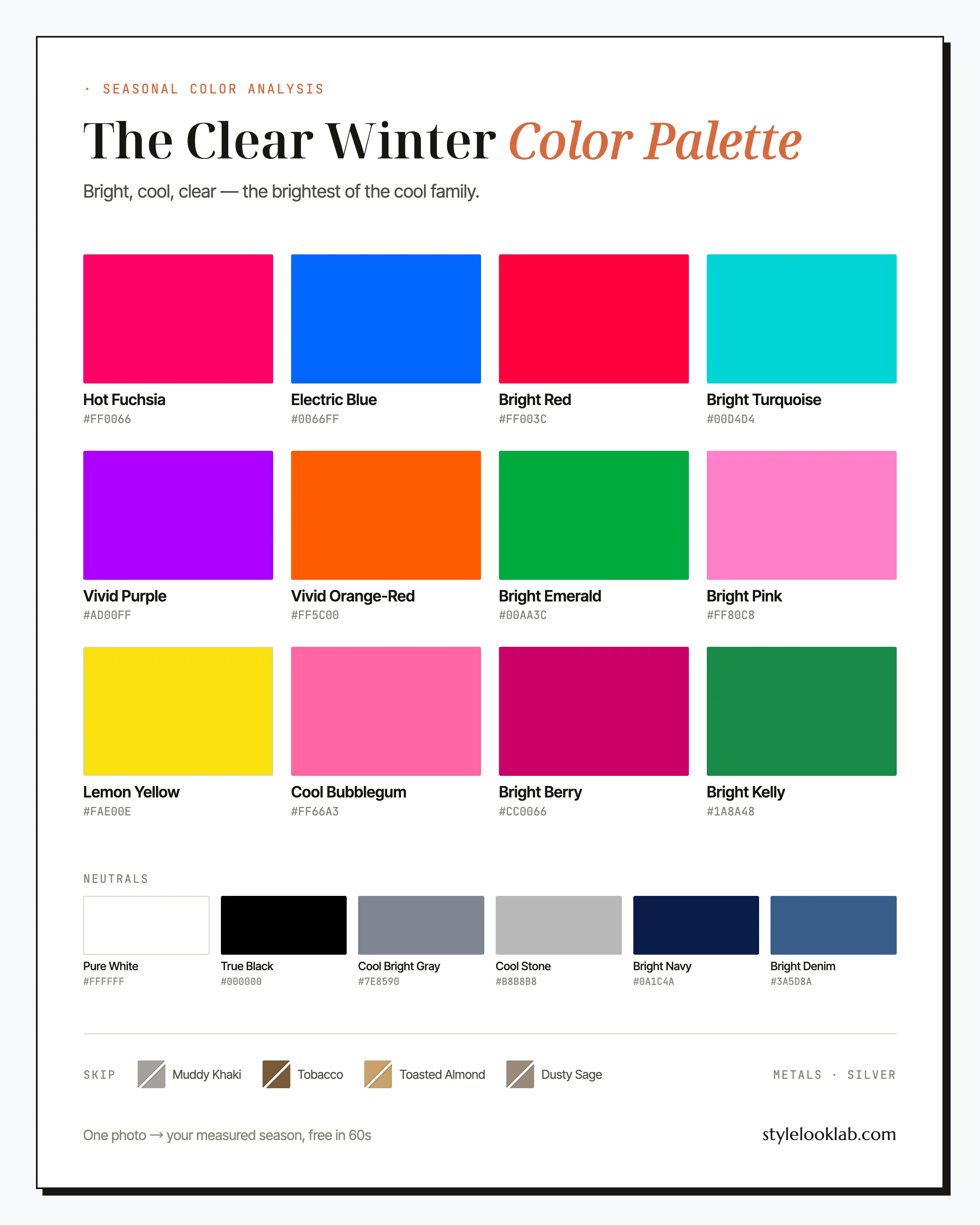
The Clear Winter color palette — also called Bright Winter — is cool and maximally saturated: Hot Fuchsia, Electric Blue, true blue-red, Bright Emerald, with True Black and Pure White at full strength. It belongs to high-contrast coloring: dark hair, cool skin, bright eyes. If vivid color makes your face look sharper while muted shades make it look tired, this is likely your season.
This guide names every color with its hex code, shows the combinations that hold up in real outfits, flags the shades that tend to sabotage you, and closes with a realistic way to check that the season is actually yours. First, the compressed version:
| Best neutrals | Best accents | Usually avoid |
|---|---|---|
| True Black, Pure White, Bright Navy | Hot Fuchsia, Electric Blue, Bright Red | Camel, khaki, warm browns, dusty pastels |
Are you a Clear Winter?
Clear Winter coloring is built on two things: coolness and clarity. Hair runs dark brown to black, usually with a cool cast. Eyes are the tell — brilliant blue, vivid green, or deep brown with strikingly bright whites. Skin carries a cool undertone and a certain crispness, and its depth commonly lands around MST 3–6 on the Monk Skin Tone scale, though depth alone never decides a season. What separates a Clear Winter from the other Winters is contrast: the gap between hair, skin, and eyes is wide, and nothing about the face reads hazy.
Run yourself through four quick diagnostics:
- Silver jewelry tends to look cleaner on you than yellow gold.
- True black near your face sharpens it rather than shadowing it.
- Muted "tasteful" shades like greige, dusty rose, and olive leave you looking faintly unwell.
- Your wrist veins look blue or blue-purple rather than olive — a rough clue, nothing more.
Three or four yes answers put Clear Winter on your shortlist. If you want a more structured pass at the question, the free what season am I quiz runs these diagnostics in a couple of minutes. That is still a hypothesis to test, not a confirmed result: warm indoor lighting can make cool skin read golden, and filters, makeup, camera processing, and image selection can move a close call. Style Look Lab estimates undertone, depth, and contrast from submitted photos and returns an internal confidence score; that score describes support in the available photo evidence, not a calibrated probability of accuracy. See the methodology and limitations before treating a photo result as settled.
Where Clear Winter sits on the three axes
The 12-season system places every season on three axes: undertone (warm to cool), depth (light to deep), and chroma (soft to clear). Clear Winter sits firmly cool, medium-deep in value, and at the extreme clear end of the chroma axis. That last position is the defining one. Brightness leads and coolness follows in this season's job description, which is why it borrows two warm-leaning notes from Spring that the other Winter palettes leave out.
Cool with a footnote — a trace of Spring warmth is why Lemon Yellow and Vivid Orange-Red survive here when the other Winter palettes would drop them.
What matters is less the average depth than the spread: True Black against Pure White in one outfit is this palette’s natural state.
The defining axis. These colors are worn straight from the tube — mix any gray into them and they stop belonging to this season.
Keep those three coordinates in mind and you no longer need to memorize swatches: any color that is cool-based and fully saturated is a candidate, even one that never made this page.
Worth saying plainly: seasonal color analysis is a way of organizing style decisions, not a scientific classification of your body. Numeric estimates can make the evidence easier to inspect under comparable conditions, but the season still depends on the color system doing the sorting — this site uses the 12-season model, and Style Look Lab's methodology page documents how the three axes and internal confidence score are estimated.
Why toning it down usually backfires for a Clear Winter
Most color advice aimed at adult women points in one direction: quieter. Neutrals over brights, muted tones as shorthand for taste, nothing that announces itself. For many seasons that advice is merely cautious. For a Clear Winter it usually backfires, and understanding why can save you a closet of expensive mistakes.
High-contrast coloring sets a visual volume level, and clothes get measured against it. A shade with gray mixed into it — greige, dusty rose, mushroom — sits at a lower intensity than your own features. The eye tends to read the mismatch as fatigue: skin looks duller, shadows deeper, the overall picture soft in the unflattering sense. Instead of calming the outfit, the muted piece blurs the person wearing it.
That is why the quiet-luxury uniform of camel, oatmeal, and taupe — genuinely lovely on a Soft Autumn — tends to photograph so poorly on this coloring. Saturation, for a Clear Winter, is not a bold choice in need of justifying; it is the neutral position. Hot Fuchsia on an ordinary Tuesday simply matches the level your features already operate at. If you want restraint, put it in the silhouette: plain shapes, clean lines, one saturated color doing all the talking.
The Clear Winter color palette, color by color
The working Clear Winter color palette runs on pure pigment with a cool base. Hot Fuchsia and Electric Blue are the two hero colors. Bright Red, Bright Emerald, Vivid Purple, and Bright Turquoise fill out the jewel-tone core; Lemon Yellow and Vivid Orange-Red are the borrowed-from-Spring surprises; Bright Pink and Cool Bubblegum cover the soft-color slot with the clarity intact; Bright Berry and Bright Kelly work as accents when a full garment of color feels like too much. The neutrals — True Black, Pure White, Bright Navy, Cool Bright Gray, Cool Stone, Bright Denim — are cool and crisp, with no brown anywhere in the mix.
The neutrals
Eighteen named colors is more than anyone recalls mid-shopping, so here are the six that do the heaviest lifting, and what each is for.
Hot Fuchsia
The signature. A fuchsia top, dress, or lip is the fastest way to look like yourself on this palette. If you own one statement piece, make it this one.
Electric Blue
The other hero, and the easier one to wear to work. Cobalt-adjacent, cool, impossible to mistake for navy. A silk blouse in this shade does what a red dress does for other seasons.
Bright Red
Your red is blue-based and clean — no rust, no brick, no tomato. It works hardest as lipstick and as the single accent in a black-and-white outfit.
Bright Emerald
The office-safe jewel tone: deep enough to read serious, saturated enough to stay yours. Over Bright Navy it makes the most authoritative pairing in the palette.
Lemon Yellow
The unexpected one. Most cool seasons lose yellow altogether; the Spring influence in Clear Winter keeps this sharp, cool-leaning version wearable. Use it in small doses — a knit, a bag — against black or white.
Bright Berry
The volume-two option for days when Hot Fuchsia feels like too much for the room. It carries the same cool-pink message at conversational volume, and it converts directly to lipstick.
On the neutrals: you are one of the few seasons that wears True Black and Pure White at full strength, together, right at the face. Bright Navy is the softer-than-black anchor for tailoring, Cool Bright Gray and Cool Stone handle low-key days without going muddy, and Bright Denim tends to beat faded, stone-washed jeans on this coloring.
How to wear Clear Winter colors
One principle organizes everything: keep the contrast high and the pigment clean. The reliable ratio is one saturated color plus one or two graphic neutrals — Electric Blue with black, Hot Fuchsia with white, Bright Emerald with navy. Head-to-toe brights can work too, but they ask for plain silhouettes; when the color is doing this much, the cut should do very little. What usually breaks an outfit is not too much color but a muddy piece in the middle of it — a taupe bag or a washed-out cardigan will drag three correct pieces down with it.
Prints follow the same logic: contrast matters more than motif. Graphic black-and-white stripes, polka dots, hard-edged color blocking, and abstract prints in palette colors all belong here. What tends to fail is anything blended — watercolor florals, faded batik, heathered marls. A quick test: if the print looks slightly out of focus from across the room, expect it to do the same thing to your face.
Clear Winter color combinations that work
Five pairings below, ordered from lowest risk to highest voltage, every one built from the Clear Winter color palette above.
The uniform, sharpened
Black and white at full strength is the base layer of this whole season. The red — lip, bag, or shoe — is what signs your name to it.
Both heroes at once
A pairing most palettes cannot survive. Keep the cuts plain and let the two colors compete; the white keeps the peace.
The boardroom jewel
Emerald over navy reads senior without going somber. Cool Stone lightens the mix so it works before sunset, not just after.
After dark
The evening option that is not a black dress. Purple this saturated needs black beside it to read deliberate; the gray softens the landing.
Pink at your volume
Tonal pink dressing, winter edition. Both pinks stay cool and clear, so the effect is crisp rather than sugary.
Clear Winter outfit formulas, ready to wear
Theory over. These three get you dressed.
- Office: Bright Navy blazer + Pure White shirt + True Black trousers + one Bright Emerald accent (scarf, knit, or bag). Reads authoritative without a single beige compromise, and silver jewelry finishes it.
- Weekend: Bright Denim jeans + Pure White tee + Electric Blue sweater over the shoulders + white sneakers. Casual at your contrast level — note the absence of a gray-marl hoodie anywhere in it.
- Evening: Hot Fuchsia silk dress + True Black heels + high-polish silver earrings. The palette at full volume. Keep hair sleek and the lip either matching or bare, not halfway between.
Search terms that find the pieces above: electric blue silk blouse, fuchsia midi dress, true red wool coat women, crisp white poplin shirt, cobalt blue sweater women, black cigarette pants.
Clear Winter colors to avoid
Two failure modes account for nearly every bad color on a Clear Winter: too warm, or too hazy. The worst offenders manage both at once. Here are the four that do the most damage, each with the swap that saves the outfit.
- Muddy Khaki
Warm and grayed in a single fabric — both failure modes at once. Next to high-contrast features it reads like a smudge on a sharp photograph.
Wear insteadCool Bright Gray - Tobacco
Warm brown tends to pull sallow tones out of cool skin, and its low chroma works against the contrast this coloring depends on. Even good tailoring struggles to rescue it near the face.
Wear insteadBright Navy - Toasted Almond
Camel-family beiges are built for warm, gentle coloring. On a Clear Winter they tend to blur the line between skin and clothing until the whole frame reads tired.
Wear insteadCool Stone - Dusty Sage
A green with the saturation drained out. The same haze that makes it soothing on a soft season sits on this face like a gray filter.
Wear insteadBright Emerald
Note what the swaps have in common: each keeps the practical job the earth tone was doing — ground, quiet, structure — while returning to a cool base. Placement matters as well, since khaki trousers are a far smaller gamble than a khaki turtleneck. Strong defaults, in other words, not a banned list.
Clear Winter hair colors
Clear Winter hair color protects two assets: depth and coolness. Wide, face-framing contrast is the feature, so the directions to be wary of are golden warmth and overall lightening.
- Blue-black — the boldest safe option, striking against cool skin and bright eyes.
- Cool espresso — near-black brown without the upkeep of true black dye.
- Cool dark brown — the natural default for most Clear Winters; ask your colorist to neutralize any red that develops between appointments.
- Icy highlights — if you want dimension, keep it ashy and minimal. Golden balayage is one of the most common ways this coloring gets softened by accident.
Warm caramel, honey, and golden ombre tend to blur the contrast that defines the season. Silver, when it arrives, is usually good news: gray tends to grow in cool on this coloring, and a deliberate salt-and-pepper or full silver often looks sharper than a warmed-up dye job. To see how blue-black or icy highlights read against your own contrast, try them on a photo with the AI hairstyle changer before booking the chair.
Makeup and metals for Clear Winter
The makeup formula is one loud thing on an otherwise clean face. A blue-red or fuchsia lip — Bright Red, Hot Fuchsia, and Bright Berry all translate directly to lipstick — with sharp black liner and groomed brows is the entire look. Choose cool pink blush over warm bronzer and black mascara over brown, and skip the brick-and-terracotta lip family, which tends to read muddy against cool, high-contrast features.
Metals are a short conversation: silver, and shiny. High-polish silver, platinum, and white gold match the clarity of the palette; brushed and antiqued finishes read too quiet for it. Yellow gold is not banned, just demoted — fine threaded into a silver stack, usually wrong as the only metal at your face.
Clear Winter vs its neighbors
Mistypes out of Clear Winter usually land in one of its two neighbors on the wheel. Both tests below need daylight, a mirror, and a few minutes.
Clear Winter vs Cool Winter
Both are cool; the question is which trait leads. The Cool Winter color palette puts coolness first — icier, more controlled, a step less saturated. Hold something genuinely electric, like Hot Fuchsia, against your face. If it overpowers you and you find yourself wanting the calmer version, Cool Winter is the better bet. If the icier, quieter winter shades look flat on you instead, brightness is your leading trait and Clear Winter fits.
Clear Winter vs Clear Spring
Both run at maximum saturation; temperature is the divider. The Clear Spring color palette leans golden — coral, sunny yellow, warm turquoise — while Clear Winter brights have a blue spine. Test warm coral against bare skin, then Electric Blue: Spring coloring tends to glow next to the coral and dull next to the blue, and Winter coloring does the reverse. Black makes a useful extra check, since it tends to sharpen a Clear Winter and visibly dim a Clear Spring.
If both comparisons feel like a coin flip, keep both on the shortlist. An undertone estimate can add evidence, but it does not guarantee a settled answer.
Clear Winter celebrity inspiration
Treat this section as styling reference, not verified classification — these are readings of outfits, not of people. Megan Fox's most photographed looks — true red, cobalt, black cut with hard white against near-black hair — are the Clear Winter formula worn as written. Zooey Deschanel's signature styling of saturated cobalt, true red, and crisp black-and-white against porcelain skin and dark hair shows how the palette works with a softer, more playful personal style. Kim Kardashian's all-black and jewel-tone eras land visibly harder on camera than her beige-and-greige phases — a one-person case study in the muted-colors problem described above.
Clear Winter FAQ
Is Clear Winter the same as Bright Winter?
Same season, two naming traditions. Some analysts and apps say Bright Winter, others say Clear Winter, and both mean the cool season defined by maximum chroma. Style Look Lab’s analysis engine uses the Bright Winter label internally, so a report that calls you Bright Winter is pointing at exactly the palette on this page.
How do I know if I am a Clear Winter?
Look for the pairing of a cool undertone with high natural contrast: dark hair, brilliant or very clear eyes, and vivid color looking better on you than muted color. Self-checks build a shortlist, not a confirmation. Style Look Lab estimates undertone, depth, and contrast from submitted photos and returns an internal confidence score; the score is not a calibrated probability of accuracy, and lighting, filters, makeup, and camera processing can still shift the result.
Can a Clear Winter wear black?
More comfortably than almost any other season. True Black at full strength, right at the face, is a Clear Winter staple rather than a risk. One refinement worth making: head-to-toe black can flatten even this coloring, so add Pure White or one vivid accent to give your natural contrast something to answer.
Should a Clear Winter wear gold or silver jewelry?
Silver first, and high polish over brushed finishes — shine suits this palette the way saturation does. Yellow gold works as a supporting player: fine when threaded through a silver stack or set with clear stones, less successful as the only metal at your face.
Can Clear Winters wear pastels?
Icy ones, yes. Bright Pink and Cool Bubblegum are cool pinks with their clarity intact, and they read fresh rather than washed out. The pastels that fail are the powdery, chalky kind — anything that looks mixed with white dust tends to drain this coloring faster than a dark color would.
What lipstick colors suit a Clear Winter?
Blue-based and confident: a true blue-red in the Bright Red family, Hot Fuchsia for the signature look, and Bright Berry when the room calls for slightly less volume. Brown-leaning nudes are the shades to skip, since a beige lip tends to erase the contrast that does most of the work on this face.
Can a Clear Winter wear brown or earth tones?
Rarely well near the face. Tobacco, camel, and khaki are warm and grayed at the same time — the two failure modes for this coloring combined. If a dress code or a trend demands earth tones, keep them below the waist and put Pure White, True Black, or a vivid color at the neckline. Bright Navy usually covers the practical jobs brown does for other seasons.
Clear Winter vs Cool Winter — how do I tell them apart?
Brightness is the divider. Both seasons are cool, but Cool Winter runs a step less saturated and a touch icier, while Clear Winter needs full-strength pigment to look awake. Test with something electric like fuchsia: if it wears you, look at Cool Winter; if the calmer winter shades go flat on you instead, stay here.
Think Clear Winter might be you?
Use clear photos for a separate color estimate. Sign in to check free preview eligibility; the paid Complete Report includes the full recommendations. A photo result does not confirm or inherit a quiz result.
- Sign-in required
- Free preview if eligible
- Complete Report sold separately
Sources & limitations
These references support photographic color measurement and its limitations. They do not scientifically validate the 12-season taxonomy, celebrity typing, or the editorial wardrobe, makeup, hair, and jewelry recommendations on this page. A Style Look Lab result is an estimate from submitted photos, and its confidence score is not a calibrated probability of accuracy.
- CIE 256:2025 — Measurement of Human Skin Colour — Measurement conditions and limits for human skin colour.
- He et al. (2022) — Facial skin colour from digital images — Evidence on estimating facial skin colour from images.
- Wang et al. (2018) — Skin colour measurement variability — Shows why location and measurement conditions affect readings.
- Sharma, Wu & Dalal (2005) — The CIEDE2000 color-difference formula — Reference for perceptual colour-difference calculations.
- Google — Improving skin tone representation with the Monk Skin Tone Scale — Google’s introduction to the 10-tone representation scale; it does not define undertones or validate this site’s questionnaire.